Redesigned packaging: Cleanser clogging is curtailed
March 11, 2015

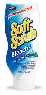
Thirty years after its introduction, Soft Scrub® cleanser from The Dial Corp. is cleaning up its act, with fresh, new packaging that not only eliminates the product clogging and buildup experienced with the brand's previous packaging, but also brightens the household cleaner aisle, with vibrant, full-body shrink labels. "After buying the brand from Clorox in November 2004, we saw great opportunities to grow the brand," says Wendy Warus, director of marketing, Household Cleaners & Insecticides at Dial. "The first step was to modernize the brand image, which led to the inverted bottle and updated graphics."
One of Dial's chief goals with the redesign, Warus adds, was to develop packaging that could dispense the viscous cleanser without clogging or causing buildup around the orifice—a complaint often voiced with Soft Scrub's 1976-inspired bottle. The new package, a custom, 24-oz, high-density polyethylene bottle developed in conjunction with Silgan Plastics (www.silganplastics.com), uses an inverted format along with a 33-mm SimpliSqueeze® valve closure from Seaquist Closures (www.seaquistclosures.com) to ease product dispensing and to reduce buildup.

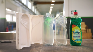
According to Mark Wanderlich, packaging development engineer for Silgan, the greatest challenge in designing the bottle was to ensure that it would return to its original shape after dispensing. "The product is extremely viscous, causing vacuum problems, or panel suckback," he relates. "We had to perfect several aspects of the package, including design geometry, material and wall thickness, and we had to incorporate some unique panel-support features for the bottle to return to its original state after being squeezed."
Created to enhance the product's image at point-of-purchase are bright, full-body oriented polystyrene shrink labels gravure-printed in eight colors by Fort Dearborn (www.fortdearborn.com). "By moving to the full-body shrink label, we doubled the billboard effect of the package," notes Warus. Graphics, designed by MLR Design (www.mlrdesign.com), use bright colors to distinguish between the line's four varieties.
You May Also Like


