Structural daring marks winners
January 29, 2014
Often, package design competitions become beauty contests. And every so often to the gaudiest graphics go the spoils?and sometimes the sales.
Judges in this year's Mobius Awards competition abandon this attitude. In their selections, presented in February in Hollywood, (see PD, Mar. '03, p. 10), their Best-in-Show choice is indeed visually stunning; but it also demonstrates innovation in decoration. And three other Mobius winners from a single source go further to present their product with engineering imagination and a bit of daring.
Chosen best is a series of yogurt cups marketed in England by Tesco Stores, Cheshunt, Herts, with graphic design by Pemberton & Whitefoord. The split image design for the 150-g paperboard cups made by Seda U.K. divides space between photographic representations of fruit and related ingredients for six flavor varieties and a black and gleaming silver field that identifies the yogurts as Tesco's Finest.
Yet that segment is printed on the two-sides polyethylene-coated board with standard offset inks from Intercolor, plus the metallic-effect ink with that supplier's new Eckart Topstar UV 21-0012, which is said to retain its bright gloss better that some actual metallics. The cup's lidstock is a 37-micron foil,two-sides-PE coated, printed with fruit graphics in 5 colors by Chadwicks of Bury on a Mark Andy 9-color flexo press.
Mastering multiples
Recognizing structural imagination, the judges bestowed an unprecedented three Mobius awards on Sony Music, New York City, for three compact disk collections marketed under its Regency label. Developed by Sony's in-house design department, the packages are submitted by Stephen Sussman, Sony Music senior director, advertising and accounts.
Since the sets contain the music of mid-20th-century artists, the three different package structures aimed at a more mature consumer are built for durability. Typical is the Herbie Hancock box holding a four-CD retrospective spanning 17 years, sampling 25 albums and including a 56-page booklet.
Containing these components is a rigid, water-clear acrylic copolymer injection molded cube made by Imperial Paper Box Corp., which also prints the booklet. Two mating parts form the cube, with one of them internally grooved to hold the CDs in an upright position. Additional security, especially during shipping, is provided by transparent 11/2-mil slotted vinyl end caps produced by Imperial.
Another alternative to the jewel box is Sony's second winner, a paperboard setup box holding the four-CD Charlie Christian: the Genius of the Electric Guitar collection with a 72-page booklet. Printed to resemble a guitar case, the box with an extension bottom is made by Imperial of a .054 black kraft- lined recycled chipboard, offset-printed in four process colors plus a second black, aqueous coating and two-level embossing on the 80# opaque text cover wrap.
Padding for position
Separating and protecting the CDs is a die-cut platform made of black foam that Imperial slits and then inserts into an interior tray that it manufactures of recycled chipboard with a 60# black kraft wrap; after insertion, end space remains for the Imperial-printed booklet.
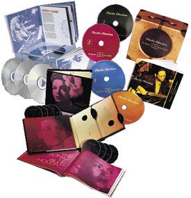 The third Sony Mobius is presented for the most ambitious, and, in a sense, most traditional, of the collections. This is a 10-CD album format for the Complete Billie Holiday on Columbia (1933-1944) with 116-page bound booklet within the 12 x 101/2-in. dimensions of the album, which recalls the days when 331/3-rpm vinyl records dominated home entertainment.
Honoring the singer Sony calls "the greatest female vocalist of all time," the album made by Imperial consists of an outer folder made of .150 recycled pasted chipboard wrapped with Pellaq lizard leatherette. The front cover is debossed around the singer's profile and gold stamped Lady Day, as well as on the spine. A die-cut portrait label is placed into the debossed cavity; it's printed in two blacks and a custom purple by an Akiyama press on an 80# brown wrap.
Lined with a 70# unprinted text, the folder's inside is attached with two banks of five CD holders made of 80# cover brown wrap, each appropriately numbered. A folded sheet printed with the Columbia, Decca, Parlophone and other Holiday labels, plus a list of all songs featured in the collection, is printed in six colors on a 70# paper by Imperial.
All three of the packages are shrink-wrapped with a clear 75-ga polyolefin coextrusion, Vanguard 501, from the Vanguard Packaging Film Div. of Okura USA. And reinforcing their positions as selling content rather than appearance, each has a simple highly detailed pressure-sensitive label. All are converted by Graphic Communications on a 60# paper, flexo-printed in one or two colors. Circle No. 407.
Moving to the top
In the area of premium food packaging, two North American winners emerge. The first is a full redesign for Eleni's, a New York City bakery marketing Eleni's Conversation Cookies. These are hand-decorated sugar cookies in a variety of designs, with the packages sold through high-end department stores, as well as in the bakery, in 14-oz quantities. Since there is a host of stock-keeping units, label demands keep growing.
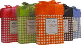 In the design system by Stormhouse Partners, a board base with automatic bottom, decorated in a spring green gingham plaid, is mated with a solid green simplex lid tied with a silk ribbon. The tablecloth-like graphic focuses attention on the main display panel's universal embossed and foil-stamped label area, with both components produced by Colad of .018 SBS coated one side and offset printed in three colors plus spot gloss and matte varnish.
The cartons then ship to Eleni's, where photographic labels relating to specific cookie groupings are printed in-house with a digital printer, a Hewlett Packard Color LaserJet 4550, that is programmed with Stormhouse-generated software graphics to cover all collections. The software can be expanded as new products are introduced.
Eleni's is said to use p-s label stock from several suppliers for this rear-panel label. The primary cookie container is a 2-pc metal container whose manufacturer isn't identified; neither is that for the silk ribbon. Circle No. 408.
Heat and light
A new entry to the salsa beat captures a Mobius for a package from Lava Foods, Houston, TX. With design by PrimoAngeli:fitch, the 16-oz vacuum-packed glass jar for Chili Chaser Award Winning Fire Roasted Salsa has the undeniable impact Lava president Larry Blanton sees as necessary to earn a place in an increasingly crowded category.
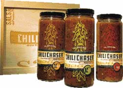 With the clear Vitro jar and button-pop black tinplate closure acquired through RYCO Packaging, the initial impression is established by chili pepper graphics screened by Custom Decorative Systems in colors relating to the mild, medium and hot versions of the recipes. But the strongest visual effect derives from labels, just more than 11/2-in wide, where powerful fonts for the tradename and explanatory copy communicate an almost industrial feeling.
These p-s labels are printed flexographically by Custom Label. For the adventurous consumer, Blanton provides a three-jar wooden crate with graphic components etched into a slide lid, fabricated by Crate Ideas. He says the salsas, initially introduced in northern Californian gourmet outlets, "are doing great." Circle No. 409.
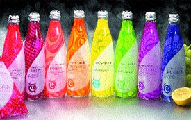 In the equally competitive alternative beverage category, the Mobius pours over Clearly Canadian Beverage Corp., Vancouver, BC, for the most recent upgrade and expansion of its Clearly Canadian® sparkling water series. Continuing its design evolution for the bottler, Karacters Design Group puts a new spin on the packaging, which now sports the startling graphics on full-body shrink labels converted by Seal-It (see PD, Oct. '02, p. 142).
Retaining some elements of the package it succeeds, the new, proprietary 14-oz clear cylindrical glass bottle from Owens-Illinois tapers toward the top to accept a bright silver 28-mm roll-on aluminum closure from Silgan. Of course, its base breaks away to indicate intrusion.
Now expanded to eight flavors including lemonade, CC's first nonclear beverage in the line, the products gain differentiation through the new label graphics. These incorporate a variety of geometric figures backing up a wraparound droplet figure ending in the Clearly Canadian logotype and making the droplet stand out almost extradimensionally.
With the greater demands on the labels imposed by the new graphics, Seal-It converts the new stock, a polyethylene terephthalate glycol, with enormous care. The film, Bonset's Bonpet 5A™, is a heat-shrinkable structure made from Eastman's Embrace® copolyester and has a shrink rate exceeding 75 percent. Seal-It reverse-prints it three-across on a 40-in., 10-color gravure press in six colors, using new inspection equipment to back up its quality control people to keep rejects at an absolute minimum. Clearly impressive. Circle No. 410.
More information is available:
Competition: Mobius Awards, 310/540-0959. Circle No. 411.
About the Author(s)
You May Also Like


