Surplus look drives Old Navy's sales
March 11, 2015
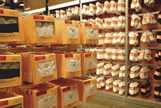
Charged with developing packaging to boost sales of men’s basics, Old Navy’s design team created a packaging theme with a vintage look that was produced in just five months.
Sometimes rule-breaking is a fast route to growth. Perhaps once in a lifetime, it can mean smashing through to a new model for maturation in packaging concepts, and for taking new ideas to the next level.
That time is right now for Jason H. Rosenberg, senior packaging designer at San Francisco-based Old Navy, part of Gap, Inc. In what seems an increasingly successful program that goes against most traditional merchandising practices in clothing retailing, Rosenberg's new packaging structures are surrounding the men's and boy's underwear, shoes, socks and accessories with consumers who are happily selecting goods they see much less of, and for which they pay a bit more.
That's where they break the first retailing taboo. Old Navy stores feature racks and racks of hanger-hung clothes, backed up by piled-high counters of folded goods. It has possibly one of the lowest packaging-to-product ratios of any comparable fashion retailer in the U.S. The consumer always gets to “glom” its goods.
Second, the few packages that retailers have are designed to the nth degree: always perfectly in-spec, ever produced to a faultless standard.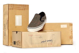
Rosenberg says forget about it. Or don't really. He rolls over traditional package design concepts with packages that can conceal more than they show–isn't that the essence of displaying beauty and desirability?–and which appear aged, stressed and distressed.
In nine discrete structures made with a single material and a hanger that argues with gravity, the new packaging for about 100 stockkeeping units, first seeing retail daylight in late summer this year for autumn rollout, has as its goal, Rosenberg discloses, a desire to convey a vintage, almost homespun attitude. This clearly emerges when the consumer sees the name, Old Navy Surplus Co., apparently casually hand-stamped slightly off-kilter on the main display panel's upper left quadrant.
So while the clothes are new and first-quality, the patina of desirable antiquity young consumers seek out is splashed in bright brown kraft paper, reversed out of a unique faded red background and supported by symbols, marks, slight imperfections and other elements of Rosenberg's imagining.
“The idea came to me,” he remembers, “as I was looking at packaging for office supplies. I saw all those plain kraft wrappers, envelopes and other packages with glued labels, hand markings and other purely functional elements like clasps, string ties and staples, and then it all started to develop in my mind.”
The nine package styles that result from his ideas come from four vendors, but all are produced to a common specification, plus the trappings appropriate to each.
A .016 C1S SBS paperboard is the starting point. But, in another break with usual practices, it is printed on the uncoated side.
“The reason,” he says, “is that to create a realistic look for various elements, we utilized some new, digital production methods by employing transparency in the artwork.” The graphic elements “would look like they were freshly inked by picking up some of the tones of the faux kraft paper we used.
“If you look closely, the blacks are not solid black and the stamps have loads of tonal and gradient information, all based on where they are placed on the tones of the faux kraft.”
In fact, all of the structures are printed in up to five colors, though the naked eye may see only two. The additional tones build the faux kraft shade, which especially under a store's fluorescent lighting, impart a color-shifting quality that makes purely graphic elements stand out in high relief.
Those elements, along with the bogus but official-looking stamps with a soaked-in appearance, include interoffice-mailer grids that, in Rosenberg's words, “create a geometrical context that organizes and contains the other elements.”
Examples are the carton for two men's crewneck undershirts and for three men's briefs, both produced by Beyer Graphics (631/543-3900), using a six-color offset press by Heidelberg (www.us.heidelberg.com) in five colors with an overall aqueous coating.
The undershirts carton, an automatic-bottom, rear-double tab-lock style with a 2-mil polyethylene terephthalate (PET) window, is a horizontal format where the grid pattern at the base contains line art that depicts the product and three bulleted callouts to extol its advantages. A partial grid in the upper right quadrant contains the size statement.
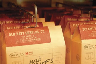
Another critical element in the design system is the hand-scripted product descriptive that runs beyond its allocated space, plus the same treatment at the upper grid, where “pack of 2” is scrawled, with an almost-circle, lassoing it and the size statement.
The same approach enlivens the designs for the windowed horizontal-format briefs carton, with both also sharing the grid approach on their rear panels. Both of these panels present product descriptions, company name/location, control numbers and other required data, as well as the selling line, “Designed for comfort. Made to last.”
At their top die-cuts, created to allow insertion of a unique hanger, also produced by Beyer Graphics, are 1 in. X2-in., 2-mil PET pressure-sensitive strips that reinforce the board and help retain the balance required for each hanging carton. Mario Marando, Beyer's senior vp of overseas operations, tells PD, “I worked out the hanger shape and the production method on a flight to Hong Kong.”
The close-fitting hanger, made with 2-mil steel wire and shaded an “anti-silver,” via barrel plating, is shaped like the numeral 2, with an extended base acting like a cotter pin. “That's where I got the idea,” Marando notes. Adds Rosenberg: “I was very happy with this metal hanger component. I hate plastic hangers.”
Likely the design program's piece de resistance is the one-piece shoebox. One side panel follows the grid with a hand-stamped, script-scrawl format, the other adding what appears to be a virtually unreadable personal note, the sort that might accompany a gift.
The lid explains it all. It is printed with an integral mailing label and vague postage stamp with a glossy “transparent tape” over the label and packing tape at the panel edges, and with staple-like impressions at one side. The carton from Shore To Shore (www.shr2shr.com), which also supplies the boy's underwear and shirt cartons, is produced to the exact specs of the other cartons, but inventory is kept under control by a die-cut, glued end label designed by Rosenberg and from the same supplier depicting the grid with line art, a size, a price, a bar code and the scripted style; everything to simplify choice.
Turning the ubiquitous shoebox into a gift presentation, Rosenberg notes, “just made everything work together. As with the rest of the program, it added that unexpected element that we felt completed the look and made it an almost noncorporate look, that the product was created specifically for the consumer. “It's almost like a friend mailed you a special package from a place far away,” he comments.
Accomplishing all of this in a tight timeframe makes it all even more remarkable. “I had to conceive those concepts, get signoff, create architecture, source the metal hanger, sample folding carton designs and substrates, test them and get these in-factory so the product could be in the packaging and then be in our stores across the United States and Canada in a little over five months,” he recalls. “This was a fast-track project of enormous proportions.”
One factor simplifying the process is the use of universal materials and printing techniques. The same specs apply to the packages already cited, as well as the board hanger-sleeve for belts, produced by Avery Dennison (www.averydennison.com) plus cartons holding men's thermal tops and bottoms, men's boxer 3-pack cartons and bands and unit header cards for socks and men's and boy's boxers from Hang Sang (415/505-6009). Though on shelf for only a few months in the company stores, the new packaging “is playing a key role in helping grow business, especially basic product businesses like socks and underwear,” says Brian Richardson, an Old Navy senior men's merchandiser.
The new packaging, he adds, “is elevating the product, allowing us to drive a higher ticketed retail price. This has differentiated us from our competitors and makes the shopping experience easier and visual presentation more attractive. It also is resulting in growth in the business from a twelve-percent average unit retail increase and a twenty-eight-percent higher gross margin. Since our customer has not been sensitive to the higher ticketed price, we have been able to be more profitable.”
Rosenberg reflects: “The creative needed to work with the overall voice of the men's shop, and had to let the garments generate a vibe that customers want to take home.”
More information is available: |
Avery Dennison, 925/935-4303. www.averydennison.com |
Beyer Graphics, 631/5433900. |
Hang Sang, 415/505-6009. |
Heidelberg USA, 888/472-9655. www.us.heidelberg.com |
Shore To Shore, 800/775-1802. www.shr2shr.com |
About the Author(s)
You May Also Like


