Baby care brand redesign strengthens bond of consumer trust
March 11, 2015

Gentle Naturals Baby Therapeutics
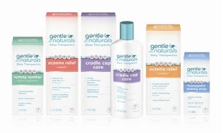
The success of baby care products, like Gentle Naturals Baby Therapeutics, depends on their positioning on trust, efficacy, therapy and quality, which is largely conveyed to busy moms by their shelf presence—the package.
So when Gentle Naturals, maker of a line of six popular therapeutic baby care products, found that many leading retailers were stocking only their three best-sellers—cradle cap care, baby eczema cream and eczema wash—a rebranding effort was required.
"The baby care category is difficult for busy moms, who often shop with baby in tow, to navigate due to the large number of brand offerings and competing product claims," says Terri Goldstein, founder of The Goldstein Group, the brand design firm hired to do the redesign. "We immediately recognized the need to create a distinctive brand identity that embodies the concept of 'therapeutic baby care' for traditional and contemporary mothers with general tummy, teething and specialized skincare needs."
Retail research
The Goldstein Group's first step was to conduct a retail research phase to determine strengths, weaknesses, opportunities and threats (SWOT), and competitive product analysis, to determine the current situation at point-of-sale, followed by small group research to determine the brand's core equities. Using Goldstein's Shelf Sight Sequence methodology, Gentle Naturals' situation assessment was confirmed and the leading competitor's retail presence documented.
"Retail point-of-sale is a riot of brands, colors and symbols," Goldstein notes, "with Gentle Naturals lost amid the chaos. We found that Gentle Naturals' teal color was 'friendly' but held little brand value with consumers. What mothers desired was a clinical, efficacious product image. This learning provided the foundation on which to develop a proprietary visual positioning for Gentle Naturals that resonates with moms."
Goldstein continues, "We identified two type of Moms—the traditional Wal-mart mom and a modern Target Mom. Then we surrounded ourselves with the cues and clues about both Moms to determine what each nursery looks like. We designed Gentle Naturals to be welcomed into both worlds."
Brand equity research confirmed the decision to move away from Gentle Naturals' teal color toward a more pharmaceutical appearing white bottle. According to Goldstein, "Overall, the category is a kaleidoscope of pastels with a concentration on white by leaders like Exederm, Johnson's & Johnson's and California Baby. We recognized that moving toward a mostly white package, while retaining elements of the brand's teal heritage, would be effective, especially when the plastic bottle is packaged in a carton, which projects a more medicinal image while differentiating Gentle Naturals from the crowd of competing bottles."
Most importantly, the new package needed to communicate efficacy. "Moms want a product that works and it must be instantly recognizable as being for a young child. They want to identify the product type, particularly for eczema, but the product descriptor cannot be so bold as to conflict with the brand name," Goldstein says.
Color
As color is the first core brand identifier, the Goldstein Group re-interpreted the package's original teal, creating a new brand mark that communicates pure and mild and is appropriate for display in the baby's nursery. Goldstein suggested adding the words, "Baby Therapeutics" to the Gentle Naturals name. Finally, several leaves were incorporated around the "Gentle Naturals" logo to support name recognition.
In the product descriptor, designers applied particular colors that speak to each product attribute—Tummy Soother is soft green, Eczema Relief Wash is pink and Eczema Relief Cream is orange. A soft blush was added to all, echoing the color block that gently fades toward the brand mark.
Symbols
Baby care products rely on a range of symbols to convey identity, from baby rabbits, birds and teddy bears to baby blocks, toy trains and illustrations of happy babies. Through this symbolic clutter, Gentle Naturals found the opportunity to develop a distinctive symbol of its own, but first needed to address its own symbol. The Gentle Naturals' out-dated baby with teddy bear illustration was retired.
"Everything in their previous packaging was designed in lock-step, which made it difficult to differentiate one product from another," Goldstein says. "Sometimes mothers would buy the wrong product because they looked so similar. There were two purples, two pinks, two teals and a powder blue, all sharing a common symbol. None had a distinctive visual point of difference."
Adding a caduceus and baby bracelet
The addition of an illustrated baby bracelet spelling "baby" provided the final proprietary cue to make mother want to display the product in the nursery where it will benefit from the word of mouth of visitors. "To have this product displayed in full view in the baby's room as a decorative item was a key design goal," says Darcy Bolker, creative director, The Goldstein Group.
Finally, a caduceus, depicted in a soft, dove silver, was added to reinforce an ethical appearance. "Adding the traditional medical symbol to the Gentle Naturals' package reassures consumers of its efficacy while enhancing brand trust," notes Bolker. "We deployed the caduceus in a somewhat recessive manner near the package bottom so as not to over-emphasize medical claims."
The new Gentle Naturals Baby Therapeutics product line is now rolling out to retailers nationwide.
See pix of "before" design here.
Source: The Goldstein Group
.
About the Author(s)
You May Also Like


