Uber-functional spirits bottle shakes up bartending

Nobody knows beverage packaging like a bartender, and to leverage their knowledge, spirits brand owner The 86 Co. asked professional bartenders to participate in its packaging design process. Their insights helped the company create an on-premise spirits bottle that emphasizes ease of use, with labeling that encourages reuse of the rigid containers.
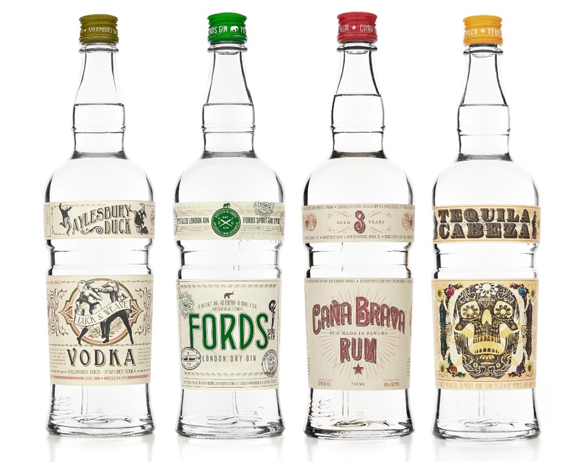
The company uses the bartender-friendly glass bottle for four brands: Aylesbury Duck Vodka, Caña Brava Rum, Fords Gin and Tequila Cabeza. To ensure the bottle’s ergonomics and efficiency, The 86 Co. worked with a water-bottle designer. And to prevent bottle-related repetitive motion injuries, it worked with a physical therapist.
As part of the design process, celebrity bartender Marcos Tello hosted a physiotherapy session that included more than 150 bartenders. Several bartenders also tested mock-ups of the package at their bars. The mixologists’ feedback inspired an array of functional features in the finished package.
For example, to avoid using foil over the closure, which can slow a bartender trying to switch rapidly from bottle to bottle, the brand owner chose a roll on pilfer proof (ROPP) aluminum screw cap.
Recognizing that bartenders pour and hold bottles differently, and to reduce the possibility of physical strain or long-term injury, The 86 Co. designed the bottle to accommodate a variety of pouring styles. In all, it has three grip zones: at neck, mid-bottle and base.
The long neck, featuring a rim just below the closure and another above the bottle’s shoulder, provides a secure grip. The upper rim makes it easy to pull the bottle from a bar well, and the lower rim serves as both fill line and comfort ridge for longer pours. The neck was designed to assure consistent flow and, when a “speed pourer” is inserted into the mouth of the bottle, it fits snugly.
Another grip is located near the center of the bottle; it’s a waistband molded into the glass. The band’s location works with the weight of the one-liter bottle to make handling and pouring easier, particularly for mixologists with smaller hands.
The base of the bottle also can be used as a grip. Its flared shape makes it secure in the hand when bartenders grab it from an upper shelf. The taper makes it comfortable to hold when pouring, as well.
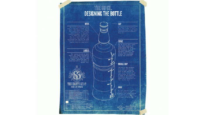
Go to page 2 to see a blueprint of the design features and learn about the removable labels.

With an eye to reuse, The 86 Co. designed the bottle with a vertical scale of fluid-ounce and quarter-liter measurements. The scale, which is revealed when the labels are removed, is handy for inventory control and for making infusions, syrups and batches of cocktails.
The labels can be easily removed from the bottles, with a rubber backing that keeps them from tearing. The brand owner currently is working on a label that will leave little or no residue after being peeled away.
Label graphics for The 86 Co.’s brands range from quirky to folkloric. Artwork on the Aylesbury Duck label shows ducks boxing, whereas the illustration on the Tequila Cabeza label is a skull with flowers. The brand owner worked with United Creatives to develop the label graphics.
About the Author(s)
You May Also Like


