Welch's juices up PET bottle for its Farmer's Pick
March 11, 2015

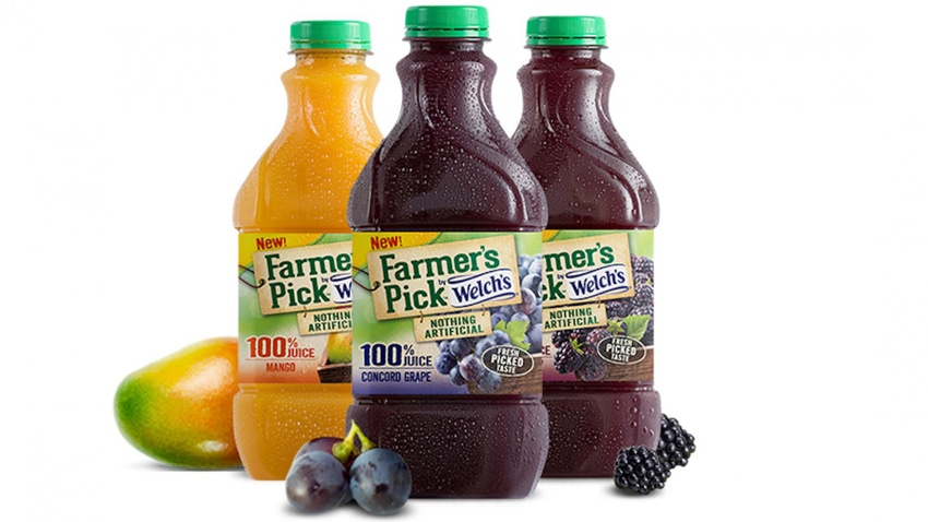
Welch's recently launched a new unfiltered juice -- Farmer's Pick -- and to coincide with its latest introduction, the company teamed up with Graham Packaging and 4sight Inc. to design a new proprietary bottle that addresses consumers’ desire for a premium looking, easy to pour container while improving operational efficiencies.
Packaging Digest interviewed both Karen Mitchell, director of marketing, strategy at Welch's, and Stuart Leslie, president at 4sight inc.
What is the motivation behind Welch's recent activity in introducing new products/packaging?
Mitchell: Farmer's Pick by Welch's is a line of 100 percent juices that contains nothing artificial and delivers fresh-picked fruit taste. With flavors like Concord grape, Mango and Blackberry, Farmer's Pick is perfect for those looking for authentic flavor variety with no preservatives or artificial ingredients. And, unlike most 100 percent fruit juices in the juice aisle, Farmer's Pick contains unfiltered juice, which gives the product body, aroma, and a fresh-picked fruit taste.
We know from talking to consumers that they are looking for a variety of beverage options, including juices that taste like the fruit itself. Made with nothing artificial and more of the fruit to deliver body, aroma, and fresh-picked taste to the shelf stable juice aisle.
What are the benefits for retailers and/or consumers of doing this in tandem like you have?
Mitchell: The bottle design, which cues fresh taste and vibrancy, reinforces the product positioning of our Farmer's Pick line. In addition, the new bottle allows us to use less heat in the manufacturing process which protects the unfiltered juice and brings the fresh-picked fruit flavors to life. An innovation like Farmer's Pick, with its sensitive ingredients, would not have been possible in our current bottle. The bottle also meets retailer criteria for case and a half pack out on shelf.
When and where (regionally or nationally) were the products introduced?
Mitchell: Farmer's Pick was distributed nationally, hitting store shelves in February 2014.
How has plant performance been improved?
Mitchell: The bottle utilizes a new labeling process. Because of the efficiency in applying a wraparound label, our lines can operate with less downtime than with our front and back spot labels on our current bottle.
What were the key goals and requirements from a marketing view? From a packaging view?
Mitchell: Farmer's Pick by Welch's is a premium product line of 100 percent juice, that contains nothing artificial and delivers fresh-picked fruit taste. In testing, consumers said this new bottle was 'premium' and matched well with the 'nothing artificial' concept. The rectangular shape facilitates convenient storage in the pantry and the refrigerator, and the bottle is easy to grip as well.
Describe packaging components of bottle, closure, label (other?) by vendor(s) and specification (or structure/polymer, size, style). To what degree is each custom? How hard was it to find the right closure for pouring?
Mitchell: The bottle is a custom design developed in a unique partnership with 4Sight and Graham Packaging. The closure supplied by Silgan is the existing style with work 'in process' to qualify a green versus purple colored cap. We found that the current 43 mm closure works well with regard to pouring.
The label utilizes a matte finish (a first for Welch's packaging), which is consistent with the authentic positioning of the product. The corrugated case was changed from a Bliss to a wraparound-style which enabled a tighter pack and reduced corrugated material.
Were there any other unexpected results and/or pleasant surprises?
Mitchell: We had high standards across a number of design criteria including communication, functionality, and performance. So although it wasn't necessarily a surprise, we were delighted that we were able to get high marks across all of them, especially from our loyal consumers.
Comment on the impact of the new design on the packaging production operations and what new machinery or modifications to existing machinery were made.
Mitchell: The rectangular bottle and the wraparound label both required operational changes. Handling a rectangular bottle on a filling line requires that accumulation and single filing for labeling and case packing are modified to address the different flow characteristics vs. round bottles which naturally flow around one another without catching or binding. The wraparound label, which is applied much more efficiently than our existing front and back spot labels, required a new labeling machine. We use the same wraparound technology in our other businesses, so the conversion is straightforward within our production operations.
Did sustainability play a role in the package development?
Mitchell: One of the success criteria of this project was to reduce the amount of material used to deliver our products. We are proud to say in addition to removing 5 grams of plastic for the bottle itself, our secondary packaging on this product uses less corrugate than current product.
Where are the products packaged?
Mitchell: These products are made within our production operations in the United States. We tightly control both raw materials and packed products to ensure maximum freshness and package quality.
What design trends does your packaging set in the shelf-stable juice market?
Leslie: The design reminds consumers how vibrant and great tasting a 100 percent juice can be even in the shelf stable aisle. It helps mom choose a beverage for the family that has nothing artificial but is still exciting to drink.
What changes did you make to the packaging that makes it more eye catching?
Leslie: We developed a form language that promises all that is great about Welch's 100 percent juice. The swirling elements remind consumers of the vines of real fruit while also promising them the vibrant, great taste people expect from Welch's. The overall profile, reminiscent of a carafe, promises the purity and authenticity of what is inside--real juice. We also elevated the label panel so that it sits higher on the shelf than the majority of other bottles in the aisle.
What challenges were encountered from a packaging production standpoint and how were they solved? Which of these were anticipated and which were not?
Leslie: The unique carafe shape was challenging to bring to life in a bottle that could withstand the rigors of a hot-fill process. We needed a design that could differentiate Welch's from the other brands in the aisle while communicating what's great about the product. The design is one that reinforces the authentic, unfiltered quality of the product as well as the exciting taste. Also, a challenge was to make the bottle easier for families and little hands to pour juice independently.
Graham Packaging Co., (901) 366-8393
grahampackaging.com
4sight inc., (212) 253-0525
4sightinc.com
Silgan White Cap, (217) 398-1600
silganwhitecap.com
About the Author(s)
You May Also Like


