Smooth package gives CoverGirl an efficiency edge
A finessed structural design for the new UltraSmooth foundation blister package elevates the consumer experience, delivers key production advantages and performs in existing retail displays.
When CoverGirl developed its UltraSmooth foundation makeup, it needed a package that aptly communicated the product’s promise of a smooth, unblemished look. After multiple design iterations, packaging engineers at Procter & Gamble and blister manufacturer Placon created a two-piece package with no hard edges but plenty of consumer, manufacturing and retail benefits.
[In June 2015, the New York Post reported that Coty Inc. is buying the CoverGirl brand, but development of UltraSmooth and its packaging took place at P&G.]
UltraSmooth’s introduction in 2014 marked the first time a mass-merchandise foundation was sold in a clear thermoformed package and with an applicator pad. The easy-open and reclosable blister holds the flexible silicone applicator pad and a flat-profile tube with 25 milliliters (0.84 fluid oz) of makeup. UltraSmooth retails for about $14 and is available in 12 shades.
Consumer-facing features
CoverGirl’s UltraSmooth foundation—specially formulated with optical concealers and sister-brand Olay’s skin-smoothing serum to tame fine facial hair for a smooth, uniform look—won a 2014 Breakthrough Award from Allure magazine.
According to Dave Wilson, P&G’s principal scientist/engineer for global package development, Delivery Systems and Devices, it was important for the package to reflect the product’s “smooth” promise, which is why the front of the blister has no harsh or sharp lines.
“The smooth rounded front panel conveys the product equity and performance attributes better than a sharp corner of a carton,” Wilson says. He points out another benefit of the blister format: “The clear clamshell offers more product visibility and ability to see the shade than a folding paper or clear carton.”
The recyclable blisters are made of Placon’s EcoStar amorphous polyethylene terephthalate (APET) recycled extruded rollstock. Clear pressure-sensitive labels on the front panel let consumers see as much of the foundation color as possible without removing the tube. Silver hot-foil stamping on the labels, as well as on the tube, add a touch of luxury to the design along with shelf impact.
The two blister pieces simply snap closed and aren’t sealed with glue or welded with heat, which also lowered the cost of the package. When asked about possible pilfering in the store, Wilson replies, “The seal flange has the appearance to the consumer of being an RF-type [radio-frequency welded] permanent seal. As such, consumers typically do not realize it can be opened easily at point of purchase and do not attempt.”
Yet easy-open is a consumer convenience feature specifically designed into the package. Tabs at the bottom of the back piece bend back easily so they can be gripped and pulled apart.
Additionally, the package is reclosable. “Once purchased, the resealable secondary pack can be used as an organizer over the life of the product to hold the applicator and tube together as a kit,” Wilson says.
NEXT: Manufacturing efficiencies
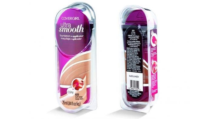
The UltraSmooth package slopes on the front so there is only one “side,” at the left. This photo shows all four labels: two on the front, one on the side and one on the back.
Making it…better
Through meticulous re-engineering and revision, P&G and Placon also finessed the blisters for production efficiency, from manufacturing at Placon through packaging at P&G.
For starters, P&G saved 30% of the projected tooling costs by designing the front and back pieces to use the same final trim tool. Lewis Lee, Placon’s sales engineer, explains, “By using interchangeable part ejector pucks along with designing the back mold to run on the upper form platen and the front mold to run on the lower platen, both the sleek, elongated lids and bases were able to run with the same identical, final trim tool for a total project cost savings.”
The package has four labels: two on the front (top and bottom), one on the left side and one on the back. Why so many? “The various labels are needed to provide critical benefit and use information to the consumer without obstructing the ability to see the shade and contents of the pack,” Wilson replies.
Specifically:
• The upper front label has the brand and product name;
• The lower front label is printed in the color of the shade (in process color) to help consumers select the right shade;
• The side label shows consumers the two-step application process and correct use habits; and
• The back label includes shade name/number again, an ingredient list, UPC bar code and manufacturer info.
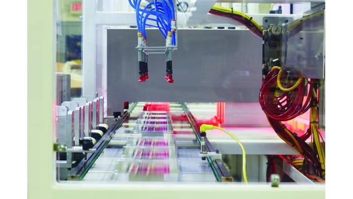
Blister bases are automatically picked and placed onto pucks for labeling prior to being shipped to Procter & Gamble. In this image, finished blisters move under an optical check station to verify label presence and correct positioning prior to automatically unloading for pack-out.
All four labels are applied by Placon as a value-added service (something the company does for all its thermoform customers) before shipping out the blister bases and lids.
Both front labels are applied at the same time. Placon’s Lee explains how this is done: “Applying the two clear labels on the front-facing thermoform required precise alignment via a puck system. The labels are applied and wiped down the smooth, contoured surface of the thermoform in one direction as the part passes under the label head in a single, unique process, made possible by the curvature of the design.”
A vision inspection system then confirms the labels presence and position. The simultaneous label application is repeatable and has another benefit, according to Lee: “The single-pass process improves run efficiency, virtually eliminating label-to-label registration concerns while also eliminating label bubbling or warping with no overhang due to precision placement.”
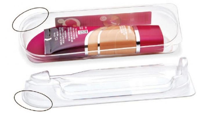
The undercut design (circled) allows the blister lid to snap into the base to secure the package without heat sealing or RF welding. The same undercut allows the bases, and the lids, to stack rather than nest for easy denesting on the packaging line.
Labeled bases and lids are “stacked” for shipment (rather than being “nested”) due to an ingenious undercut design in the four “corners” of the base and lid (see photo above with circles) that does two things:
1. Keeps the parts separated for easy denesting on P&G’s packaging line;
2. Allows the lid to snap into the base in a secure fit so heat sealing, welding or gluing is not needed. Lee affirms that they conducted extensive testing to make sure the package didn’t pop open during drop tests yet could still be easily opened by the consumer via the bottom pull tabs.
NEXT: The shelf impact
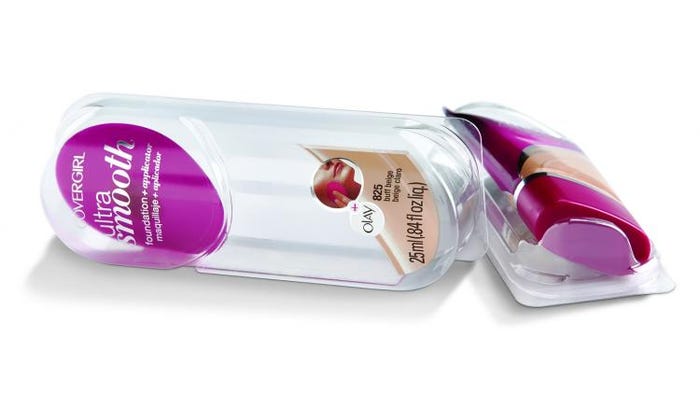
The flat-profile tube of liquid foundation sits on an angle within the blister package for two reasons: to fit in a major retailer’s spring-loaded pusher display and so the fluidity of the sloping front communicates the product’s “smooth” promise.
The shelf impact
Even with these consumer and production features in place, P&G and Placon still were not done engineering the design, which was further finessed for retail display.
The package cradles the foundation tube securely, with little movement in the blister. Lee says, “With liquid foundation, no two tubes are necessarily identical in density. Worst- and best-case scenarios were taken into consideration to ensure a snug product fit within the package despite minor variances in product density.”
However, there is a little “wiggle room” for the applicator so consumers could easily see that it is a separate piece in the package. But the applicator is held in place for upright display. “A formed ‘swoosh’ was designed into the package to prevent the applicator, which is loaded first, from sliding down once it’s assembled and standing up,” Lee explains.
To fit in existing retail spring-loaded pusher displays—and minimize skewing or crushing—the package is flat on the left side of the front and on the bottom. This makes aligning the packages easy with those ahead and behind. Additionally, a “slight raised ‘lip’ was designed on the base of the tray to eliminate packaging hanging to the product behind it when lifted out of the pusher display,” Lee says.
Lastly, because the front of the blister slopes gently from left to right, the tube rests at an angle in the package, rather than head on. As mentioned earlier, this helps communicate the product’s “smooth” message. But there was a secondary benefit: The width of the blister pack fits into the narrower spring-loaded display of one major retailer.
Well-executed, all around.
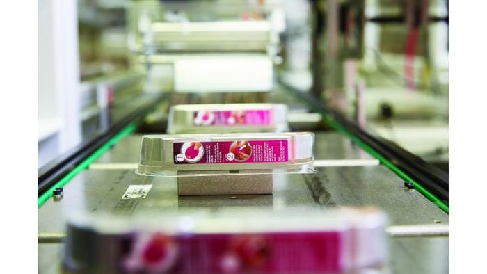
Puck design and transfer conveyor ensure the accurate and repeatable alignment of the thermoformed blister base to the label heads so front labels can be smoothly applied. When on the puck, the blister base registers zero thermoform deflection.
About the Author(s)
You May Also Like


