Kraft redesigns Crystal Light packaging for better shelf appeal and sustainability
January 30, 2014


Kraft redesigns Crystal Light packaging for better shelf appeal and sustainability
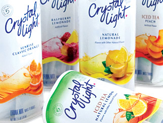
Kraft Foods recently trimmed its Crystal Light packaging to create a more modern, sleek package that also is more environmentally friendly. Changes to the packaging include a new Crystal Light logo and a transparent window that allows consumers to view product inside.
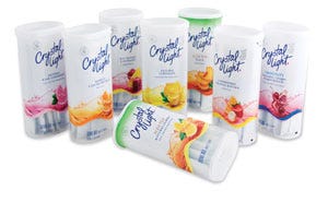
The brand's modern look is carried through to the stick-packs inside, which replace the previous foil-covered tub format. The packaging updates from canisters to stick-packs combine to offer significant material savings for the brand to the tune of 250 tons less packaging each year.
The updated packaging is available nationwide now with a suggested retail price of $3.29 for the 8-qt size and $4.59 for the 10- or 12-qt size.
PD caught up with Nicole Tom, a packaging engineer in the research and development department that supports Kraft's powdered beverage brands such as Kool-Aid, Country Time, Tang and, of course, Crystal Light. She shared insights into her role at Kraft, the company's sustainability philosophy, Kraft's research and development practices, and details about the Crystal Light redesign project.
Packaging Digest: What is your role at Kraft Foods?
A big part of my job is to start with consumer insights and then apply packaging industry technologies to develop new packages or improve on existing designs to meet the needs of our consumers. This, of course, also helps us meet our business goals.
As a packaging engineer, I also develop specifications and test packages to be sure our product is contained and protected during distribution. Additionally, I take the lead in qualifying and commercializing new packages in our manufacturing plants. And, of course, at Kraft we're always working with our cross-functional colleagues (for example, those who work in marketing, sales, operations) to be sure a quality product—and one that meets our consumers' needs—is the result.

Nicole Tom
How did Kraft approach the packaging-development process for Crystal Light?We first reached out to our consumers to get a better sense of their needs. And, just as important, we thought about our customers' requirements and how Crystal Light can be better for the environment.
Here's a breakdown of our goals and the results:
The new package had to be better for the consumer. It is. The new packets are easier to open and pour than the current packaging; the new look is tremendously appealing on shelf; and, the canister shape is eye-catching, slender and feminine as well as unusual.
It's also better for the customer. The new footprint reduces clutter on-shelf and it improves shopability—there's less potential for the face panel to turn so the consumer isn't able to find her favorite flavor.
And, of course, it's better for the environment.
Why did Kraft redesign the packaging for Crystal Light?
We wanted to make Crystal Light stand out on supermarket shelves—to call out to our consumers. And, we definitely think the new package does that. When you see a display of several flavors side-by-side, there's this great wave of color. And it doesn't just look more contemporary—it's more functional, which appeals to an even broader group of consumers. Of course, the redesign also was driven by sustainability opportunities to reduce packaging material and increase transportation efficiencies.
Does Kraft have an established, formal sustainability policy?
As a food and beverage company, we depend on the earth's ability to produce raw materials to make our products. Our approach is to meet the needs of the present while being mindful of the future. We are committed to reducing the environmental impact of our activities and promoting the sustainability of the natural resources we depend on, while delivering quality products to our consumers.
Our vision is to make sustainability part of every business decision at Kraft. And by doing so, we can build a better community, a better lifestyle and a better world for the future.
How did you measure sustainability improvements for the Crystal Light redesign?
We measured the improvements in pounds of packaging material reduction and in terms of shipping efficiencies. Comparing finished cases, the new packaging uses 250 tons less material than previously. And, the new canister's footprint allows for a 33-percent more efficient pallet, which we expect will result in greater outbound transportation efficiency.
Does Kraft view sustainability as an environmental or an economic issue?
We see sustainability as an environmental, economic and a social issue. Reducing the use of water and energy as well as the packaging we produce plays a critical role in the long-term success of our business. Our retail customers want to partner with businesses that support sustainability and our consumers want to know they're buying from a company that cares about the environment.

Crystal Light Packages
How long did the Crystal Light redesign project take? And what were some of the challenges?The redesign was done in stages over a few years.
As I mentioned previously, a major design principle was to reflect and relate to our core consumer with a feminine, modern and slender appeal. The challenge was to elevate the current Crystal Light canister to meet these needs, as well as making it more environmentally friendly.
The coupling of a unique shape and the design clarity of the canister presented some technical challenges during the molding process. There were a lot of variables to choose from when designing the outer shrink sleeve. But we also kept in mind protection of the package.
The shrink sleeve we chose incorporates a tamper-evident band and the graphics. This new look also allows for shoppers to find their favorite flavor and to give a clean but colorful and arresting look on shelf.
Some of our customers put the finished tray on the shelf.
Designing the right count in the tray to meet the shelf dimensions and to meet an optimal pallet pattern proposed some challenges. I'm happy to say that we were able to find the right tray configuration to not only meet the customers' needs, but also to gain pallet efficiency.
Is Kraft conducting the majority of its own packaging research and development, or are you optimizing resources from vendors to provide innovations?
In R&D, we make the best use of all the Kraft resources—here in our business unit, in our other research centers, even those outside of the U.S.—as well as the expertise of our suppliers and, when appropriate, we'll even reach out to other external experts. Part of my responsibility is to bring everyone together to see what works the best and results in the best possible product for our consumer.
How did Kraft determine who would be the internal and external team members for this project?
The combination of Kraft Foods' internal packaging expertise that is dedicated to the business unit, together with a group of valued external technical experts, allowed us to collaborate to deliver a quality product. Each project we undertake is supported with the right resources to ensure success.
Looking back at the Crystal Light redesign project, what do you consider the most significant take-away about designing sustainable packaging?
As much as you look to improve the sustainability impression of a package, you always have to begin with the needs of your consumer and what your customer requires. Our most significant takeaway is finding just the right balance, which we think we've accomplished with Crystal Light.
When looking at the beverage packaging market as a whole, what trends can you share with PD readers?
We're aware of a number of trends. One, of course, is the need to be better for the environment, with a significant focus on reducing packaging weight.
There's also a lot of attention going to enhanced graphics, like the use of material finishes for consumer messaging or to give a more natural or organic look.
And, while there's a definite trend toward cleaner and simpler looks, there's also a growing use of texture and attention-grabbing treatment in graphics.
And, we can't underestimate the value of using packaging and graphics better for pallet displays. I recently was shopping in a clubstore and noticed how the packaging that's integrated into trays or shippers makes the entire display pop out from the rest.
|
|
About the Author(s)
You May Also Like


