Beverage packaging: Miller’s classy lady continues her reign
January 29, 2014

Beer has always been one of the more interesting categories for package design. It’s a long heritage that has yielded many iconic visuals - some of which have endured for a century or more.
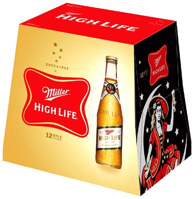
Among the more memorable of them is the Miller High Life “Girl in the Moon.” This week, Landor Associates and Miller unveiled the latest expression of Milwaukee’s favorite party girl, as part of new packaging aimed at strengthening brand’s selling proposition of quality beer at an affordable price.
Nice work — another tasty expression of a great beer icon. Here’s what the company says about it:
Today, the iconic “Champagne of Beers”, Miller, has announced its selection of Landor Associates as its AOR for Miller Lite, the Miller High Life franchise, and the MGD franchise. Together, the pair is also unveiling refreshed packaging, designed by Landor, for the Miller High Life franchise. The official appointment comes after a long and successful relationship between the two brands.
The refreshed packaging brings a steady brand character to life, creating a cohesive look and feel for Miller High Life and Miller High Life Light, while reinforcing their main features; high quality beer at a great price. By reflecting the brand’s current ‘common sense’ positioning and highlighting visual assets like the famous “Girl in the Moon” iconography and the “Champagne of Beers” callout, the simple and timeless design, better differentiates Miller High Life from other beer brands in the marketplace.
.
About the Author(s)
You May Also Like


