Beverage packaging: Seattle's Best goes generic?
January 29, 2014

I love clean, modern design. The idea of stripping visuals to their very minimum has produced designs that are not only immediately compelling, but enduring in their ability to communicate.
Unfortunately, it can also create a very generic, low-buck look when taken just a tiny bit too far.
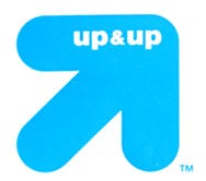
 And that’s exactly what seems to be happening with a lot of packaging design - for example, Target’s recently launched Up & Up brand. It’s plain almost to the point of being a non-brand, in my opinion.
Maybe that “almost” is where the magic is though. I’ve seen worse designs.
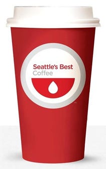
But now, the latest to succumb to the design trend of almost-no-design, is Starbucks B-team coffee brand, Seattle’s Best. Here’s a rundown on the brand’s history and new revamp, from The Seattle Times.
Like I said, there’s clean and spare, and then there’s just plain “plain.” And apparently I’m not the only one that thinks so about the Seattle’s Best redesign. The brand’s hometown crowd seems generally unimpressed with it — in a follow-up story, one Twitter post is mentioned calling the new design “Jiffy Lube.”
Personally, I think the red and the circle combine to evoke Target stores (which brings me back to my first example!)
But hey - you never know. The best designs tend to challenge mainstream sensibilities at first, until they’re more widely accepted. This might be the start of what will later be called one of the great eras of modern design. Stranger reversals of opinion have happened.
d!b
.
About the Author(s)
You May Also Like


