Packaging evolves for Evolution Fresh functional beverages
May 22, 2018
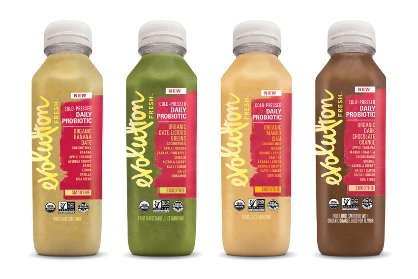
A redesign centering on simplicity and transparency and the addition of sleeker, downsized bottles is the next evolutionary step for Evolution Fresh juices that now include smoothies.
Evolution is said to occur in steps if you believe in that sort of thing. Evolution Fresh’s new-look packaging has been rolled out in a three-step process starting last September when attendees at Natural Products Expo East were given a preview of the redesigned packaging. Step 2 was when the new bottles rolled out to grocery customers in early March and Step 3 was their debut in Starbucks stores in April.
Evolution Fresh’s new packaging is designed to address customer requirements for premium, transparent and authentic packaging. The new design scheme will appear on all Evolution Fresh bottles, including a new 11oz-size to accompany the existing 15.2oz and large multi-serve sizes.
It’s a fresh start for a brand that helped pioneer the cold-pressed juice category.
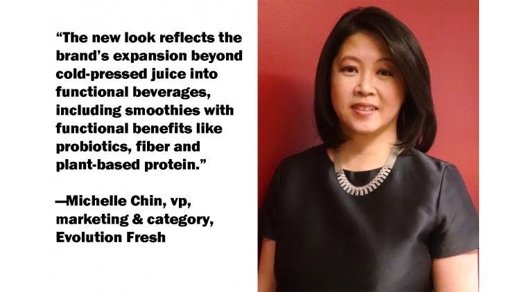
Michelle Chin, vice president, marketing & category, Evolution Fresh, informs Packaging Digest that the new look-bottles continue to reach grocery retailers' refrigerated cases nationwide.
“The new look reflects the brand’s expansion beyond cold-pressed juice into functional beverages—including smoothies with functional benefits like probiotics, fiber and plant-based protein,” she says. Chin explains that the redesign focuses on three elements:
Front of bottle ingredients: Ingredients are listed on the front of the bottle, so customers can see the quality ingredients they will taste;
Transparency: Juices have completely transparent bottles and clear film labels replace paper labels to showcase the vibrant spectrum of each juice’s ingredients and the natural separation that occurs;
Simplicity: Bottlesfeature a simplified color scheme and label design to further spotlight the products.
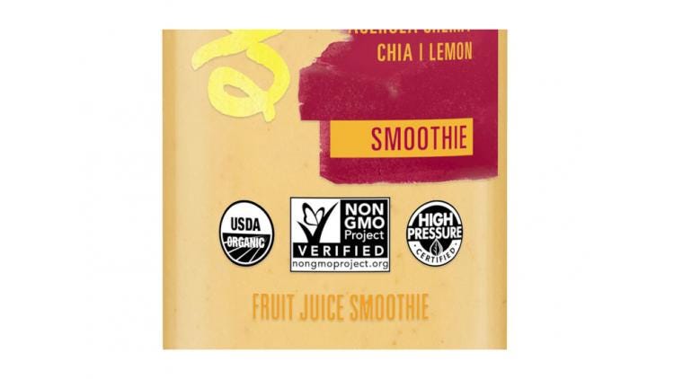
Another new element is that consumers can now find the Cold Pressure Council's first-ever High Pressure Certified Seal on the label.
“The seal signifies that the product has been third-party verified as High Pressure Processed (HPP) and recognizes Evolution Fresh’s commitment to HPP, which helps to maintain the flavor and nutrients of the raw fruits and vegetables in our juices,” Chin explains.
The brand now offers 23 SKUs in the new 11-oz PET bottle, which offers a trimmer look than the larger single serve size of 15.2oz. Notably, it also meets consumer demand for smaller portions that are convenient and control sugar intake, according to IRI research.
The revamped packaging is accompanied by two new plant-based probiotic smoothie lines, offering a day’s worth of probiotics in six unique flavors such as Organic Mango Chai Daily Probiotic Smoothie and Organic Greens Complete Probiotic Smoothie. The protein-rich smoothies are formulated for nutritional support for immunity, digestion and energy.
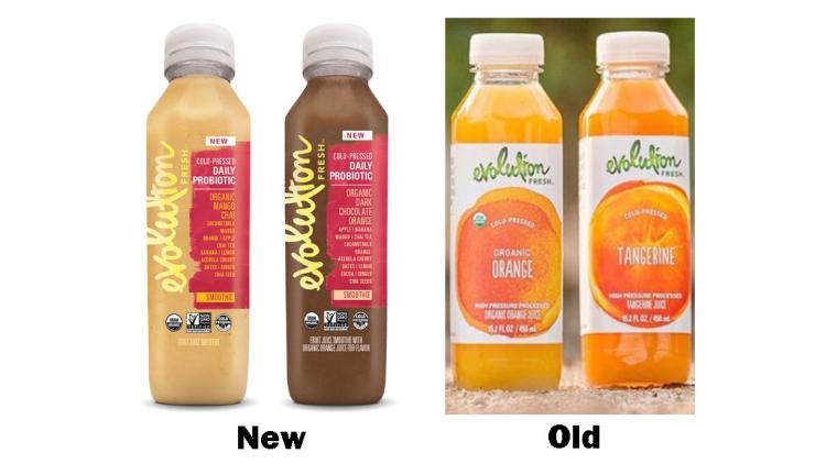
Return to relevancy and vibrancy
The redesign was handled by branding agency clarkmcdowall, which sought to make the pioneering cold-press brand more relevant within a category whose boundaries lacked clarity.
“It feels like there really isn’t a juice category anymore,” offers Catherine Clark, partner, clarkmcdowall, “everything is really blurring. They needed to reclaim their leadership.”
A category that had lost clarity meant the product’s definition, distinction and packaging-forward messaging could get lost in the at-store “fog” and confusion.
“The brand needed to disrupt again,” says partner Paul McDowall of clarkmcdowall. “We arranged an architecture system that helped organize the whole brand into ‘pillars’ with a design idea to bring a sense of moving forward, of movement, momentum and flow.”
That was the reason the brand name was repositioned vertically on the labels, which also gives a positive vibe with the upward orientation.
“These were expressive elements across the line that help give a visual shortcut across a unified brand eco-system, says Terry McCarthy, lead strategist. “We saw a lot of promise and untapped potential then ran with what could really make the brand come to life and retake its leadership.”
“We pushed the brand into a more serious place and got more ‘oomph’ behind it,” adds Clark. “It helps people connect with the brand.”
___________________________________________________________________________________
Have a thirst for packaging information and ideas? During EastPack 2018 (June 12-14, New York City) you’ll find a 3-day packaging conference, demos, networking opportunities and expert-led Innovation Tours.
___________________________________________________________________________________
You May Also Like


