Breck spins gold
January 29, 2014
You can go home again. In the most meticulously planned and executed program since the Entebbe raid, New York City-bssed Himmel Group is reintroducing a classic container for an equally esteemed product. And, it's doing it with enviable fidelity.
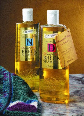
The product is Breck, a top-quality shampoo with roots that go back several generations. Its bottle, one of the category's first to be virtually interchangeable with the product, seems timeless in its attitude.
 In its reincarnation, the bottle, holding regular and dry-hair formulations in 12-oz quantities, gains visual impact. One reason is materials technology not available in the '70s when the brand shifted from glass to vinyl. Another, PD learns, is Himmel's commitment to an exact reproduction. Says Himmel CEO Jeffrey Himmel, "We went to great pains to make certain this would be a replication down to the last detail, but with better materials than were common when the brand was last marketed.
"Research on the new container took us to the archives of the Smithsonian Institution, which had literature but no bottle, and then to the Connecticut Valley Museum in Springfield, MA, where a bottle is displayed." The city is home to the original office of John Breck; the brand is licensed to Himmel from Dial Corp.
"At the museum," Himmel notes, "we took measurements, photographs and impressions of the bottle, since it couldn't be removed. Then came the challenging part."
Simple serendipity
It's probably a matter of simple serendipity that the firm chosen to direct the design work and package coordination, Fenton Weber & Jones Packaging, has as its engineering director Chuck Goss. He explains, "I was working at Monsanto in the seventies when Breck decided to change over from glass to polyvinyl chloride. And so I had a significant role in that program."
The new bottle, he says, is as near an exact replica of the vinyl container as is possible. "In making the initial impressions, we worked with a mold material that's used for dental impressions," he explains. Working with FW&J designer Phil D'Andrea, Goss brought the molds and supporting material to Matrix Packaging, where a spokesperson declares the bottle one of the more challenging the company has had to produce.
Using a versatile polyethylene terephthalate resin, Laser+C, acquired in '01 from DuPont by Alpek and marketed by its DAK Americas unit, Matrix makes the bottle on proprietary stretch/blow-molding equipment. Orientation enables particular focus to be placed on the elegant script "B" embosses in the lower segment of the front and back panels, which are recessed to permit convenient gripping in the shower, as well as on the tapered platform of the shoulders.
Also not accessible in the days the brand was in vinyl is the technology applied for the pressure-sensitive face and back labels that reproduces the graphics used with that bottle. Both labels are converted of biaxially-oriented polypropylene by A1 Label on an 8-color Gallus combination press.
The face label is a 2-mil BOPP, laminated to a 2-mil metallized BOPP. It's printed in six colors using rotary screen/letterpress technology with ultraviolet letterpress inks, and it is then given the glossy UV varnish that helps it stand out in high relief against the gold color of the shampoo. For the back label, A1 uses a 2-mil clear BOPP, printing it with two hits of white and black for the bar code and copy.
Control, too
Also retained is the white closure of the original. But the new structure gives the consumer flow control, too. It's an integrally hinged closure injection-molded of PP, with a reduced orifice and a thumb recess, and is made by Polytop Corp. The bottle is filled by contract packager Conair Corp.
In discussing the bottle's reception since it started appearing on store shelves in the summer of '02, Jeffrey Himmel notes: "The element of surprise was definitely a factor in its initial impact, and was backed up by our radio and TV advertising campaign, which rolled out in August.
"Now, we find consumers love it. All of our measurements are very positive, especially a consumer survey showing a ninety-five-percent intent to repurchase."
Not content with resuscitating a classic, Himmel says he's working on a conditioner to join the shampoo, and expects to introduce it this year. And maybe, he suggests, use of advertising featuring the Breck models who were also a part of that bygone era.
More information is available:
Design direction: Fenton Weber & Jones Packaging, 716/568-1290. Circle No. 221.
Bottle: Matrix Packaging, 905/624-2337. Circle No. 222.
Bottle resin: DAK Americas, 888/738-2002. Circle No. 223.
Labels: A1 Label, 416/701-9800. Circle No. 224.
Press: Gallus, 215/677-9600. Circle No. 225.
Closure: Polytop Corp., 401/767-2400. Circle No. 226.
Contract packager: Conair Corp., 203/351-9000. Circle No. 227.
About the Author(s)
You May Also Like


