New Cannabis Packaging Nails ‘Universal Compliance’
Redesigned cannabis packaging for Wana’s edibles creates visual coherency for the brand while meeting a pastiche of cannabis labeling regulations.

Wana Brands, a leading cannabis-edibles company based in Boulder, CO, is using a packaging redesign to unify the brand identity for hundreds of stock-keeping units (SKUs) sold in numerous US states, Puerto Rico, and Canada.
The company faced an industry-specific challenge as it approached the redesign: How to navigate a maze of cannabis labeling regulations, which vary from state to state and country to country.
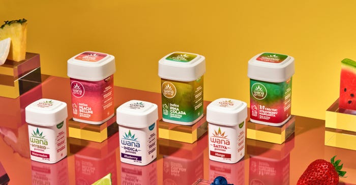
Wana overcame the hurdle, creating a packaging design that meets the various cannabis-labeling regulations while uniting the products as one brand family and performing well on-shelf at cannabis dispensaries and adult-use (recreational) cannabis shops.
In this exclusive Packaging Digest Q&A, Joe Hodas, Wana’s chief marketing officer, answers our questions about the redesign and the regulatory impediments.
What was the primary motivation for Wana’s recent cannabis packaging redesign?
Hodas: The motivation for Wana’s recent packaging redesign was twofold: refresh the look of the label and provide consistency across all markets where Wana is sold, so whether you are purchasing Wana in Colorado or Maryland, you will easily recognize the packaging.
It may be good to provide some historical and political context here. Currently, cannabis is not recognized federally, so there is no overarching regulatory body that governs labeling and packaging.
Each of the 38 states that allows cannabis for medical or adult use has differing policies on label allowances. In the cannabis industry, it is no secret that when it comes to any sort of marketing, we’re operating with one arm tied behind our back. This includes packaging. Some states allow fruit images on labels, others don’t. There are also regulations around colors, serving size, allowed ingredients, and more.
In 2010, Wana was established in Boulder, CO. The original Wana packaging sported a crisp, white label featuring lush fruit that represented the products’ flavoring. In 2015, when we began expanding into other legally regulated states, each state had different parameters around what was allowed on the packaging.
We have a team of five designers, and 50% of their work has been revising packaging. They are constantly tweaking design and language on packaging and labels for hundreds of SKUs across the markets where Wana is available, including 15 US states, Puerto Rico, and [nine provinces in] Canada. We expect this redesign to remove much of the inconsistency across states, streamline design efforts, and provide a brand refresh.
What were the biggest challenges in creating a new package design that would be consistent across the many regulatory environments where you distribute your products, each with its own packaging/labeling regulations?
Hodas: The biggest challenge Wana faced in creating the new design look is the patchwork of state regulations and lack of federal guidance. We wanted our new look to be eye-catching to adults, but not appealing to children.
Additionally, we want to be as sustainable as possible while still ensuring the packaging is child-proof. Still, we have outlier states where we need to produce a different look, such as Florida, which doesn’t allow any color at all on labeling.
How did you overcome the design and regulatory challenges?
Hodas: To overcome those design and regulatory challenges, we needed to carefully review the requirements in every market and determine the common desired attributes that could be incorporated in packaging across the board. We wanted to give Wana products a vibrant new look that reflects the premium nature of Wana gummies, which are one of the only edibles on the market that are vegan, kosher, terpene-enhanced, meltproof, and created using organically sourced sweeteners, never gelatin or high-fructose corn syrup.

The updated designs were developed with universal compliance in mind — for example, removing fruit images. Our new design gives our products a fresh, premium feel while eliminating many of the pesky state-by-state variations we’ve previously dealt with.
Although we approach each market we enter as a unique community with its own needs, values, and opportunities, it was time for our packaging to reflect the same vibrancy and consistency across all markets, from Arizona to New Jersey.
Did Wana gain cost savings by making its cannabis packaging consistent across states and countries, possibly by reducing the number of packaging components or label print runs?
Hodas: Yes, Wana’s redesign effort will also save money, because there are fewer inconsistencies that lead to laborious label revisions. Several of our states have nearly identical packaging, which means our designers can edit one version that can be compliant in several states, rather than revising dozens of different label versions.
Did Wana change the packaging for all its products in this recent redesign?
Hodas: With more than a dozen markets and hundreds of SKUs, our redesign process is happening in stages. Our initial redesign focused on our Quick and Classic product lines in Colorado, and we’ve continued to roll out the new look on additional SKUs and markets.
When did the new cannabis packaging begin rolling out?
Hodas: The new packaging began rolling out in Colorado in March 2023 and is rolling out on other SKUs throughout additional Wana markets.
With hundreds of uniquely formulated options at more than 3,000 dispensaries across North America, the packaging rollout will take time. But we see this as a necessary step toward our growth as a national brand, and we know the work we are doing today will help set the industry standard for the future.
Was this entirely a package graphics redesign? Or did you change some of your package formats, as well?
Hodas: This was a package graphics redesign. We continue to use our child-safe and iconic Calyx containers for the majority of our SKUs.
What materials are the containers and closures made from?
Hodas: Wana uses Calyx containers as the core structure. The Calyx containers are FDA food-grade-approved plastic product containers that are machine-labeled We heat-wrap the container with a tamper-evident shrink band, adding another level of security.
Wana switched to Calyx containers to reduce both its environmental and storage footprints by eliminating the need for three layers of packaging, including a cardboard box, vial, and plastic reclosable bag.
In addition, the Calyx container provides compliant, sustainable product storage that is reusable, recyclable, and biodegradable, while combatting the four adversaries of marijuana storage — moisture, oxygen, static charge, and ultraviolet (UV) light — by being airtight, anti-static, and UV-light opaque.
The aesthetically pleasing sustainable packaging is recyclable but will also break down faster than regular plastic products if it ends up in a landfill, thanks to a biodegradable plastic additive. The sleek, modular storage solution streamlines operations across the cannabis supply chain, saving time, money, and space. Wana Brands’ Calyx packaging offers exceptional legal compliance and more shelf and storage space for distributors and dispensaries.
How have consumers and retailers reacted to the new package design?
Hodas: We have received positive feedback on the new design, with customers noting a modern look and eye-catching color palette.
Click through the slideshow to see the different designs, starting with the previous one.
About the Author(s)
You May Also Like


