Horse Food Packaging Redesigns to Corral Consumers
Standlee’s updated horse food packaging design conveys a premium experience and optimized nutritional wellness with bold new graphics and a clean, timeless look.
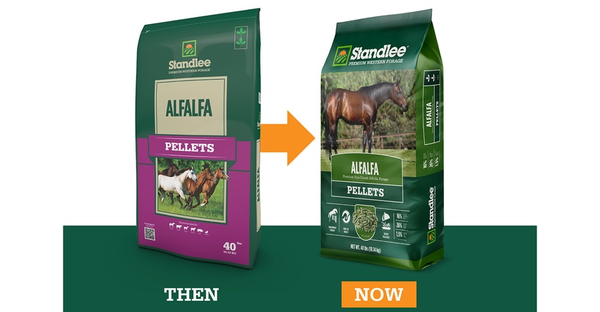
Standlee, an Idaho-based animal wellness company, debuted bold new packaging for its premium forage horse food. The graphics redesign that better communicates its products’ nutritional wellness in bright, vivid color. Since 1981, the company has grown and manufactured premium, sun-cured, forage pellets, cubes, chopped and baled foods formulated to help keep animals at peak health and performance. In addition to helping consumers better connect with their pet food needs, the new packaging also serves to modernize the company’s visual identity.
Company president Scott Plew reports that the new packaging is a commitment to visually sharing its company mission to enrich the relationship between its consumers, the animals they care for, and the life they love through education, wellness, and premium forage.
The new packaging hinges on colorful visual elements situated on a backdrop of the company’s signature shade of green. Large, striking graphics on each of the back and front of the brand’s 26 current and six new product packages help consumers zero in on the right product for their animal. Helpful logos distinguish each product line and product category, spanning forage-based products grown in the western US, non-forage-based products, animal wellness products, and more.
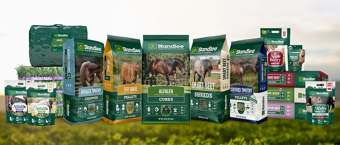
Standlee horse food packaging now helps consumers to quickly zero in on the right product for their animal across 26 items.
Nutritional information, formula benefits and a feeding chart can be found on the front and side panels of the packaging. Standlee also printed a quick-response (QR) code on the back of each package that leads consumers to the Standlee website for additional product information.
“As a family-owned company, we believe in cultivating a relationship with our consumers through our high-quality forage, convenient product packaging, and the education we provide to support those who live this lifestyle,” Plew says. “Our team designed the new packaging with as much detail as our farmers harvest each field. We will continue to provide a premium experience for all, as we share this mission that is, grown for the life we love.”
Jessica Wright, Standlee’s director of marketing, adds that the consumer experience impacted every aspect of the new packaging, and the company paid careful attention to details that helped communicate the premium aspect of the products. “We designed our packaging to reflect our premium products while wanting the shopping experience for our consumers to be just that–a premium experience. Each element on every product has been thoughtfully considered; we are proud and thrilled to see it in stores and in our consumer's barns, homes, and trailers.”
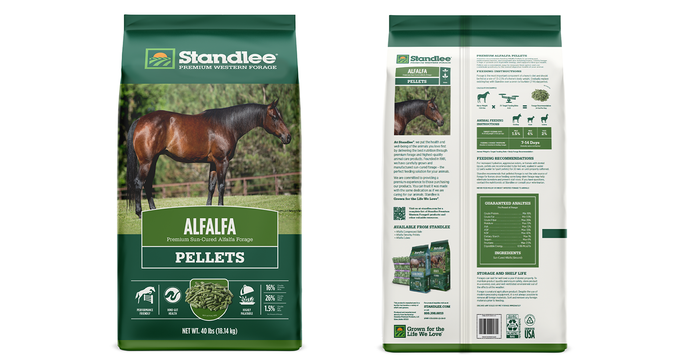
Standlee's redesigned horse food packaging offers plenty of helpful icons and useful information...and a QR code for those wanting more.
Consumers are embracing the redesign, according to the brand, which shared several examples with us from social media:
Fancy, much more sophisticated!
Absolutely love it! And all the new information right there on the front! Felt like I was buying premium.
Love the new packaging! It looks so good and it’s nice to be able to tell which product it is from a glance.
Standlee’s newly packaged pet food products are rolling out to retailers and consumers starting this month and continuing throughout the year.
About the Author(s)
You May Also Like


