Military-style containers for BBQ sauce get ‘atten-shun!’
To launch its new retail barbecue sauce, Two Soldiers and a Marine LLC created containers that look like an authentic canteen and flask used in the Armed Forces and dressed them in patriotic colors.
Just before the Fourth of July, a small team of U.S. military combat veterans embarked on a mission that took courage, skill and coordinated planning.
This band of brothers called Two Soldiers and a Marine LLC launched a new product, Rattlesnake Red Bar-B-Q Sauce, in packaging designed to appeal to patriotic Americans keen to support this service-disabled veteran-owned company—and enjoy some awesome barbecue.
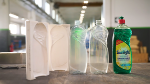
The two bottles replicate (as closely as possible) containers well known to personnel in the Armed Forces and elsewhere: a canteen and a flask. With American flag graphics and the color scheme of the Marine Corps dress blue uniform, the labels reinforce the product’s military bearing.
Who are these two soldiers and a marine? Meet the men behind the Chicago-area company:
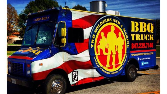
• U.S. marine Daniel Elsner served in the Iraq war as a turret machine gunner with the 1st Battalion 9th Marines Weapons Company. He owns and co-founded the company with fellow marine Perry Mandera, who has ample experience in the transportation business as the owner of The Custom Companies Inc., a full service transportation and logistics company. They started as a mobile catering company and food truck in the summer of 2013 in the Chicago area, and have now expanded into retail sales with the launch of their bottled barbecue sauce. The color scheme on the labels mirrors the design of the company’s two food trucks: Chow Hall and B-B-Q Truck.
• Adam Rukavina is currently a senior scout and battalion career counselor in the U.S Army.
• Anthony Colquitt spent four years in the Army, including 2004-2005 in Operation Enduring Freedom Afghanistan. After that, he supported domestic emergency efforts during Hurricane Katrina’s aftermath in 2006.
These veterans combined their barbecue talents to create a sauce they describe on Facebook as the flavor of freedom. “She lulls you in with the sweet smoky sauce and then Bam! She bites you—the sting’s burn is progressively strong.”
Much of the food sold from their food trucks is made with this barbecue sauce. That’s one of the reasons why the company sells out several times a day—and why they were featured by Chicago’s Best show in 2014 (see a three-minute video from the show at pdlinks.com/2Soldiers).
Meeting military specs
Why these particular bottle designs? Co-owner Mandera explains, “Today’s modern soldier carries a flask with him or her when they are out on daily maneuvers. The conventional soldier doing maneuvers overnight or on long days carries the larger canteen. So our bottles are the same basic shapes. They have the same feel in the hand. Both are reusable, as well.”
The flask is often adapted by modern servicemen to hold flavorings, such as barbecue or hot sauce, for adding taste to MREs (meals ready-to-eat).
With an idea in mind of how they wanted the containers to look and feel, co-owner Elsner worked with custom blow molder Parker Plastics to develop both bottles out of its Pleasant Prairie, WI, location. Now in its 25th year of business, Parker Plastics celebrated the opening of its fourth facility in Las Vegas in late September.
Marty Zei, Parker Plastics’ Midwest sales manager, recalls key points of the project, which involved creating a 40-oz net weight canteen and a 20-oz net weight flask—both made from polyethylene terephthalate (PET).
“Danny gave me a current military canteen and said, ‘I want this replicated the best you can,’” Zei says.
The canteen design needed to be modified, though. “We had to design it to the correct overfill capacity. An actual canteen can hold 32 fluid ounces to the brim. We had to make it a little bigger so the fill capacity for that 32 ounce, or 40 ounce net weight, would include about an inch and a half for headspace,” Zei explains. “We had to change it so the shape would hold the correct amount, but also to make sure it fit into our molds.”
The canteen is stretch blow molded in two stages on an SBO2 machine from Sidel, on which the injection-molded preform from Parker Plastics is reheated and then blown. “Every machine has limitations on how tall, wide and deep you can make a container,” Zei says. “The original canteen design was fractionally too wide for the SBO2. But to go to a different machine would have upped the cost of the mold by several thousand dollars.” The start-up company didn’t want to absorb that added expense so “we sized the bottle for cost as well as for capacity,” Zei says.
They also considered the sauce volume of competitive containers, which is one of the reasons they have two bottle sizes.
The 55-gram canteen has a 38mm modified Kerr neck finish, and the 36-gram flask has a 33-400 shallow skirt neck finish, both selected for looks as well as for function. Mandera says, “These are big-mouth bottles so they are easy to pour and easy to refill. Easy to clean, too—you can stick a brush in there.”
Both these bottles are convex in the front and concave in the back, like the actual containers used by soldiers, so they fit snuggly and securely against the contour of a body. The flask, for example, fits into the sleeve pocket of soldiers’ field uniforms and curves around the arm.
One challenge of replicating containers used in the military was to keep an authentic look yet be able to manufacture and label the unusual shapes, which are convex on the front and concave on the back.
“Every bottle design has its challenges and these had their fair share with the multiple radii,” Zei admits.
The shapely bottles were also interesting to decorate.
‘Decorated’ designs
As mentioned earlier, the color scheme on the labels copies the design of the company’s food trucks. The waving flag graphic on the front labels paints this as an American product. And on the back labels, the colors connect with the marine dress uniform: navy blue for the coat, lighter blue for the pants, red for the blood stripe down the length of the pants and gold for the brass all over the uniform.

The packaging graphics mirrors the design and color scheme of the company’s food trucks.
“We wanted the packaging to be eye-appealing on the shelf,” Mandera says. “We spent more for labeling and packaging because we wanted that different look. When you’re the new kid on the block, you need something people can remember you by—not only just by taste but by the look. It’s got some sex appeal to it.”
Elsner agrees, “You’re not going to be able to walk down the aisle without picking up a bottle.”
“You want to touch it,” Mandera adds. “You want to get the feel of it.”
Zei recommended MPI Label Systems at its University Park, IL, location, and consulted with them during packaging development to understand the parameters and limitations of various label types. Because of the bottles’ challenging shapes, Two Soldiers and a Marine opted to use a shrink label on the canteen and front-and-back pressure-sensitive labels on the flask, closely matching the graphics and colors between them.
The PETG shrink label conforms to the canteen and allows a bit for the curve in the back. The story of how Two Soldiers and a Marine LLC was created appears on the back of the canteen (and on the company’s website at www.iraqvetfoods.com).
To work with the concave on the back of the flask, the back label is a bit narrower than the front. And both pressure-sensitive labels (front and back) for the flask are made of polypropylene. John Holley, general manager at MPI Label Systems, explains, “We wanted it to be flexible, especially with the back, so they can reach in there and wipe it down.”
This flexibility was especially helpful for the flask’s thicker back label, which is a two-ply structure with the story about the company on the bottom ply.
Applying the back pressure-sensitive label might seem tricky because of the concave container, but it turned out to be a non-issue for the contract manufacturer and packager, Contract Comestibles in East Troy, WI. According to owner Andy Gehl, “We’ve had no problems at all. No unusual amount of setup. It has run extremely well. We’ve done other multiply labels in the past that didn’t run as well.”
Accommodating entrepreneurs
Contract Comestibles has already been in production for this product twice, the first a small run of 7,500 units and then a larger run of 20,000. Gehl explains that this is a common production strategy for start-ups. “The basic rule of thumb is start small and work up,” he says. “There’s always something you look at and say ‘Oh, I wish that could be better or different.’ You don’t want too much inventory of packages you don’t want to sell anymore.”
This production strategy has served the company well over the years, including with this project. For example, the back graphics on the flask didn’t tell consumers to lift the label to read the company’s story on the bottom ply. MPI Label Systems’ Holley says, “We have changed the artwork so that the next run will have a ‘Lift Here’ in the lower right corner to tell the consumer there is more information beneath.”
Contract Comestibles works with a lot of entrepreneurs and is adept at handling smaller batches and unique products. Gehl says, “This facility is built to handle what is normally unusual or different. With entrepreneurs, you never know what will come out of their heads next. If you can dream it, somehow we’ll find a way to do it.”
U.S. soldiers are used to being adaptive…and self-sufficient. Mandera is using his own trucking company to distribute the product to stores and restaurants. “We want to get into as many retail locations as we possibly can,” he says.
John Glennon, a business consultant helping Two Soldiers and a Marine LLC, says, “Danny sells the sauce off the trucks and it’s very popular. He is also having early discussions with Walmart and many of the big grocery chains—all of whom seem to be interested in selling the sauce and giving them shelf space.”
While the company is looking at national distribution, did you notice that it sourced local, Midwest suppliers?
Geographic serendipity, according to Mandera. “Convenience, price and relationships we developed with these people made sense,” he says.
One other factor may have helped, too. “It does seem that many who have been involved or given input are former military from various branches of service,” Zei says, a U.S. Army veteran himself from about 40 years ago. “A bit of kinship having served, I guess.”
Holley from MPI Label Systems—whose son was a marine and is still in Afghanistan, but not in active duty—admits that they got aggressive on pricing the labels and didn’t charge Two Soldiers and a Marine LLC for printing prep or plates. “We all tried to give these guys a break to help them get going. That was instrumental with all the players throughout this process,” Holley says.
But you don’t have to be military to enjoy the sauce. The response to the new product and its packaging has been fantastic from people all over, according to Elsner and Mandera.
Earlier this summer, they were serving food from their trucks at a disabled-veterans’ 22-mile run event. Elsner recalls, “They were all raving about the sauce. And they loved the canteen. ‘This is awesome. I can throw it right in my pack. It fits on my hip and in my pocket.’ They loved the bottle and the form of it, especially when they were pouring it.”
Why Rattlesnake Red?
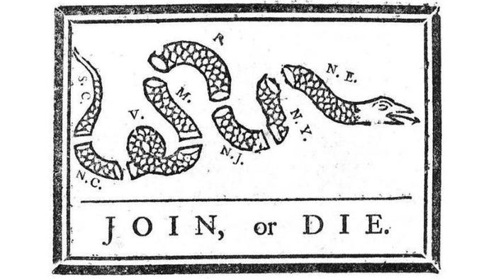
The rattlesnake graphic harkens back to the American Revolution and Benjamin Franklin, who created and published the first known political cartoon in an American newspaper. His woodcut of a snake cut into eight sections represented the colonies and included the phrase “Join, or Die.”
Since then, the rattlesnake has come to symbolize American values and has been used over the years by various U.S. Armed Forces on flags and seals, sometimes with the words “Don’t tread on me.”

About the Author(s)
You May Also Like


