3 High-Profile Packaging Redesigns: Dude! or Dud?
Morton Salt, Midol, and Coca-Cola recently updated their packaging designs. Were they successful? Here’s what the original research shows …

A successful redesign requires brands to strike a careful balance between appealing to new audiences and maintaining brand recognition for existing customers. Brands that succeed in this arena win market share. Brands that fail end up on the most recent “Worst Brand Redesigns” list (or, worse, end up in the failed redesign hall of fame, à la Gap).
What current examples can we learn from?
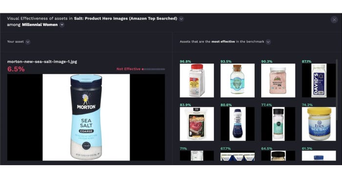
Packaging Digest asked Vizit to use its cutting-edge Visual Brand Performance Platform to analyze three recent packaging redesigns — for Morton Salt, Midol, and Coca-Cola — to find out which brands succeeded in creating new designs that were more visually appealing to their target audience than the original. Vizit’s platform allows brands to quantify how a target audience views imagery by providing a Vizit Score (0-100%) that measures the appeal of an image for an intended audience, while attention and performance image mapping within the platform shed light onto elements of the image that garner the most attention and boost appeal with an audience.
Start the slideshow to see the Morton, Midol, and Coca-Cola packaging redesign results.
Note: The version that scores higher is on the left in all images. The “Old” and “New” package designs are clearly marked but they aren’t in the same order, image to image.
About the Author(s)
You May Also Like


