3 Packaging Mistakes Newbies Make (But Shouldn’t)
Learn what not to do with your food packaging designs from other people’s blunders.

The food market is bustling with innovation and fresh food ideas — from reinventing favorite comfort classics to exploring alternative protein sources. With such diversity and choice, how do you distinguish your product and effectively communicate its value?
One of the most compelling ways to distinguish your product is through packaging. Everything — from shape, size, and colors — impacts consumer perception. Think about the variety we see in the water category alone, shared by the likes of Smart Water, Liquid Death, and Spin Drift.
Just as strategic packaging can drive purchases, mistakes can equally dissuade potential consumers. In this article, we spotlight three common packaging mistakes to avoid: too many callouts, concealing flavor profiles, and ignoring color associations.
1. Too many callouts!
When designing your packaging, less is more. Overwhelming the consumer with a flood of text on the front of your packaging is a bit like trying to have a conversation in a noisy room — everything is drowned out. Too much information leads to consumers disengaging and not absorbing your messaging.

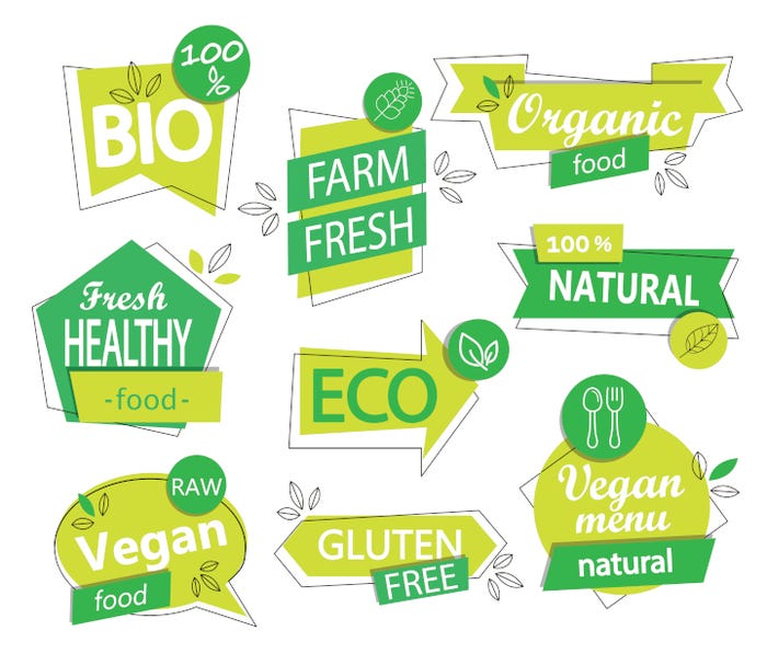
Consider the front panel of your packaging as the star of the show. It is your prime real estate to make the best possible first impression. Instead of presenting a laundry list of features, functions, and certifications, pick three of the most relevant call-outs that resonate with your core consumer and effectively addresses their needs. In the end, a clean, focused front label will let your product’s core values shine through.
2. Hiding the flavor. Taste matters.
Taste reins king when it comes to purchasing decisions — especially repeated purchasing. Regardless of health benefits or checked boxes, if something does not taste good, it is unlikely to secure a recurring spot in consumers’ shopping carts. However, a frequent mistake in food packaging is over-emphasizing dietary attributes at the cost of highlighting taste.
For instance, what is more likely to tell the value of a product: boldly proclaiming 'VEGAN' on the front panel or highlighting the rich, smoky barbecue flavor or the sweet, tangy burst of berry can leave potential consumers uncertain about what to expect.
3. Ignoring the harmonization of colors with flavor profiles.
Colors on packaging influence how consumers perceive the flavor of your product. This is largely because, over time, consumers have developed associations between certain flavors and colors, based on a combination of marketing and experiences with natural foods.
By matching packaging colors with product flavors, you create an easy visual guide for the consumer, simplifying the decision-making process and improving the overall experience of the product.
Say you're marketing a spicy food item. Opting for hues of red or orange — colors traditionally linked with heat and spiciness — can evoke the right sensory expectations. On the other hand, a cool mint flavor might be better represented by refreshing shades of green or blue.
Now imagine the opposite scenario: a strawberry-flavored item encased in an orange package. The key is to leverage colors that complement and reinforce the perceived flavor of your product.
By avoiding these three mistakes in packaging, food entrepreneurs can ensure their product packaging is not just visually appealing, but also communicates the right messages to consumers. Keep in mind that packaging serves as one of the first touch points with consumers. Make every element purposeful and effectively tell your story to your core customer.
About the Author(s)
You May Also Like


