4 daring packaging designs that create magic moments
April 2, 2018
In a store, consumers scan category selections in seconds and either pass them by or pick up products for further evaluation before, hopefully, buying them. Much of their assessment rides on the package design. Packaging is often the “make or break factor” in consumer decision making.
Adequate package design doesn’t cut it anymore (but I’m not sure that it ever did); there’s just too much competition in every category. Packaging has to go beyond the expected; it really has to be great to get any attention at all. But every once in a while, the stars align and in a genius moment, packaging is created that goes beyond great—all the way to magical.
You know when a package design creates a moment of magic. Consumers stop in their tracks and literally forget where they are, entranced and totally captivated. I know what you’re thinking. Sure, we work with toy and entertainment properties and our job is to create magic in packaging; to captivate consumers—kids and adults alike—before they ever interact with products. But I think that a large number of consumer product brands, regardless of category, can and should elevate their visual design assets to create magic for two important reasons:
1. Remember that consumers in general and millennials in particular seek experiences more than they look to acquire things. If consumers encounter magical experiences in their interactions with packaging, this will go a long way to cementing their relationships to specific brands.
2. Secondly, adults, like children, are highly responsive to a bit of magic in their time-starved, responsibility-driven lives.
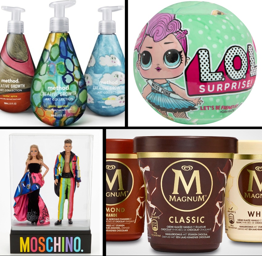
Here are four examples where the packaging makes marketing magic.
1. A method behind the magic
Brands that have a history of being unorthodox from their inception (translation: that are unconventional and comfortable in their own skins) continue to surprise and delight consumers with the unexpected.
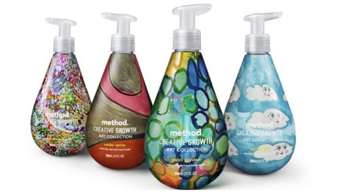
Method Home, long known for innovative packaging that directly led to the success of its products, recently launched four gel hand soaps in support of Creative Growth, a non-profit art center for adults with disabilities in Oakland, CA. The company collaborated with four artists who each designed packaging, and then filled them with four limited-edition fragrances. The package designs are full of vitality, energy and movement—not to mention distinctive use of color.
Lastly, there’s Method’s unique package structure, which is sinuous and tear-drop shaped. Every aspect of this package design is artistic; a stand-out on shelves filled with hand-soap brands in expected category packaging. Proof again that art is magical; consumers always have an emotional response to it.
NEXT: Magnum premium ice cream
2. Squeeze in interaction
Are there many categories that are more crowded than the ice cream and frozen novelty category? It’s unlikely. Are many products in the category unique? No. Yet, innovators are making inroads, thanks to reimagining product and package design to enchant consumers.
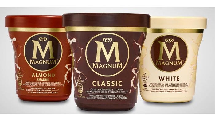
Magnum premium ice cream bars—known for their velvety, vanilla ice cream wrapped in a chocolate shell—has one-upped itself. And it has done it by capitalizing on its chief visual brand asset on its new pints: a cracked chocolate shell and shards of chocolate embedded in thick ice cream.
Beyond that, Magnum pint-sized ice cream packaging is unlike that of any luxury ice cream products you’ve ever seen. Sure, there’s a logo printed in metallic gold ink—a stand-out on the matte-finished label that creates an appealing contrast—that touts the premium quality of the product. But it’s the totally unique structure and graphics that tell the story in a compelling manner.
How about packaging that was made to be broken? Graphics along the sides of the new pints depict chocolate cracklings with vanilla ice cream underneath. The concave sides of the pints and precise instructions exhorting consumers to squeeze their ice cream to enjoy the “cracking experience,” creates a high level of interaction with the packaging.
Rahul Rajpal, brand development, Magnum Europe, observes: “Consumers are completely in love with the cracking ritual of the new Magnum Pints. Squeezing it is a cool and unique experience and consumers love the iconic cracking sound of Magnum chocolate.” And we know that experience is all-important when it comes to successful brands now.
And creating brand-embedded rituals? Pure magic.
NEXT: L.O.L Surprise! Doll
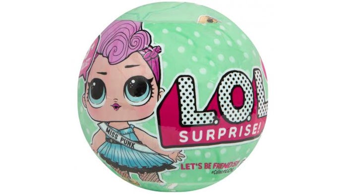
3. Surprise!
There are so many kids’ toys in every category these days, that unless the packaging delivers something unique and unexpected, they tend to get lost on retailers’ shelves and web sites. But what if packaging was leveraged to deliver something so fresh, so new and so magical that the brand became one of the hottest in the toy business? And what if it was solely driven via social media?
That was the premise behind one of the biggest toy industry surprises of the past holiday season. The L.O.L Surprise! Doll is the brainchild of MGA Entertainment CEO Isaac Larian. In a CBS Sunday Morning interview recently, Larian explained how he came up with the idea in a classic lightbulb moment. An insomniac, Larian was watching YouTube unboxing videos one night that depicted children opening up toy packaging. He noted that many of these videos had millions of hits. As he watched, he thought: “Well, we gotta do a toy that's a true unboxing, so every kid can unbox it," Larian said. "Nobody has done a toy where you don't see what's inside."
That was in 2016. Without a single ad, the YouTube unboxing videos of the L.O.L. Surprise! Dolls have driven the sale of 25,000,000 units to date. Market research firm NPD Group ranked the L.O.L. Surprise! Tots the top selling holiday toy in the U.S. in a press release dated Oct. 31, 2017. Amazing success with an unconventional new collectible toy marketed solely through social media channels. For example, one unboxing video of two young girls peeling back layers of the packaging to reveal the surprises within the packaging has enjoyed 7.5 million hits, building anticipation and demand for the dolls.
In the shape of a ball, the ingenious package design features seven layers that are removed one at a time to reveal a secret message sticker, first, followed by a collectible sticker sheet, a water bottle charm, shoes, an outfit, an accessory and last but not least, a collectible L.O.L. Surprise! Doll. Filling the water bottle to feed the doll leads to an additional surprise. She might cry, spit, tinkle or change colors. Young girls are enthralled by the process of unboxing to discover the treasures that lie within the unique packaging.
The package design itself features a thin outer wrapper with a large eye-popping brand identity. Chunky L.O.L letters appear in white outlined in black and filled with black polka dots—and the word “Surprise” in white beneath them over a magenta ground. Artwork depicting one of the small, wide-eyed Surprise dolls appears to the left of the brand identity. A speech balloon has her uttering these words: “45+ to collect!”
The background colors vary but they feature white polka dots. Beneath the brand identity on the bottom of the package there is limited verbal brand communication that delivers two emotive messages to young girls: “Let’s Be Friends!” and #CollectLOL.
The magic quotient of this brand packaging speaks for itself. And it proves that even in the collectibles category populated with powerful brands like Hatchimals and Shopkins, there’s always room for new brands that know how to make magic to become successes as well.
NEXT: Mattel’s Barbie and Ken Moschino Gift Set
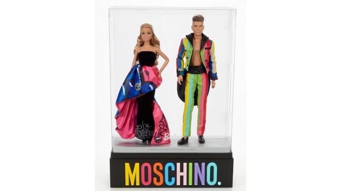
4. “It took my breath away.”
Pop culture, haute couture and art meet in Mattel’s Barbie and Ken Moschino Gift Set. This is a limited-edition collector’s item raised to star status. Boldly colored, urban-inspired street art meets high fashion in an inspired look from Moschino creative director, Jeremy Scott, recognized for his fanciful design work. Barbie’s slim couture gown copied from the Moschino Fall 2015 collection and Ken’s custom-striped tuxedo make one of our culture’s most famous duos ready for any gala affair.
As wonderful as the dolls are, the packaging steals the show. Minimalist, black matte packaging is punctuated by bold, multi-colored acrylic lettering that spells out Moschino, the brand known for its ebullient take on high fashion. The packaging lifts to reveal Barbie and Ken on a silver stage within an acrylic case that gives us a 360-degree view of their spectacular outfits. The Barbie logo appears at center bottom of the acrylic cover. And the words “Barbie Collector Gold Label” are inscribed on the front of the silver staging.
When product and packaging come together like this, it’s truly magical. It literally takes collectors’ breath away. This is packaging that is meant to be kept and savored as much as the collectibles contained within it.
Final takeaway: The most mundane of consumer product brands can make magic, from food to toys. All it takes is a fearless stroke of design ingenuity and daring.

Ted Mininni is president of Design Force Inc., a leading package and licensing program design consultancy to the consumer product and entertainment industries. He can be reached at 856-810-2277. Mininni blogs about package and licensing program design at www.designforceinc.com.
About the Author(s)
You May Also Like


