7 Key Principles for Inclusive Packaging Design
Inclusive design starts with the few but expands to encompass a much wider, more accepting audience. It ultimately leads to the broadest possible bandwidth of people.

The need to embrace inclusion in all aspects of business — to ensure that products, services, marketing, and recruitment processes do not exclude people — has been an increasing priority recently. And this applies equally to design as in any other area of business strategy.
Indeed, it may seem counterintuitive but the interesting paradox in the design world, is that by developing something for a minority, the outcome is invariably better for the majority. A classic example is that of the Aga; this is an abiding piece of inclusive design. It was created for the inventor’s wife who was blind, and the result was a stove that was easy to use for everyone.
At GSK, the pain relief brand, Voltaren, comes in tubes that were specifically designed so the caps could be opened by people suffering from arthritis — consequently, they are easier to open for everyone.

Whether product or packaging, service or sign, to be inclusive designers must ruthlessly question themselves — does this work for the left- and right-handed; can text be easily read; would someone who’s color-blind be able to use this?
Inclusive design starts with the few but expands to encompass a much wider, more accepting audience. It ultimately leads to the broadest possible bandwidth of people. While it requires consideration of individuals, it ensures that no one is alienated. The thought process is about bringing humanity into every stage of design, as the designer works through the problems that need to be overcome. The best design involves a layering of detail so that the final experience is completely intuitive.
When inclusive design is discussed it is too often associated with limitations — with accessibility and disability or focused on assistive technology. Invariably seen as being about accommodating niche markets such as older people or only being about public services, aesthetics risk becoming less important.
But one of the most important principles of inclusive design is that it is still desirable — not just functional. Perhaps one of the best examples of this is the humble pizza cutting wheel, easy to use for both the left- and right-handed, and for those with different dexterity and strength profiles. Designers should work hard to avoid alienating people as they try to meet specific needs. For example, the bars that support people when using stairs or in the shower are frequently cold and ugly — they end up highlighting that there’s a problem.
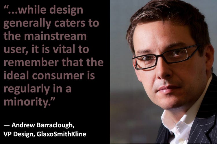
So, while design generally caters for the mainstream user, it is vital to remember that the ideal consumer is regularly in a minority. Most people are excluded in one or more ways at different times, be that because of their age, disability, gender, race, or socio-demographic status.

By looking at people who are generally excluded, we can broaden design’s focus and increase the market potential and opportunities. This means embracing diversity, avoiding stereotypes, and recognizing the ways in which lifestyles are changing.
To this end, the seven key principles for inclusive design are:
1. Equitable: It offers the same means of use for all users and is equally available to all users.
2. Flexible: It should accommodate a range of individual preferences, strategies and abilities so it includes a choice in methods of use, accommodates the right- and left-handed, and is adaptable to the user’s pace and precision.
3. Intuitive: It should prove easy to understand regardless the user’s experience, knowledge, and skills by eliminating unnecessary complexity. It should allow for a range of literacy and arrange information consistent with its importance.
4. Perceptible: It should communicate necessary information effectively, maximizing legibility of essential information, be compatible with techniques and devices used by people with sensory limitations, and differentiate between interface elements.
5. Tolerant: It should reduce any adverse consequences of accidental or unintended actions by arranging elements to minimize hazards and errors, give warnings, include fail-safe features, and discourage unconscious action in tasks that require vigilance.
6. Ergonomic: So it can be used efficiently and comfortably, it should allowing the user to maintain a neutral body position, minimize sustained physical effort, use reasonable operating forces, minimize repetitive actions, give a clear line of sight, accommodate variations in hand and grip size, and give adequate space for the use of assistive devices/personnel.
7. Desirable: It should appeal to all potential users, precluding any possible connection to stigma. So, avoid trying to be too young, or using visual language/color strongly associated with any specific demographic group and design for identity, emotion, delight, and self-expression.
Integrating inclusive design into a business strategy requires linking this strategy with the company’s other objectives. It involves making sure design is incorporated through all areas of the business and established within the core competencies of marketing, market research, and research and development (R&D).
When all this is followed, we are far more likely to develop designs that address the needs of the few but benefit the many.
About the Author(s)
You May Also Like


