Beauty products use packaging to project sophistication
March 11, 2015
|
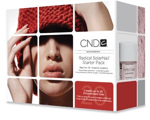
Creative Nail Designs' revised Enhancements Kits use a streamlined, sophisticated design to convey a premium image in more sustainable and affordable packaging. Previously, CND relied on the use of plastic in its packaging to emphasize the premium nature of its Enhancement Kits.
The new look, the result of a collaboration between CND and MiresBall (www.miresball.com), employs existing CND imagery to help preserve the co.'s 28 years of brand equity. To ease customers' transitions from the previous packaging to the new system, the boxes feature color coding that aligns with each product's original packaging color: purple for Moxie Liquid, red for Radical SolarNail; Liquid; and blue for Retention+ Liquid.
To help identify the products as premium, the new packaging uses a grid motif that is a recurring element in the corporate visual identity and underscores the systematic nature of CND's enhancement products. “The new design presents the packages' beauty and product shots in a visually compelling way, and it creates visual pop when the boxes are grouped together,” says John Ball, partner and creative director at MiresBall. “Because of the sophistication of the new design, the packaging is cheaper to manufacture yet achieves a more premium look and feel.”
You May Also Like


