Big Red unveils updated packaging graphics
March 11, 2015

Big Red unveils updated packaging graphics
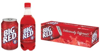
Big Red, America's original and No. 1 selling red soda brand, has introduced an updated, refreshed version of its iconic package design—its first graphics change since 1997.
"It had been over 14 years since we changed our graphics," says Thomas Oh, vp of business development. "As we get set to embark on new marketing initiatives for this summer, we felt it was the right time to contemporize the graphics and give the brand a more modern, upbeat feel."
After considering more than 40 different designs, Big Red narrowed the options and engaged its Facebook fans to help make the final decision. "With such passionate fans of the brand, we wanted to ensure that our consumers were involved in the process, and we listened," says Oh. "We ultimately chose an evolutionary design that stayed true to the equities and elements our fans love most about the brand."
The new graphics feature a sleeker version of the popular "splash", a distinct customized font, a glow behind the splash, and subtle bubbles in the background. In addition, a flavor descriptor—"So Sweet So Smooth"—was added to signal taste expectations for the unique flavor avid fans affectionately call "indescribable."
The new packaging graphics started rolling out nationally the week of June 6, 2011, on Big Red, Diet Big Red and Big Blue across all package sizes. Other flavors (such as Big Pineapple, Big Peach, Big Orange) will transition later this year.
To learn more about Big Red, visit www.facebook.com/bigred.
.
About the Author(s)
You May Also Like


