Sign up for the Packaging Digest News & Insights newsletter.
Bread packaging with real personality!
David Bellm
March 11, 2015
3 Min Read
.svg?width=850&auto=webp&quality=95&format=jpg&disable=upscale "Bread packaging with real personality!")
 When most people think of packaging for whole grain, nuts-and-oats, healthful types of bread, the look is pretty well set – calm, clean design elements accented with folksy types of illustrations … wheat, barns, amish villagers, grain mills, etc. etc. etc.
But Silver Hills Bakery and DDB Canada division Karacters Design Group have proven that it doesn’t have to be that way. It’s an interesting story of how a bit of insight and the willingness to be adventuresome result in a fun, attention-getting design.
You can tell the creative team really enjoyed working on this line, and it shows in the finished product. Great work!
Here’s what the folks at Karacters Design Group say about it in their release:
Silver Hills Bakery transforms packaging
to tell “bread time” stories
Karacters Design Group rebrands bakery to warm up appeal
Across the Pacific Northwest, Silver Hills Bakery is unveiling its new look this week as re-branded bags of its sprouted whole grain bread are delivered to various grocery stores in Canada and the United States. The re-designed packaging offers unique “bread-time stories” and a first glimpse of Silver Hills’ new look and recharged brand personality developed by Karacters Design Group.
 The revitalized Silver Hills’ packaging and image makeover is creatively designed to appeal to a wider, health-intending demographic to boost sales and broaden its customer base.
“We aspire to bring good, basic nourishment to more people and want to shift people’s perceptions of our sprouted whole grain breads, from a niche health-food bread to a nutritious bread that is good for everybody,” says Brad Brousson, CEO, Silver Hills Bakery. “It’s important that our creative platform supports our vision and helps differentiate our brand and what it stands for in a crowded and competitive category. We carefully craft our bread the way it should be – simple, honest and wholesome – and wanted this to be reflected in the new packaging.”
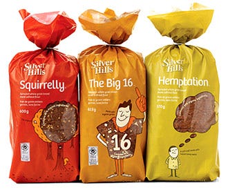
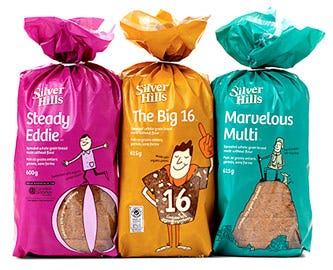
The new creative concept was prompted by an insight discovered during brand strategy development that the bakery’s “Squirrelly” bread had higher brand recognition and recall than the Silver Hills’ parent brand. Karacters Design Group’s brand identity experts used this insight as an interesting naming strategy for the other breads and counseled Silver Hills to rename them with the following unusual, unique names: Squirrelly, The Kings Kamut, Hemptation, The Big 16, Little Big Bread, Hardy Hearty Harvest, Mack’s Flax, Marvelous Multi, Radiant Raisin and Steady Eddie.
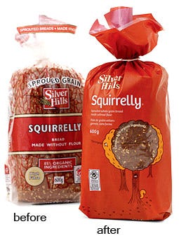 The re-branded packaging has a distinct shelf presence that beckons to be picked up and examined. Using solid, matte colours, which are unusual for the category, the colourful, biodegradable bags include witty illustrations by Robert Hanson. The lighthearted illustrations evoke the new names visually and cleverly incorporate captivating bread windows to display the product.
“The sliced bread category is very dull and one dimensional with most brands sharing the same visual wheat sheaf-cues, functional descriptors and clichéd good-for-you health claims. Our goal was to develop new packaging that would break through the homogeneity and connect with consumers in a humanistic way,” says James Bateman, creative director, Karacters Design Group. “The witty illustrations and unique names engage customers on an emotional level that makes you want to smile, while the short stories reveal the authenticity and integrity behind each carefully crafted loaf.”
 Silver Hills Bakery’s new visual identity will be extended to all customer touch points, including a refreshed logo, signage, stationery and website, all timed with the launch of the packaging. Karacters Design Group was responsible for developing Silver Hills’ original packaging over 10 years ago.
.
About the Author(s)
You May Also Like


