Building a package design architecture that holds up
March 11, 2015

Crayola
Architecturally unique buildings become landmarks. Think NYC's Chrysler Building. Chicago's Willis Tower (the former Sears Tower). I.M. Pei's pyramid in the courtyard of the Louvre in Paris.
Design architecture doesn't exist for its own sake, though. If it isn't functional, there's little reason for it-aesthetically pleasing or not.
Architecture doesn't only apply to buildings. It applies to packaging, too. While it isn't necessary for every brand, many do use package design architecture. In some cases, it's obvious; in others, less so.
Package design architecture, if effective, delivers the brand to consumers at a glance—increasingly important at a time when competitive products crowd retail shelves.
In the case of licensed consumer products, package design architecture is a necessity. Not only does it deliver the most significant visual assets of the licensed property, it works across numerous categories of consumer products to make it instantly recognizable.
Licensed product planograms and store-within-store shops are rare. These products are typically merchandised throughout the retail environment. So how important is instant recognition?
Brands, licensed or not, have equitable assets that must be uncovered. Many brands have significant heritage and deep emotional connections with consumers. It's important to delve into these properties to uncover both overt and hidden values. They then can be fully leveraged when designing product packaging that encompasses the essence of the property.
Understanding the visual cues that resonate with consumers on an emotional level leads to compelling and recognizable package design that refers back to the brand.
In licensed packaging, it's important to leverage the most equitable visual assets as the package design architecture—aside from the brand identity, the most identifiable and consistently used visual element. What else works to tie it all together besides a strong brand identity positioned in the same place on packaging, signature color and package structure? Package design architecture: An important element that's effective when it works cohesively with every other visual package design component.

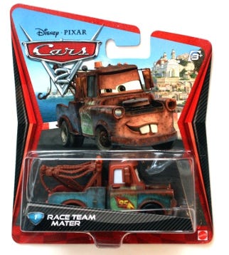
Cars 2
Often, package design architecture is the first thing consumers identify on packaging from a distance. Even more than the brand identity. The package design architecture usually encompasses the brand's signature color. And it embodies something emotive about the brand that is unique to it. For example, Disney/Pixar's Cars 2 package design architecture features chevron stripes down both sides. There isn't a fan, kid or adult, that doesn't instantaneously identify the Cars franchise, and all that it means to them at a glance, when they see those chevron stripes.
By developing a packaging guide for licensed properties that illustrates modularity for various packaging formats, it becomes easy for licensees to maintain a consistent look across a breadth of product lines in every category. Modularity builds flexibility. Package design architecture builds recognition. When well executed, it does more than that: it helps build consumer relationships with brands because it leverages emotional responses.
Theory put into practice
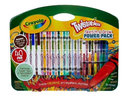
Package design architecture is obvious on brands like Crayola. Most consumers hone in on the cut-out that shows a range of crayon colors within their boxes. By the way, the clever cut-out has been broadened into a "smile" which promises fun for customers. Enjoyment, as we know, is a powerful purchase motivator.
The sweeping green arc, its package design architecture, at the top of Crayola toy product packaging is quite overt. If the brand identity was removed, consumers could readily identify Crayola due to the package design architecture. When these products are merchandised within a shelf set, there is a cohesiveness that makes an impact at retail.
Barbie Band Aids
Mattel's Barbie packaging features an oversized image of Barbie's head as its package design architecture. The image is always strategically cropped along the left side of the primary display panel. Every little girl focuses in on Barbie's glamorous face so why not lead with the brand's strongest visual asset? For young girls, Barbie's image generates excitement and pleasurable emotions.
Licensed Barbie products are packaged in the same manner and Johnson & Johnson's Barbie-branded Band-aids are a good example. The package design architecture reinforces the Barbie brand on products in a wide swath of categories, no matter where they're merchandised. Can a young girl spot her favorite brand from a distance and make it her purchase choice? You bet.
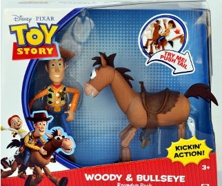
Toy Story licensed games and toys, as well as other consumer products, feature a white arc defined by a blue border as its package design architecture. The actual toy or game contained within the package is then depicted on a light blue background. Even without seeing the colorful red, yellow and blue brand identity in its playful typographical style, every kid in America and around the globe immediately recognizes Toy Story packaging. Does that immediate recognition elicit an emotional response from children? Of course it does!

Toy Story
Over time, the principal visual elements that comprise package design architecture are not only instantly recognizable, but they become subliminally associated with the brand at a deep level. They're meaningful for their audiences. What has meaning leads to deepening relationships and strong emotional responses. Package design architecture has the power to create category landmarks and leaders, as well as lasting impressions. What can it do for your packaging?
Ted Mininni is president of Design Force Inc. (www.designforceinc.com), a leading package and licensing program design consultancy to the consumer product and entertainment industries. Reach him at 856-810-2277.
.
About the Author(s)
You May Also Like


