Caribou Coffee revamps branding
March 11, 2015


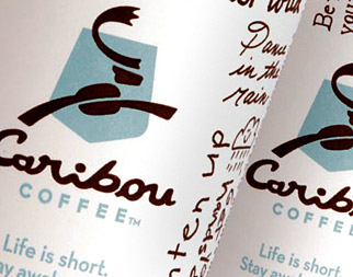
Caribou coffee cups
Caribou Coffee® customers in all stores nationwide will notice a new coffee-centric caribou on their cups as they reach for their beverages today. As part of the company’s strategy to enhance its brand position and create new opportunities to engage customers, the 17-year-old brand has undergone a makeover that will roll out during 2010 and into early 2011.
“In Caribou’s case, it’s passion to deliver the highest quality coffee and the best customer experience.”
The new brand look includes a new logo, color palette and design elements that bring fresh energy and broader context to the existing tagline: Life is short. Stay awake for it.® Previously the tagline focused on the benefits of caffeine, but Caribou has now shifted the element from a declarative statement to an opportunity for customer engagement on a more personal level; “stay awake” has grown to signify a “seize the day” attitude.
“We saw an opportunity to better express who we are and what we believe in as a company across all interactions with our customers,” said Alfredo Martel, senior vice president of marketing. “The new elements of our brand give us an opportunity to do that and to ask our customers to explore and share what ‘staying awake’ means in their lives.”
A New Approach to Growth
Since Caribou Coffee CEO Mike Tattersfield’s arrival in August 2008, Caribou has shifted focus away from expansion and toward elevating all aspects of the brand experience to match its world-class coffee. The company’s new strategy has resulted in the most diverse and premium line of offerings since the company opened its first store in 1992.
“Our brand relaunch runs much deeper than the new logo design; it really signifies the evolution of our company. We are passionate about and committed to creating the best cup of coffee possible and an experience that extends beyond our products,” says Tattersfield. “We are working to ensure that all aspects of the customer experience are at the same premium level of quality as our coffee.”
In November 2009, Caribou unveiled a menu of reformulated chocolate beverages made with all-natural gourmet chocolate from Guittard Chocolate Company of San Francisco. To boost its breakfast platform, the retailer introduced handcrafted oatmeal to its menu in January of this year and has been testing baked in-store pastry items at 25 stores in its home market of Minneapolis.
Bringing the Brand to Life
Central to this new rebranding, the company’s logo has been adapted to a simpler but playful representation of the brand’s key identification. Most noticeably, the leaping caribou is now a coffee–brown color and in the brand’s playful nature, is assembled out of graphic elements, including a coffee bean at the heart of the animal and “C” shaped antlers. The caribou also now leaps to the right, signifying the company’s vision and movement toward the future.
The shield element in the original logo has been updated to a rich blue color with a new shape that echoes the shape of national park system signage, a nod to the Caribou founders’ hike in Alaska’s Denali National Park where they were inspired to begin the company.
“As we explored new versions of the central elements of the brand, we made sure to stay true to the heart of our company and the vision in which it was founded. We are a brand that embraces living life to the fullest, regardless of what it is that you are passionate about,” says Martel. “In Caribou’s case, it’s passion to deliver the highest quality coffee and the best customer experience.”
Beginning on March 1, the new look will be introduced via in-store elements such as napkins, cups, drink carriers, canteens and signage.
SOURCE: Caribou Coffee
.
About the Author(s)
You May Also Like


