Concentrated Product Puts the ‘Squeez’ on Mouthwash Packaging
The packaging design for a new concentrated Scope mouthwash from P&G offers convenience, personalization, and sustainability.
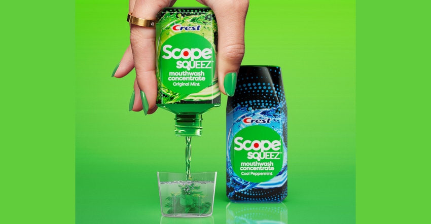
Procter & Gamble is bringing the packaging benefits of a concentrated product to the mouthwash category with its new palm-size Crest Scope Squeez package. The product is P&G’s first concentrated mouthwash.
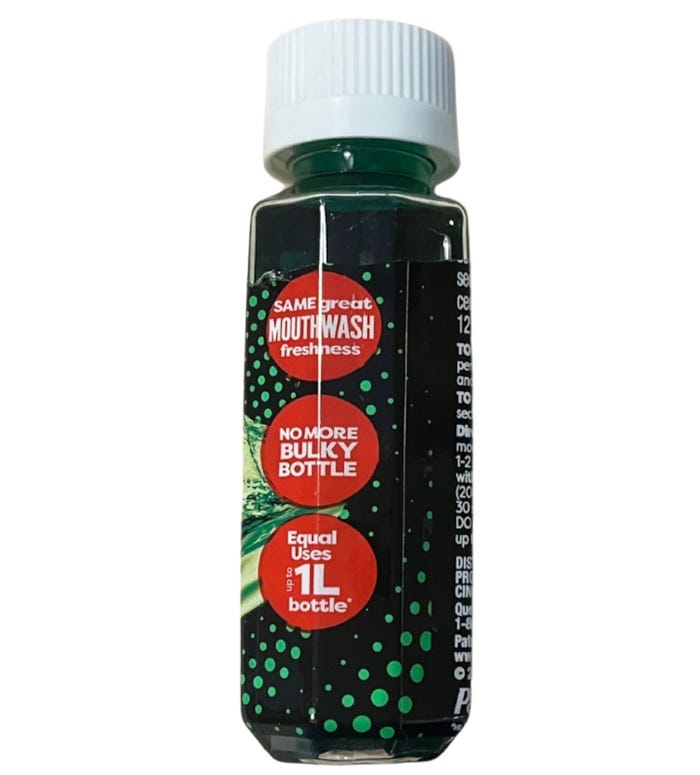
The squeeze bottle delivers the same number of mouthwash doses as a regular 1-liter bottle but with much less packaging. According to P&G, Scope Squeez uses 70% less packaging than a 500-ml Scope mouthwash bottle and provides up to 50 doses per bottle.
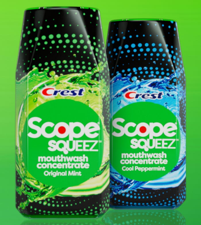
Scope Squeez launched in March 2023 in two flavors, Original Mint and Cool Peppermint, with a suggested retail price of $7.99. While prices vary per outlet, that’s about the same price as the non-concentrated product.
To mix a personalized dose of mouthwash, consumers use the friction-fit dosing cup that doubles as an overcap on the package, adding water to fill line (20 ml) and then squeezing in one or two squirts of concentrate.
Consumers vary the number of squirts, depending on how strong they want the reconstituted mouthwash to be. P&G advises using up to four squirts per day.
The product’s key benefits are customized product strength and convenience. The small package is small enough to take on the go, and it takes up significantly less counter space than a conventional mouthwash bottle.
Additionally, the reduction in packaging material vs. regular mouthwash offers a sustainability benefit, though P&G has not been emphasizing that point with consumers. Read contributor Robert Lilienfeld’s thoughts on the sustainability angle.
Anatomy of the package.
P&G declined to answer our questions. But here’s what we’ve been able to suss out.
For the Scope Squeez pack, P&G uses a clear polyethylene terephthalate (PET) bottle that holds 50 ml (1.69 fl oz). The sides of the bottle are beveled, possibly in homage to the angular full-size Crest Scope Classic mouthwash bottle design.
A full-body shrink label on the Scope Squeez bottle provides tamper evidence and a canvas for graphics. Using the perforations at the top of the shrink label, consumers remove the portion of the label that covers the dosing cup.
The bottle is topped with a push-down-and-twist child-resistant closure with arrow-shaped cutouts that show the twisting direction for opening. But nothing on the package tells consumers to push down before twisting the closure on or off, so consumers may have a frustrating time opening, closing, and reopening the package.
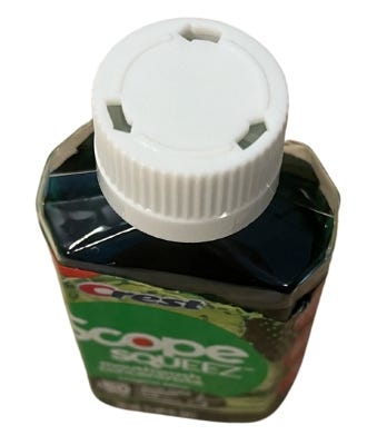
When the closure is securely tightened, it does not leak, even when the bottle is held upside down and squeezed. (Full disclosure: The closure on a Scope Squeez package purchased online by Packaging Digest was not closed tightly enough during shipment, and the sticky product leaked all the way through the opening in the shrink label at the top of the package.)
A valve closure or similar component in the bottle neck keeps the open bottle from dispensing when it is upside-down, until the bottle is squeezed.
Theoretically, the PET Scope Squeez bottle is recyclable. But in the real world, the pack’s overcap, closure, shrink label, and any valve or dispensing component inside the bottle would need to be removed before throwing the bottle in the recycling bin.
Graphics working overtime.
Graphically, the package design is hyperactive, providing a great deal of visual information on the small package. Virtually all the text is printed in white against a black or colored background, which can be challenging to read.
The font for “Squeez” starts out plump but thins as the eye travels from left to right, possibly conjuring the idea of a concentrate being diluted. In addition, the tail of the “Q” is stylized, perhaps modeled on a drop of water, a squirt of concentrate, or even a tongue.
Callouts on the side of the package, each in a red circle evocative of the red “O” in the Scope logotype, are rendered in various font sizes and letter cases to broadcast “freshness IN EVERY DROP,” “SAME great MOUTHWASH freshness,” “NO MORE BULKY BOTTLE,” and “Equal Uses UP TO 1L bottle.”
The Scope Squeez package and product concept are reminiscent of Mio, a concentrated beverage flavoring that launched in a portable, droplet-shaped container in 2011. The packaging enabled consumers to add as much or as little flavoring to their water as they wished.
About the Author(s)
You May Also Like


