Five ways to successfully break the rules in packaging design
March 11, 2015

Rapid commoditization of products in every category. Customer churn. The economy a roller coaster. All moving at Mach speed. It's enough to make marketers crazy.
Yet, brand building has to remain the focus no matter how challenging the consumer environment is. Assessments must be made about where products are in the life cycle. Solid performers need incremental improvements. Would they also benefit from contemporized packaging? If so, how far should a package refresh be taken?

Kleenex
At the same time, new products have to be launched. How to package them so they stand out on shelves burgeoning with an endless stream of me-too products? At times like these in consumer purchasing history, it's tempting to break out and do something risky. Let's face it: package designers are always eager to let their creative juices flow. But should brand managers go for the daring and the trendy?
There are five instances in which to consider breaking the rules in packaging, as long as that risk is well-managed. The brands that do this well are the trend setters in their categories.
1. Establish brand alignment
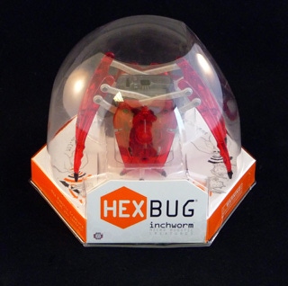
If a brand is edgy to begin with, if it's a forward-thinking trail blazer with a Type A personality, daring packaging is in total alignment with the brand's values. Think HEXBUG and the packaging that showcases these unique toys. These colorful, micro-robotic, remote control operated creatures appeal to kids' imaginations as they come to life under their command. The hexagon shaped package structure refers back to the brand, while allowing product to neatly interlock at retail. The thermoformed dome works in conjunction with the paperboard base to glorify and display each HEXBUG specimen. Perfect brand alignment.
2. Evolutionary yet sustainable
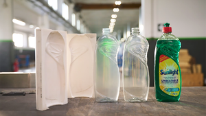
If a brand is all about sustainability, evolutionary packaging is the norm. Think Seventh Generation's Natural 4x Laundry detergent in unique recyclable/compostable bottle. It's made from 100 percent recycled fiber. The entire package system: fiber bottle, inner pouch, spout and cap uses 66 percent less plastic than a typical 100 oz laundry bottle but delivers the same number of loads! With this ground-breaking new packaging, Seventh Generation has raised the bar on sustainability without losing any equity in its brand.
3. Avoid looking like a commodity
If a new brand or co-branded product is being positioned in a heavily SKU'd category with a lot of similar packaging, doing the unexpected keeps it from becoming a commodity. What has more SKUs than the snack category? How about a product and package that leverages the Kellogg's and Lego brands in perfect harmony? Package artwork depicting larger-than-life iconic Legos on Kellogg's Legos Fun Snacks appeals to kids and parents. How smart is it to fashion the product into the Legos shape to reinforce the strength of the brand? The entire concept speaks of value, wholesomeness and a marriage of two trusted brands.
4. Limited-edition packaging
Brand managers can have fun with this concept while creating enjoyment for consumers. Coca-Cola and Pepsi have both indulged in artsy packaging for short periods. Some of it retro, some of it daring and cutting edge; all of it sparking commentary from packaging experts and consumers alike, pro and con. Think about the new Diet Coke can with uber-sized brand identity splayed across the can in a unique manner.
5. Seasonal packaging
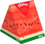
Kimberly-Clark elevates seasonal packaging with its Kleenex tissues. Who can forget the watermelon and fruit wedge boxes of last summer? The ice cream scoops with waffle cone designs this year? Tissues are a basic commodity, so how to elevate one brand over the competition? Kimberly-Clark gets it; consumers will maintain Kleenex as the category leader with hot sales on whimsical packaging like this. Not to mention social buzz.
Can established brands break the rules? Category leaders can to a point, but they must extend the brand equities consumers identify or risk loss of recognition and market share.
For decades, billboard style labels featured the "Miracle Whip" brand identity in its distinctive red font set on a stark white oval within a dark blue background.
Fast forward to new packaging. A bold red "MW" in a modern gestural font appears on a solid white background. Gone is the white oval. Instead, bold blue undulating lines in various tonal values graphically represent a slice of bread while wrapping around the entire package left to right. "Kraft" appears above and left of the bold "MW."
Thankfully, the words "Miracle Whip" appear in red to the bottom left of the lettering, otherwise, would we know this product was in fact Miracle Whip? Doubtful. While the brand colors and the Kraft logo appear intact on the new packaging, the overall impression is markedly different from Miracle Whip brand's long heritage. Will it confuse customers? The new package looks cool, but it's missing key elements of the brand identity; components that hold great equity; not least of which is the spelled out "Miracle Whip" brand name.
Then, there's Tropicana. Once again, the No. 1 orange juice brand repackages. This time, Pepsico opted to kick out its 59-oz cartons altogether, replacing them with clear plastic carafe-like bottles. Unlike the disastrous package refresh of a couple of years ago, the brand made certain to retain all of its key equities on the new package label. The straw-plugged orange and signature brand identity were left intact. It's obvious at a glance: This juice is Tropicana.
Why plastic? Apparently, market research divulged that people wanted to see the juice inside the package. For another, it's 100 percent recyclable. Of course, upstart Coca-Cola's Simply Orange is packaged that way and the brand has made some inroads on Tropicana's huge market share. Could that have also played a part in this decision? Likely.
If brands have unique attributes, the packaging should complement those assets. If brand communication is formulaic and packaging looks and works just like competitors', or looks stale or non-descript, it's time to punch it up. Why would marketers work hard to differentiate their brands and then execute packaging that looks and feels the same as their competitors'? Why would they work to create positive, memorable experiences with their brands and fall down with their product packaging when it's the most tangible representation of those brands?
This is the issue. Solid brand management focused on delivering enjoyable customer experiences at every touch point is crucial. Packaging may be only one tactic among all brand initiatives, but it either cements the deal or it doesn't. It either clearly stands for one brand-and stands alone-or it doesn't. If it doesn't, it's not daring enough. Taking a risk but a well-strategized, well-managed one is the key to elevating packaging from good to great. From one of the pack, to the category leader.
Ted Mininni is president of Design Force Inc., a leading packaging design consultancy. For more information, call him at 856-810-2277 or visit www.designforceinc.com.
About the Author(s)
You May Also Like


