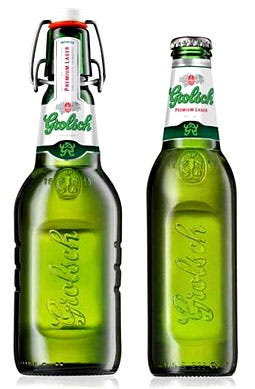
Grolsch beer gets redesign as part of brand repositioning
March 11, 2015


Grolsch beer redesign
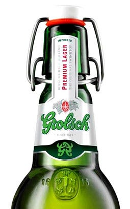
Anthem Worldwide announced the recent release of its new label design for international beer brand Grolsch that integrates "The Mark," a new symbol derived from the Grolsch logo.
Grolsch is a brand and company whose rich traditions date back to 1615. The focal point of Grolsch's commercial activities lies in the Netherlands, Grolsch's historic home market. Made in Holland, yet enjoyed all over the world, Grolsch exports its beer to more than 50 countries. Important international markets for Grolsch include South Africa, the United Kingdom, the United States, Canada, Poland and Russia. The Grolsch brewery in Enschede is one of the most eco-friendly breweries in the world. SABMiller plc, one of the world's leading brewers acquired the Grolsch business and brand in February 2008.
Most recently, SABMiller repositioned its Grolsch beer globally as a "maverick" brand to create a strong and differentiated position. The new global marketing campaign revolves around a mysterious symbol derived from the Grolsch logo called 'The Mark.' 'The Mark' is composed of the initial capital of the Grolsch logo and a mirrored G.
Ronald van Amerongen, global brand director for Grolsch, said, "The campaign is about harnessing the power of symbols to intrigue consumers and convey Grolsch's maverick character. The integration of 'The Mark' into our already distinctive packaging is a critical part of the positioning." 
Grolsch beer redesign
Hans Muysson, Anthem group managing director for Europe, said, "'Untraditional since 1615' has been Grolsch's progressive authenticity and strategy. It's exciting to be a part of this global journey as Grolsch defines and differentiates the next generation of this icon. With the brand's heritage, it is only fitting that these non-conformist ideals have been harnessed in this new positioning as a 'charismatic maverick.'"Arthur Brandenburg Van Den Gronden, Anthem's chief strategy officer for Europe, commented, "Creating relevance means moving the brand forward, while instinctively representing the original parent icon. We have helped to redefine this brand in small steps over a number of redesigns. We haven't been around for all of Grolsch's four-centuries, but our 13-year partnership has allowed us to gain a deep understanding of the Grolsch brand heritage and its visual equities. Our experience, instinct and knowledge of Grolsch's core equities allowed for the seamless integration of 'The Mark' into the new label design."
Brandenburg Van Den Gronden continued, "On label, 'The Mark' has depth and surprise and is shorthand for Grolsch's charisma, craftsmanship and artistry. As Grolsch aspires to recruit new users in non-Dutch markets, 'The Mark' is an intriguing symbol that will inject a modern tweak."
Muysson added, "In this stage of the brand's international development, Grolsch has found a way to move from a brand with the iconic Swingtop, to an iconic brand now symbolized by 'The Mark.' From all indications, the global campaign has hit the mark."
SOURCE: Anthem Worldwide
About the Author(s)
You May Also Like


