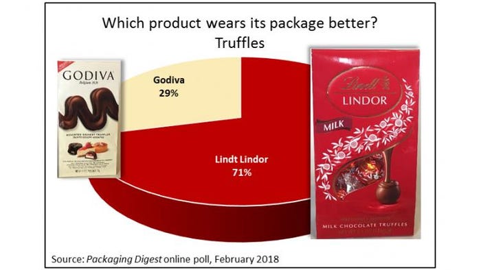
The outcome of a truffles tussle in our latest Who Wore It Better series has Lindor surpassing arch-rival Godiva in packaging design.
The poll was conducted online throughout the month of February 2018. Of the 69 packaging professionals participating, 71% chose the deep red Lindor bag versus the pale cream-colored Godiva bag, which received 29% of the votes. We also asked people to explain why they picked the package they did. A selection of their insightful comments are below.

To help them decide, survey participants were given a written description of each package, along with photos of all surfaces of each package.
Both products are sold in stand-up paper bags with a fold-over back heat-seal closure. The Lindor package holds 5.1 ounces; Godiva contains 4.2 ounces. The Godiva bag is nearly 8-3/4-inches tall; the Lindor bag stands 7.5-inches high. Truffles inside both bags are individually wrapped.
The Lindor package has a die-cut and clear window on the front and gold hot stamping. The shiny surface is the same for the entire package. The Godiva bag adds elements of gloss on the front on an otherwise matte material.
Both print the UPC bar code on the bottom.
The “Best Before” dates appear on the back, on top of the folded-over seal. The Lindor info is laser coded; the Godiva date code also looks like it has been applied by a laser, but the characters feel rough and there is not as much contrast between the color of the bag and the color of the code.
The Lindor package is all in English; the Godiva prints text in English and French. Both brands print on both sides of the bags. Lindor uses a side panel for the Nutrition Facts box; Godiva positions that on the back.
Godiva is owned by Turkish company Yildiz Holding; Lindor is a brand of Lindt & Sprüngli.
The Godiva admirers
More than a quarter of respondents preferred the Godiva bag because…
“Lindor package is too ‘Christmasy’ or seasonal,” says one Godiva fan. “Godiva has a more modern upscale feel for any occasion. The dessert truffle name is very well reinforced with the photo of other luscious desserts.”
Details matter to this respondent: “Godiva tells you what type of truffle(s) is in the bag while Lindt just says “truffles.”
“White background is easier on the eye than red,” says another Godiva supporter.
And this poll taker explains, “Cleaner look. I don’t prefer the window when the interior is individually wrapped as well.”
A couple respondents admit the Lindor package has game, but Godiva appealed more to them:
“It was very even but the dark red shows the paper more and will look shop worn.”
“Type is easier to read. I do like some elements of the Lindt package but overall give the edge to the Godiva package. I do not care for the color bar showing on the bottom of the Lindt package.”
“Cleaner looking package. The images look more appetizing. But, sitting on a shelf the Lindt package would catch my eye first.”
Giving Lindor the love
Nearly three quarters of respondents favored the Lindor bag for a range of positive reasons, but some were clearly voting against Godiva:
“I don’t understand the Godiva ‘wave.’ It looks cheap,” starts this respondent, who then goes on with: “Lindt also showcases the truffle bigger and better, on both the front of the pack and the back. Lastly, the overall color scheme looks premium for Lindt while Godiva looks generic. Where is the Godiva golden color? Is this a cheap outlet-store product line? It clearly can’t be the same premium truffles that come in the golden boxes, right?”
Another survey taker also questions the Godiva authenticity: “The chocolate on the Godiva bag looks very fake and forced. Also, the package for gifting is busy and not especially appetizing in my opinion.”
“More consistent color branding per Truffle. The Godiva bag is a weak color and the large chocolate ‘swirl’(?) looks ugly,” says one respondent.
If you think that comment about the Godiva swirl was harsh, it gets worse: “Just spoke to me. The red. The Godiva chocolate looks like poop.”
However, many respondents pointed out specific features that they liked on the Lindor package:
“Smaller package holds more and I like being able to see the product,” says this respondent.
“Bright packaging. Catches the eye on the shelf. Shows product inside thru the window,” says another (seeing into the Lindor package was mentioned as a key advantage by quite a few people).
“…Foil stamp is more premium looking on Lindt versus Godiva,” in this person’s opinion.
According to this respondent, “The bag has more of a Special Occasion look to it. Better for gifting.”
The Lindor package was a bit smaller in size than the Godiva one and, to several respondents, used the available space better. “The package color is so iconic, it is hard to not love it. I like the back panel much more as it does not look like some ‘pharmaceutical’ product. The nutritional facts looks better on the side. [I like] the back panel of the Lindor pack sketches and experience.”
But to be fair, this respondent points out that Godiva is somewhat at a disadvantage because of the multiple languages on the package: “[The Lindor package] speaks more decadence to me, but the comparison cannot be justified if only one of them uses English only. I’m sure the Godiva packaging would look great too, if they only used one language. The [Nutrition Facts text] wouldn’t have needed to be so large and take away from the extra space on the back panel.”
Stay tuned for our next Who Wore It Better poll!
Click here to see the results of our earlier Who Wore It Better polls:
Beef Jerky: Strong packaging graphics also need ‘context’
Olive Oil: Shoppability, easy-pour key to olive oil packaging design
Iced Coffee: Starbucks v. Dunkin’: Iced coffee looks ‘premium’ in glass
*******************************************************************************
Production efficiencies, ecommerce challenges, sustainability trends, new bioplastic technologies and more are among the topics on the agenda at EastPack 2018 (June 12-14; New York City). This free educational program will have more than 16 hours of can’t-miss presentations and demonstrations. Register to attend today!
About the Author(s)
You May Also Like


