Materials, graphics meld in winning ways
January 29, 2014
Creating a package design is one thing. Keeping it communicating powerfully over a variety of containers is quite another. The current Mobius awards recognize this latter challenge. In the best-of-show package design award plus two first-place winners, the capacity for creativity is, if anything, compounded by extension.
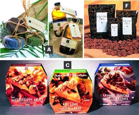
This is most obvious in the packaging for the Inara™ bodycare collection's 33 stockkeeping units that combine to capture the Mobius best for Wild Earth of Lake Bluff, IL, and package designer Gams Group. Along with the packages for 11 different candles, wrapped in translucent amat? bark paper made in Puebla, Mexico, and the 151/2-oz ceramic pot for Babassu Sugar Rub previously reported (see PD, April, '02, p. 10), other equally effective designs for widely varied containers share the top award.
One is the package for a trio of 3.57-oz round soap cakes in Inara's Quiet, Enliven and Ignite fragrances (photo A), made for Wild Earth by a women's cooperative in Maranhao, Brazil. Initially wrapped in polyvinylidene chloride film to protect their oils and fragrances, the soaps are then overwrapped with color-mated tissues produced by Nashville Wraps and Bag. The tissues are secured by spot pressure-sensitive labels converted by Prairie State Graphics of an uncoated MacTac 50# EDP matte paper with permanent adhesive and 40# kraft liner. Using water-based inks, Prairie State prints the stock in four process colors via flexography.
Natural ties
Turning the trio into a single sale is natural hemp, ingeniously looped and knotted, and securing one additional label. Cord-tied to the hemp is a tri-fold hang-tag made with an uncoated 80# Confetti Sand stock from Fox River that is offset-printed in four process colors by 3X Printing, which then guillotine-cuts, drills and loops it for simple application. While presenting the Inara mystique, the tag differentiates the soaps, lists the all-natural ingredients and carries a bar code and company information.
Wild Earth cofounder and managing director Anne M. Dolbeau, while pleased with the imagination going into the soap linkage, tells PD she's equally happy with the other package sharing in the Mobius award. This is a simple Boston Round amber glass bottle for an 8-oz quantity of Inara Babassu Bath Oil.
"Of course it's the perfect barrier for our oils," she notes. "But it's also an excellent color match for the collection, and with the body label, it almost assumes a sleek, modern look." Acquired through Crown Packaging, the Owens-Illinois bottle is topped by a simple black threaded polypropylene closure injection-molded by Poly-Seal Corp.
The narrow, full-wraparound decorative p-s body label featuring the Inara logotype and product descriptive is converted by Prairie State Graphics using the same materials and processes as for the soap labels. A circular base p-s label using a 50# matte-look stock from Optimum Paper Products is flexographically printed in one color by Prairie State on a Mark Andy 10-in-W. press to provide ingredients and a bar code. The final decorative touch is a hemp tie with carry loop and tri-fold hang-tag converted by 3X Printing to the same specs as are used for the soap tag. Circle No. 370.
Two by three
Like a lash mark, a crimson numeral three dominates a design that captures two Mobius first awards for packaging of a new vodka from Chicago-based Sovereign Brands (B). Introduced late last year by Sovereign's 3 Vodka Distilling Co. unit, the soy-based drink is the result of three years of development, Sovereign managing partner Brian E. Berish explains to PD.
Helping the 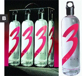 brand rise above the clutter of white goods at retail, the design system by Wencel/Hess Co., executed together with Saxco Intl., blends simplicity with innovation. For the customized 750-mL flint glass bottle produced by Vetri Speciale with a tall, 33-mm neck finish, a threaded, ring-topped closure is injection-molded of PP by Walsen Intl. with liner from Newark Liner. The closure is molded around a metal insert.
There's a reason beyond unique appearance for this. When inverted, the closure accepts a 1-oz quantity of the 80-proof vodka. Its metal insert gives the closure the heft of a shot glass.
Along with the vivid numeral, the Wencel/Hess graphics communicate a high level of quality. The other crimson element on the bottle's face is the copy "made smooth with soy™," while the three-color screen printing by Chattanooga Labeling Systems uses the back space to explain to consumers the company's use of soy isolates with selected grains to give the vodka "its signature smoothness." Another decorative element that assures tamper evidence is a rectangular p-s label applied to the bottle's neck and closure. It's converted by Webb/Mason of an Avery Dennison stock using that supplier's Hammerlock® adhesive and is printed flexographically in two colors: black and the crimson numeral.
The brand's second Mobius goes to the design of a three-bottle carrier for consumers who can't get enough of a good thing. Or, for those who believe in gift-giving on a grand scale. The sturdy structure is a lock-tab, tuck-top, automatic-bottom carton made by Pride Container Corp.
On the carton's side and end panels are reproduced the likeness of the 750-mL bottle, with die-cuts at the closure rings. The other side panel conveys the product's story under the heading, "The Breakthrough Vodka," with short paragraphs on the sleek bottle and closure. Pride prints the stock, a .010 SBS, in four process colors plus the special red, on a six-color Man Roland offset press, and then applies non-slip ultraviolet varnishes to the top and bottom flaps. For the side and end panels, there's a high-gloss polyester coating prior to laminating to a single-face, E-flute corrugated and die-cutting that also enables the attachment of a carry handle.
Another pair
A perennial Mobius mover, Toronto-based Loblaw Brands comes away from the competition with a pair of firsts. Known for its pioneering design work in advancing store labels as powerful competitors through the President's Choice® franchise, Loblaw enhances its reputation with two new packages.
First are cartons for 1-kg frozen dessert pies in Mississippi Mud, Key Lime and Caramel Sundae varieties (C). "The idea of the designs for the cartons," says Loblaw design coordinator Diana Lee, "is to make the product so attractive that the consumer will have trouble choosing among them, so it never becomes a matter or yes or no." Through stunning product photography, with a single slice of pie flanked by related ingredients, the job is done quickly.
The cartons that carry this appetizing artwork are made by Smurfit Stone of a PE-coated-two-sides .020 SBS, sheet-fed offset-printed in four process colors and one special, flavor-distinguishing shade, followed by application of an aqueous coating. Closing in an octagonal shape before the ends are glued, the cartons also feature the face-panel artwork, made from separations by Filmark/Livewire, on two side panels, for visibility in freezer displays stacked too high to see the topmost container. Circle No. 371.
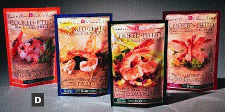
Equally appealing artwork accounts for the second winner, pouches for President's Choice frozen cooked and peeled black tiger shrimp (D). With a standard 454-g weight, the bags also use startling product photography to dramatic effect. But here, beneath the familiar President's Choice logotype and brandmark, product descriptives in English and French frame the artwork and clearly identify the shrimp as jumbo, large or medium, with numerals at the panel's base presenting count range per size.
Specifications aren't given, but the bottom-fill/seal pouch is printed by a Thai firm, Film Master Co. The rear panel of the pouch repeats the fetching typography with nutritional table and bar code, sells through President's Choice sauces and provides a window for product viewing. Circle No. 372.
Sleeve for a sister
Coming up with a component to tempt travelers in duty-free shops worldwide, San Francisco-based DFS Group helps itself to a Mobius first while promoting sales for its sister company, Hawaiian King Candies. It's a highly decorated sleeve prepared 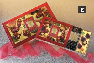 for Christmas '01 marketing of Hawaiian King chocolate-covered macadamia nut royales (E).
Produced by Rose City Printing & Packaging, the sleeve slides over a two-piece telescoping box holding 6-oz Royales (20-piece) and 8-oz Wholes & Halves (16-piece) quantity of nuts. The sleeves were designed by DFS's Packaging Design Studio in San Francisco. Its richly photographed product and the framed gold logotype depicting the company's namesake make an appealing statement to the consumer. Rose City uses a foil-laminated .018 SBS, which it prints via sheet-fed lithography using translucent water-based inks in six-colors on a Planeta press, followed by blind and sculptured embossing for the delicate decoration.
Packaging is created and produced in Honolulu and San Francico, PD learns from Packaging Design Studio's production manager Daryl Buhrman. Following sleeve application, product freshness and the decorated surfaces are protected by a Cryovac MPD-255 shrink film. Circle No. 373.
From discontent a prize
A Mobius first canters out of California. It results from the refusal of Kuzumi Komar's horse to eat commercially available treats. So, when she developed her own organic recipe and it became popular among horses of other riders, she established Blue Mountain Biscuit Co. in Oakland, with world of mouth and some subtle promotion expanding distribution considerably (F).
Marketed under the Grand Prix tradename, the treats are packaged in standup bottom-gusseted pouches featuring a design system by Finger & Smith Design Associates. In 1-, 4- and 8-lb sizes, the zippered pouches use starkly simple copy and graphic elements to good effect; a product identification panel is flanked by line art, a repeat pattern of horses.
The pouches, sold through tack shops and catalogs nationwide, are also built to last by Pacific Bag Co. For the 8-lb size, they are (from the outside) 48-ga polyethylene/adhesive/48-ga metallized PE/adhesive/51/2-mil linear low-desnity PE. For the smaller sizes, a 4-mil LLDPE is used, and for all, the outer polyester layer is reverse-printed via rotogravure in four colors. The zipper structure is from Presto Products. Circle No. 374.
In the black
A redesign that revitalizes a brand lets  Toronto-based Corby Distilleries focus on discerning consumers. The Mobius first for its Polar Ice Vodka (G) honors a distinctive, proprietary 750-mL clear glass bottle that replaces a black container for the premium quadruple-distilled, triple-filtered product (see PD, March, '02, p. 30).
Designed by Pigeon Brand+Design, the Anchor Glass bottle is decorated with clear face and black opaque rear labels, retaining continuity but gaining clarity. The labels are produced by Spear of a 21/2-mil proprietary polyolefin blend supplied as p-s stock by Avery Dennison. Spear screens the face label in one color, the rear label in two.
Neatly, the black also is picked up by the linerless tamper-evident PP closure with breakaway base, produced by Kerr. The total presentation, it is reported, is turning white into black for Corby. Circle No. 375.
More information is available:
Competition: Mobius Awards, 310/540-0959. Circle No. 376.
About the Author(s)
You May Also Like


