Minimalist vs. Maximalist Packaging Designs
Both strategies resonate with today’s consumers for different reasons. Find out which design is better for your brand through these nine examples.

Packaging design is hard to get right. The ideal packaging conveys a company’s mindset and production style to a customer before they’ve even started looking at the product. Like movie posters, there are subtle cues and nearly unconscious expectations from color choice and layout.
Most people prefer a middle ground in packaging design because it feels comfortable, normal, and accessible.
Both minimalist and maximalist designs push at our emotions and make us feel like a product is different from the standard, which is why they’re a popular part of today’s design trends.
What is Minimalism?
Minimalism makes you feel happy with less. It is the aesthetic of not including more information than necessary in product design. It often contains small letters, no iconography other than a company logo, and only a single color.
Minimalist designs usually prefer white and some shade of gray, rather than the bolder contrast of black on white, though you may see subtle embossing or texturing.
Minimalist designs appeal to simplicity. This appeal is especially evident with Apple’s slogan “It Just Works,” reflecting a product design philosophy that requires minimal training, reading user manuals, or configuring complex settings.
In other words, minimalist designs appeal to busy people by implying reduced stress. You’re getting one thing that performs as expected, and that’s far more comfortable than maximalist products that are loud and in-your-face.
Many companies make products for different groups. Apple’s iPhone series is designed as a luxurious but mass-market product (that is, a luxury they want everyone to have — a very unusual approach for products).
Still, some of their other products focus on artists and graphic design professionals.
This focus is evident in packaging design, where boxes for products like the iPad and iMac may show not just the product but how it looks when it’s on. This steps away from minimalism and back towards the middle ground because professionals want quality and reliability more than simplicity.
What is Maximalism?
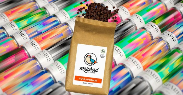
Maximalism makes you want more and is all about impact and details. It implies that you’re getting a lot of a product and that it’s both bold and practical. Maximalism caters to people looking for success and for products that help them feel like they’re getting everything they want in life.
Many products aim for maximalist design because it helps them stand out on crowded shelves where every product is vying for the buyer’s attention.
You can’t sell products if people don’t notice them, so the idea of going big or going home is fundamentally baked into product designs.
Maximalist or minimalist, the fundamental concept here is that packaging should represent both company and product.
There are plenty of resources out there to learn more. Check out this guide from Canva on the color wheel and how to balance colors in packaging, or Landor’s thoughts on the fundamentals of packaging design.
Things are constantly evolving as society moves between trends, so there are always new ideas and philosophies to explore in product and packaging design.
Start the slideshow to see examples and explanations of five minimalist packaging designs and four maximalist ones:
1. Apple’s iconic matte white box is an “experience” in minimalism.
2. Negative space helps eyes rest, find calm.
3. Symmetry reduces complexity.
4. Ultra-refined typography becomes a design element itself.
5. Some patterning is okay.
6. Design elements that fight for attention embody maximalism concepts.
7. Optical illusions are full of movement.
8. Hand-drawn designs evoke smaller or limited runs.
9. Really bold typography makes a statement.
About the Author(s)
You May Also Like


