Minute is in it to win it with redesigned rice packaging

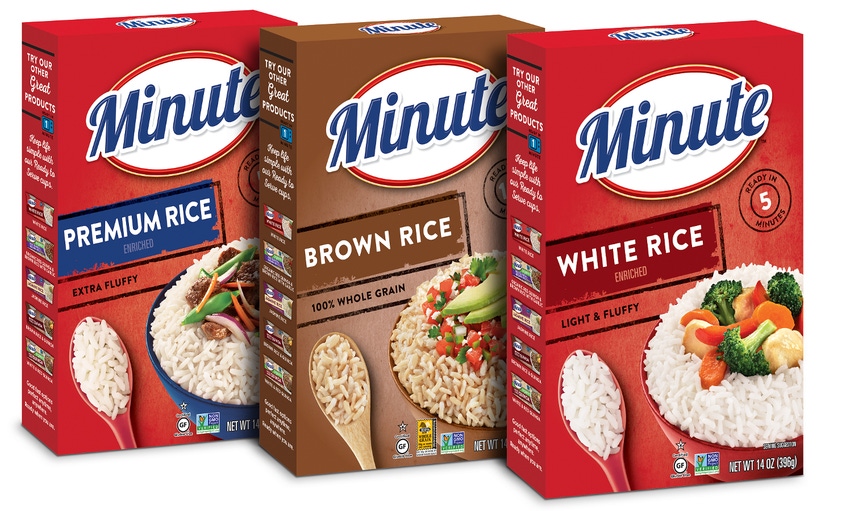
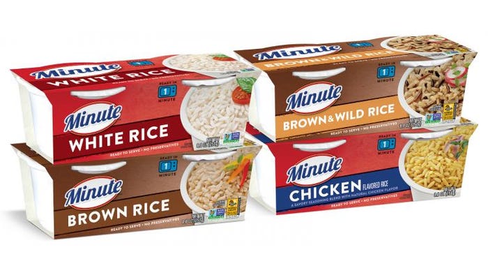
Packaging for Minute brand rice products is newly up to speed, courtesy of a packaging design update by brand owner Riviana Foods Inc. The brand owner worked with Brand Image to redesign the graphics for all Minute Instant and Ready to Serve rice packaging—27 stock-keeping units, in all.
The updated food packaging is simpler and more contemporary than what it replaces, but similar enough to make finding Minute products on-shelf easy for brand loyalists. The design includes a refreshed logo on the front of the packages plus recipes and cooking suggestions on the back that underscore the products’ versatility.
Diane Patterson, senior brand manager for Minute Rice at Riviana Foods, provides some details about the redesigned packaging, which began rolling out in the United States in April 2018.
What Minute brand attributes does the redesign emphasize?
Patterson: Quality, convenience, simplicity, relevance, uniformity/consistency, evolutionary, contemporary. Minute wanted to target the younger consumers and younger generation, but not alienate existing users. We wanted to convey that the brand is becoming more relevant and contemporary to today’s consumers.
How does the redesign convey that?
Patterson: Improved imagery, simple but eye-catching design, focus on core product attributes, graphic icons, clean and consistent design architecture across Instant and Ready to Serve product lines, updated cooking directions/recipe ideas/copy.
While retaining its distinctive red background and brand mark, all product packages now feature a simpler design that incorporates a consistent cook-time call out, an updated logo and modern font.
What drives consumers to purchase our products: taste and convenience. We make sure that is always front and center, and then we provide those added benefits and added values as we progress with our consumers. Their needs change and we need to change with them.
Did you make any changes to the package structures?
Patterson: This was strictly a redesign of package graphics.

What package structures were involved in the redesign?
Patterson: Cartons (Instant, at top of the page) and sleeves (Ready to Serve, above).
How have consumers reacted to the redesigned packaging?
Patterson: So far, favorably overall. We’ll be getting more feedback from our consumer information team soon.
**************************************************************************************
Packaging solutions come to Minneapolis: As part of the region’s largest advanced design and manufacturing event, MinnPack 2018—and the five related shows taking place alongside it—brings 500+ suppliers, 5,000+ peers and 60+ hours of education together under one roof. Register for free today.
About the Author(s)
You May Also Like


