Morton Salt Targets Millennials with Packaging Redesign
New packaging design modernizes Morton Salt’s culinary and home-care products, including augmented reality codes for select products. But the Morton Salt Girl isn’t going anywhere.

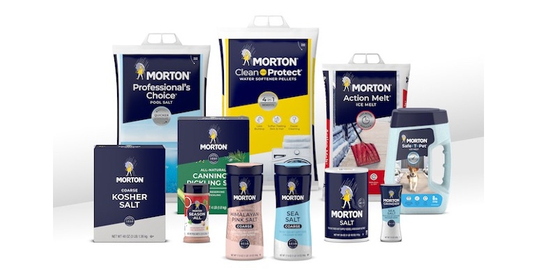
Morton Salt is using packaging design to refresh its home-maintenance and food packaging and make it easier for consumers to shop for Morton products. The new package graphics feature bold angles and salt-related educational content, together with the brand’s familiar colors and the Morton Salt Girl.
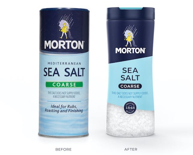
Morton worked with Chase Design Group on the redesign, which includes the How2Recycle label and a quality seal that displays the brand’s founding year of 1848. The new packaging graphics honor Morton Salt’s history while modernizing the brand and engaging with Millennial consumers.
The entire Morton product line is currently rolling out in the new packaging. Products in the culinary category include Morton Kosher Salt, Sea Salt, and Himalayan Pink Salt. The home-care products include Morton Clean Protect Water Softener Pellets, Professional’s Choice Pool Salt, and Action Melt Ice Melt salts.
Starting in December 2020, the packaging for select Morton culinary products will also include a quick response (QR) code that activates fun and educational augmented reality (AR) experiences. Scanning the QR code enables consumers to interact with the new packaging, the Morton Salt Girl, and recipes.
Denise Lauer, chief marketing officer at Morton Salt, and Clark Goolsby, chief creative officer at Chase Design Group, share creative and brand insights in their responses to Packaging Digest's questions about the project.
When did the new packaging start to roll out in the United States?
Lauer: Morton Salt is rolling out its new packaging in a phased approach. Our updated home-care packaging started to appear in market at the end of 2019 and continued to roll out in early 2020. Our refreshed culinary packaging is rolling out throughout 2020 and into early 2021, with the majority of Morton’s new culinary packaging hitting shelves now.
Will the package design be used in other countries?
Lauer: This packaging redesign is focused on the US market, where Morton products are largely sold. It is part of a broader, multiyear brand-modernization effort designed to help strengthen Morton’s appeal and relevance, particularly among Millennial consumers.
How many stock-keeping units (SKUs) were affected by the packaging redesign?
Lauer: We updated Morton Salt’s entire retail portfolio with this packaging refresh — that’s approximately 250 SKUs!
What type of research did Morton and Chase Design Group conduct prior to developing the redesign?
Goolsby: We conducted several rounds of qualitative and quantitative research. We did focus groups on brand territories, multiple qualitative packaging sessions, and quantitative shelf tests.
What insights were gained from the research?
Goolsby: We learned that consumers have great affinity for the Morton Salt Girl, and that they were open to many design directions, as long as she was present. This gave us great freedom in modernizing the brand.
Is the quality seal new, or is it a carry-over from the previous design?
Goolsby: The quality seal is a new addition to the packaging. Morton Salt is an innovative, forward-thinking company, and it wanted its packaging to reflect this. Unlike many historic brands, Morton did not want its packaging to feel like it was from another era.
However, 170 years of business is an incredible achievement and important reassurance for consumers. We created the seal to reflect the consistent, high-quality salt that Morton has produced for more than one and a half centuries.
Was the How2Recycle label already on the packaging, or was it added during the redesign?
Lauer: The How2Recycle label had appeared on a few select Morton products prior to the launch of our new packaging graphics. We extended the How2Recycle label across our entire line of retail products with this packaging redesign.

Did you change the logo?
Goolsby: We did not change the logo. The Morton Salt Girl and wordmark had been updated fairly recently, and the Morton team did not want to further evolve them.
When will the AR packaging roll out?
Lauer: The QR codes will start to appear on select Morton culinary products in mid-December 2020, giving consumers the opportunity to unlock the augmented reality experience and interact with the Morton brand in an exciting new way.
Is the AR packaging going to be used for Morton culinary products only?
Lauer: Correct. The augmented reality experience will be released only on select Morton culinary salts featuring the new packaging design. Consumers should look for Morton culinary products with QR code tags to activate the augmented reality experience.
Did packaging structures change at all? If so, how?
Goolsby: The packaging structures for the salt shakers changed dramatically. The new structure offers transparency so customers can see the beautiful Morton Salt, and an easy-to-pour cap.
What types of packaging structures does Morton use for its various products?
Goolsby: Morton Salt has an incredibly diverse portfolio that spans culinary, pool, ice-melt, and water softening. To contain all of the different types of salt, Morton employs a range of structures.
It uses bags, canisters, jugs, boxes, shakers, and grinders. To accommodate all of these structures, Chase Design Group needed to create a flexible design system that allowed each package to be effective at shelf while maintaining a cohesive brand look.
How have consumers reacted to the new packaging?
Lauer: The consumer response has been very positive! During one consumer study, we learned the new packaging design helped drive positive perceptions in quality, brand trust, and overall appeal. But don’t just take our word for it. Here’s what one consumer had to say: “The product stands out on the shelf more. But the brand still keeps its classic feel with the girl and the umbrella.”
One of the goals of this redesign was to help drive greater awareness, visibility, and shoppability of our full portfolio of products. We believe the end result is a more modern, premium, and cohesive look across our culinary and home-care lines that will help Morton stand out in-store and on the digital shelf.
About the Author(s)
You May Also Like


