New Creamer Label Taps into Friendly Fans
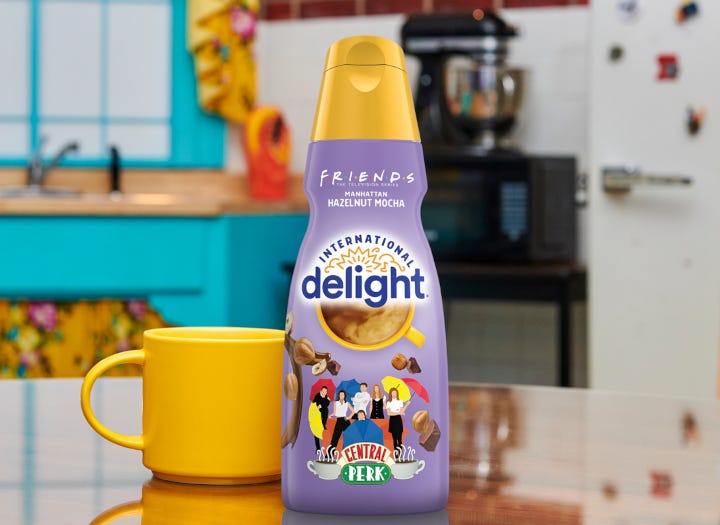
The label design for International Delight’s new limited-edition coffee creamer is “hilariously relatable” for fans of this popular TV show.
Twenty-two million people watched the first episode of the popular TV show Friends. And more than 52 million Americans tuned in to see the final episode, which aired on May 6, 2004. Although almost 20 years has passed since then, about 16 million fans watch the syndicated reruns weekly.
That’s a loyal audience that’s been sustained for more than two decades.
In partnership with show owner Warner Bros. Discovery Global Consumer Products, the marketing folks at Danone, owner of the International Delight brand, created a limited-edition flavor and packaging design that instantly connects with the Friends fanbase — as well as with other consumers looking for an exciting new creamer flavor.
International Delight
In this Packaging Possibilities episode, Lauren Koprowski, Creative Director of Brand Design Strategy at Danone, tells us how the brand team pivoted during a refresh of the entire International Delight brand to bring fun and flavor to this temporary package.
PACKAGING POSSIBILITIES - Season 3: Episode 2
If you have a topic you’d like to propose for a future PACKAGING POSSIBILITIES episode, please email Lisa Pierce at [email protected].
TRANSCRIPT IS AUTO GENERATED
Lisa McTigue Pierce
Hello, this is Lisa Pierce, Executive Editor of Packaging Digest, with another episode of Packaging Possibilities, a podcast that reveals what’s new and what’s next for packaging executives and engineers, designers and developers. And this episode, I’ll be talking with Lauren Koprowski, Creative Director of Brand Design Strategy at Danone, about the packaging design for the company’s new International Delight Coffee Creamer, Manhattan Hazelnut Mocha. The label of this new product ties into the wildly popular TV series Friends. Its last episode aired May 6, 2004, with more than 52 million Americans tuning in. And still today, about 16 million fans watch the syndicated reruns weekly. Not a bad audience to reach with this new product.
Let’s find out more about the packaging design. Lauren, hi. Thanks so much for taking the time to talk with us.
Lauren Koprowski (guest)
Hi, Lisa. Thank you for having me. And by me, I mean, you know, my whole Danone gang that wasn’t able to join us, but I’ll be representing them. So, thank you.
Lisa McTigue Pierce
Yes, excellent. Thank you. As soon as I heard about the tie in to the Friends TV show, which I did watch, it made perfect sense for a coffee creamer because so much of the friends’ time was actually spent in the coffee shop, Central Perk, that they used to go to all the time.
Lauren Koprowski (guest)
That’s right.
Lisa McTigue Pierce
But Lauren, tell us, how did this project get started and all come together? And also as part of that, what’s involved with the licensing and the partnership that you have with Warner Brothers Discovery Global consumer products?
Lauren Koprowski (guest)
Friends is one of the most iconic TV shows. Very beloved. It’s super loved, super watched, super engaging, right? There’s so many people still engaged in a show that really isn’t live or airing and not having new content. But you know, the idea …
Lisa McTigue Pierce
Very much still relevant with the people. Yep.
Lauren Koprowski (guest)
Yeah, exactly. But the but the idea of not just the show, but also Central Perk was a perfect kind of mutually beneficial matchup and alignment with the International Delight brand. So as a brand, you know, we’re really collaboration focused.
We call them limited time editions, which we know consumers love, having something new to spice up there every day and something that they can look forward to and again capture their attention in the store.
But really, as a brand, we’re all about flavor. Everything we do is about transforming that cup of coffee. And when you think about it, that’s exactly what the Friends show is doing. Much of the show actually took place in Central Perk Cafe. So the synergy just made complete sense. You kind of think about, like, why you would partner with different brands. And this one was just a … it was a no brainer. So we knew it would be exciting for our consumer. We knew our brands were very similar, in terms of like humor and levity and being about joy and laughter. So you know, partnering with Warner Brothers Discovery Global Consumer Products was just meant to be. And so something that our super fans would love and you know, just came, came really naturally.
Lisa McTigue Pierce
Laura, I seem to remember reading, though, that this was this is not the first partnership that you had with them, correct though? So this is kind of like an ongoing thing and looking for new opportunities?
Lauren Koprowski (guest)
Yeah, yeah, yeah. I think, you know, we’re always, we try to have, you know, two new limited time offers per year to keep things interesting, to make sure that we’re continuing to engage with our consumer. So you know, it’s a really strong relationship that we continue to reinvent. But also we do it, so that again, it’s mutually beneficial to both brands — that both brands have similar values and qualities; that it’s like minded and it makes sense for both brands, which I think is really valuable these days because anybody can partner, right? Anyone can kind of slap a different brand on their brand and and it doesn’t always have, you know … it’s not always the perfect brand fit. But in this situation with our partnership, we’re really thoughtful about why it makes sense for the two brands to work together and what it does from, like, an engagement perspective, which I think is so much bigger than just “we can partner together,” right?
Lisa McTigue Pierce
Mm-hmm. Yep.
Lauren Koprowski (guest)
So it makes it a very valuable experience for both parties.
Lisa McTigue Pierce
Right.
Lauren Koprowski (guest)
And ultimately our consumers we care the most about.
Lisa McTigue Pierce
Yes, yes. So limited edition. I think one of the things that I like about this, and I know you have, you try to do two limited editions per year, usually tied in with some event that’s happening, whether it’s a holiday or you know something else. One of the things that I love about this, is it is a limited edition, so you know you’re going to get people interested in, you know, making sure they get their product while it’s still out. But it doesn’t tie into a singular event. It’s more of a, you know, community of, you know, the Friend’s fans, which I really loved being one of them.
Lauren Koprowski (guest)
Yeah, yeah.
Lisa McTigue Pierce
But I wanted to ask … limited edition. So how long is this on shelf?
Lauren Koprowski (guest)
Limited edition can mean different things for different brands. For us, we do play into — just to your point — we do play into seasonal moments. So we have other things like the Grinch, you know. But for this one, it was really about like playing into a cultural moment that we’re a part of, right?
You know, determining, you know, we wanna do this together. Then what flavors fit. And then of course, like, how does that fit with time of year? And luckily this flavor actually, you know, the Manhattan Mocha coffee felt like it actually was something that could really last throughout the year.
So I don’t think it’s necessarily, you know, gonna be kind of a cut off at a certain hard point. It will be around until July, June-July-ish, basically until supplies last. So again, it’s not a hard … we don't have a hard date like we would on something like the Grinch. This will be around until were done making it …
Lisa McTigue Pierce
Sure.
Lauren Koprowski (guest)
… and people are done enjoying it and until we have the next new news to bring to shelf and surprises, so.
Lisa McTigue Pierce
OK, good answer. Thank you for that.
International Delight
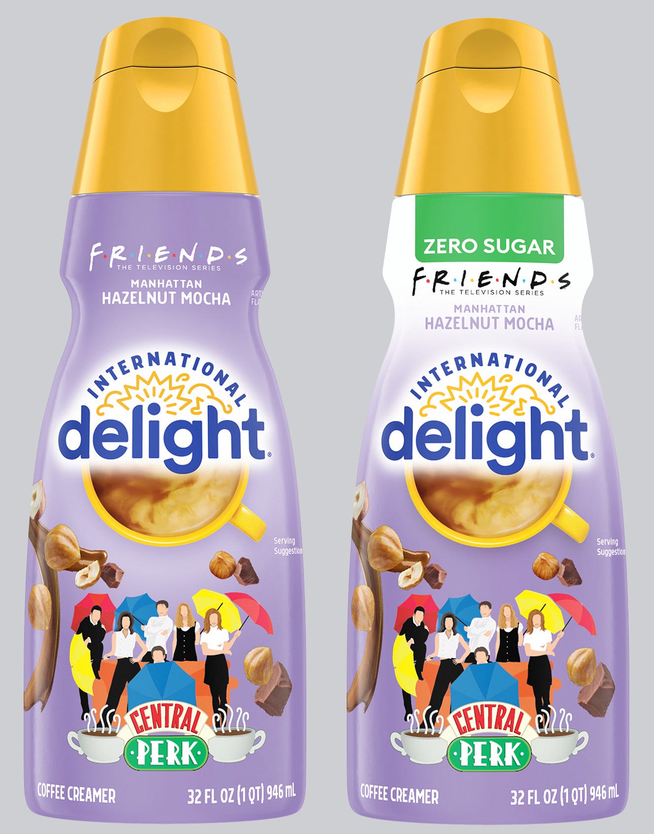
So I will have a photo of the package so that people can see it on the web page where we do host the podcast. But the package itself, the bottle and the closure are the same as your other creamer flavors. It’s the same shape, the same size. But, of course, the label is different. So let’s talk about the graphics just a little bit.
Lauren Koprowski (guest)
Yeah, love to.
Lisa McTigue Pierce
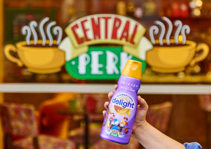
The thing that caught my eye immediately is the Friends logo up at the top center. Great display for that, including those colored dots within the logo. There’s a lot of pleasant surprises, I can say, throughout the entire label for Friends fans. So tell us a little bit about how the graphics all developed and maybe point out some of the some of the features.
Lauren Koprowski (guest)
Sure. Absolutely. Absolutely. So this was such a fun one. I mean, obviously. I’ll start by saying.
There’s nothing our design team loves more than actually being able to immerse ourselves in the brand. So we had a little showing party, little Friends showing party when we kicked off this, along with our design brief, so we could all get really in the mode of Friends. And like even surprisingly, some people on our team, like, hadn’t watched as many episodes as some of us as, you know, there’s age factors into these things.
Lisa McTigue Pierce
It went 10 seasons. That’s a lot of episodes. Yep.
Lauren Koprowski (guest)
You see, it’s crazy. Its crazy.
So you know, we really got into the creative mindset of Friends. We already knew ideas a brand cause it’s our baby, but we wanted to also get into the mindset of Friends characters, who they were, their environment.
The team that worked on this was split between Manhattan and Colorado. So for the Coloradoans, we had to get them to like really understand the Manhattan ideal. But it was perfect because actually we were just wrapping up our International Delight rebrand and redesign. So everything kind of hinged off of that, which was a huge opportunity for us to really reset the brand and refresh the brand identity to … really again, the whole point of it was to play up this idea of transforming the way we leave our cups of coffee into, like, this whole room-to-party moment, which is joyful, full of celebration, opportunity for self-expression because, like, let’s face it, everyone takes their coffee differently, right?
Lisa McTigue Pierce
Yes, customized.
Lauren Koprowski (guest)
Like you’re the way you take your coffee says a little bit about you and your lifestyle and other things. So we had recently redesigned to make sure that we were really reflecting, kind of, the essence of the brand.
And for this consumer, it’s different than other creamer and coffee … like coffee-house brands. It’s much less about that serious, perfect, you know … I’m trying to think of the, the name … but that perfect cup of coffee, you know, perfectly measured. It’s much more about the delicious flavor that ID [International Delight] brings to your cup. So knowing our consumers. So flavor driven. We wanted to make sure that as a brand anything we do is really dialing that flavor up to an 11.
So with the new packaging design, that meant reframing the brand mark, which now always has that iconic yellow morning kind of cup of coffee in the center. You see that bullseye right there.
Lisa McTigue Pierce
Yes. Mm-hmm.
Lauren Koprowski (guest)
The halo above it, like, really representing the idea of delight and each kind of cup being paired with that dynamic flavor depiction. So you’re seeing, especially on this bottle, like all of the flavor cues kind of essentially bringing the flavor party to the pack.
Lisa McTigue Pierce
Mm-hmm. Yep. The hazelnuts and the chocolate. Yep.
Lauren Koprowski (guest)
Exactly. And like making sure they look delicious and beautiful. And, again, at shelf, really, really turning up that deliciousness, right? You have to have it.
Each bottle, actually, like, top down, we change color, which is … in the branding world, right? … goes against almost everything. Every brief is always like, “Own a brand color.” Well, ID flips that on its head, right. We are flavor driven. So we actually take the opportunity to have our whole bottle change colors per flavor. So for Friends that made so much sense. So it’s like an immediate … the light purple and making sure that we had like the Friends logo tied up with our logo. And again having those synergistic design elements that really still work with that core brand identity refresh, but also making sure that we bring the Friends assets and, kind of, equities into this. So it’s immediately recognizable, but also something that’s immediately different enough but still fits within the brand and how our consumers shop the brand.
Lisa McTigue Pierce
And the purple, Lauren, that was Monica’s apartment color, correct? From what I remember.
Lauren Koprowski (guest)
Yes, yes.
Lisa McTigue Pierce
OK. Yep. Got it.
Lauren Koprowski (guest)
I don’t know if it’s the exact same Pantone, but we tried pretty, pretty, pretty hard.
So everything from, again, bringing the characters to the front of the pack — that was a huge thing. Of course, we’re not using like all of the detail of their faces. We don’t own the rights to their faces.
Lisa McTigue Pierce
Ah. I was wondering about that.
Lauren Koprowski (guest)
But … But it’s perfect because it’s just enough that you know who the squad was …
Lisa McTigue Pierce
Right. Just to …
Lauren Koprowski (guest)
Along with the …
Lisa McTigue Pierce
Just to explain, at the bottom of the front label there is that, again I would say iconic, shot of the Friends characters from the open … the show’s opening credits, where they’ve got the umbrellas by the couch and they’re all running around, fooling around, playing around there at the couch. The Central Perk couch, no less. And so I did want to ask … because of course the characters are immediately recognized. But I did notice that there were no faces on them.
Lauren Koprowski (guest)
Yeah, exactly.
Lisa McTigue Pierce
So excellent for explaining that.
International Delight
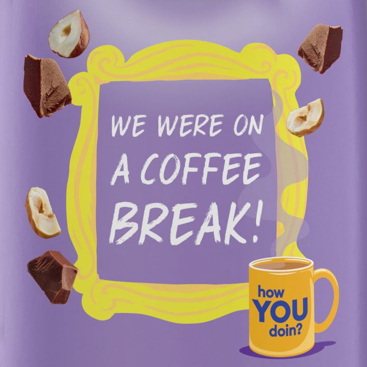
One of the other things that I absolutely loved was all the friendly surprises … the Friends references throughout the entire label that the fans are gonna immediately recognize and appreciate. It’s kind of like the insiders, we’re insiders. And on the back label is the picture frame that’s on Monica’s apartment door, but adding a big, fun fact in there that, again, insiders will understand … where it’s got the words “We were on a coffee break,” which is, you know, kind of like a little bit of a, you know, a play on those, on the words …
Lauren Koprowski (guest)
Tongue in cheek. Yeah, yeah.
Lisa McTigue Pierce
Yeah, yeah, yeah. And it’s so, it’s so fun that you slightly changed Ross’s line …
Lauren Koprowski (guest)
Exactly.
Lisa McTigue Pierce
… that he and Rachel were on a break when he cheated on her, and then also another famous famous line from the show, Joey and his pickup line, “How you doin’?” And I don’t, I did not do it justice … I did not do it justice. I know.
Lauren Koprowski (guest)
Umm, I love the way you said that. No, you did. You did. That was really good.
Lisa McTigue Pierce
But the, um … these are the … I know that there’s a couple of different flavors in the Friends limited edition. So are these the same graphics on all the Friends creamers? And tell us a little bit about the number of stock keeping units that you had.
Lauren Koprowski (guest)
Sure, sure. So I think going to starting with the brand voice, again, part of that redesign, we wanted to make sure that we were like … the way we think about it is like hilariously relatable, which I think is just so spot on.
International Delight is a brand for everyone and all types of people. But we also like to have fun, right. And and we’re not just visually fun, but also packaging is no longer just about, like, selling the thing, right, but also continuing the engagement, continuing the story and, like, bringing people in to see another dimension of the brand.
On our, on our some of our core ID things we talk … we, you know, we say things like “Pour that vanilla stat.” You know, we really trying to take on, like, the human voice of ID that’s relatable and also has a little bit of a wink. So we wanted to tie that into this as well and look for more opportunities or Easter Eggs, if you will, for people to continue to find those great little aha moments. You can imagine you just pour your creamer and then you’re turning around the bottle and taking the first sip and, like, use a little laugh to your day and most likely your morning.
So. So we like, you know, reinforcing those pop culture ties in our own way. And again, Warner was excellent in helping us identify what kind of iconography and things that we can use along with the language to have those little surprising kind of fun, bright moments.
So things like the Central Perk sign, the purple backdrop, the frame. Like you said, “We were on a break.” All those things are just things that fans will immediately recognize and hopefully smile and that’s the intent of really what we’re trying to do.
Lisa McTigue Pierce
It worked for me.
Lauren Koprowski (guest)
Yeah. Great, great, great.
Lisa McTigue Pierce
So you do have a couple of different stock-keeping units, regular and sugar-free correct? So those are two that you’re doing.
International Delight
Lauren Koprowski (guest)
We do. Yeah, yeah.
Lisa McTigue Pierce
OK. Excellent. Thank you for that.
So there’s so much about the packaging that we’ve already talked about, but the flavor even itself ties in with the show, which I know fans are gonna recognize. And if you give me just one second … you did issue a press release. And I just want to quote from it as you explain how the flavor ties into the show. So the press release explains, quote: “Inspired by Central Perk’s Manhattan Mocha Coffee, which eagle-eye Friends superfans may have spotted on the famed coffee shop’s chalkboard menu, the boldly flavored creamer features hints of hazelnut, mouthfuls of mocha, and all the excitement of Manhattan. One sip and you’ll be thinking, Hazelnut? Good. Mocha? Gooooooood.” Unquote.
Can you talk a little bit more about the tie-in with the flavor and is there a possibility that this particular flavor is going to be a become permanent in your line and, you know, why or why not?
Lauren Koprowski (guest)
I wish I could. I wish I could speak to that, but I will say we’re always, we’re always tinkering and have things in the works. But I can’t confirm whether this would stick around. But I will say, we referenced that original, you know, chalkboard menu and Central Perk multiple times. That was like one of … when we started to identify like one of the most memorable things that you think of when you think of Friends. And if you had to close your eyes and describe, right? Like, that was one of the big ones, and the couch.
And so the Manhattan Mocha coffee was what was spotted kind of on the chalkboard menu and that kind of gave way for us to work with Warner to come up with the Manhattan Hazelnut Mocha creamer flavor, which is really, we think … the hazelnut you know is that nice tie in, the mouthfuls of mocha, and all the kind of excitement of when you think of Manhattan, it kind of embodies all of that.
Really it was like, we want people to experience this flavor, taste it, and then love the idea of it almost transporting this kind of coffee from their homes to the most iconic orange couch and really sitcom history. That was the idea … was bringing the flavor to them and having that again, that direct tie in as closely as possible. And also making sure that obviously whatever flavor we choose, as much as people are looking for surprise and delight, it’s also something that would be highly lovable and super delicious.
Lisa McTigue Pierce
Thank you for the explanation on that. I do think that the design, even though I am a Friend’s fan — don’t know that I call myself a super fan. I think I’ve seen all the episodes, but I can’t promise — but I do think that one of the things that did strike me about this package is even people who aren’t a fan of Friends would still be interested in this because of all the flavor cues. Number one, because of the flavor. But then all the flavor cues that you’ve added to the package. So in that regard, I think the package design speaks on so many different levels, like you’ve already pointed out.
Lauren Koprowski (guest)
Yeah.
Lisa McTigue Pierce
OK. The other thing that I love about package, packages, is when the closures are oriented. So the front of the closure actually opens with the front of the label, which is always kind of nice. And I know that you do that deliberately. Thank you for doing that. And I’m just wondering … the, the orientation of the label, how do you get the label to … the shrink label, full-body shrink label … how do you control the positioning of that so that the graphics line up correctly? Because there is, you know, a flat surface here on the front of the label. And the back of the bottle, even though it’s a round bottle, there is a definitive front and back to this package. So how do you do that?
Lauren Koprowski (guest)
Yeah, we work very hard to do it. Just say right off the bat. And anyone who works in packaging, right, knows how challenging this could be. So sometimes it can get a little off, off on the line, especially since COVID. We’ve definitely seen unprecedented demand due to at home coffee habits increasing and changing. And what we’ve said is, “Listen. It won’t always be perfect.” We do a lot to make sure that the positioning is as accurate as possible, more often than not. We do work to make sure that it’s perfectly aligned, but we’ve really chosen from, like, a business perspective and, you know, for our consumers who really love our product, we’ve chosen to really prioritize getting as many of bottles on shelf. But of course, the idea is for us to always ensure consistency of how those shrink labels really are aligned.
As you mentioned, we do always have the oriented closure, which makes a huge difference. So. But more often than not, especially on things that are not as long of a run, so like the Friends bottles, they do end up looking really beautiful and accurate.
Lisa McTigue Pierce
OK. Thank you for that.
All of your closures are at the same color, correct? I mean throughout your product line?
Lauren Koprowski (guest)
Yeah.
Lisa McTigue Pierce
That is so smart, Lauren, to be able to optimize …
Lauren Koprowski (guest)
On some areas. We definitely would like to have some different colors. But yes, right now, it’s all consistent, which is kind of nice because, again as I said, we have a rainbow on shelf, and this is something that’s like a really nice kind of red thread or gold thread on shelf for people to always know it’s ID.
So from a shopability and navigation perspective, it really does help quite tremendously, as well as, like, obviously …
Lisa McTigue Pierce
A family look.
Lauren Koprowski (guest)
Efficiently, it’s more efficient so. Yeah. So yeah.
Lisa McTigue Pierce
Yes. I understand that on the packaging line, sure. If you don’t have to change something over, don’t change it over.
Lauren Koprowski (guest)
Mm-hmm. Exactly. Exactly. Exactly.
Lisa McTigue Pierce
So, Lauren, those were all the questions that I have, but is there anything else about the package or the project that I haven’t thought to ask that you feel compelled to tell us?
Lauren Koprowski (guest)
Sure, sure, sure.
It’s a really exciting time for International Delight from a design perspective, not just packaging. You know, with this rebrand and with exciting limited-edition partnerships like Friends, we’ve been able to really bring the brand experience, the true brand experience, that idealistic brand experience to life.
You’ll be seeing much more from us too. And our brand activation and our brand world that kind of compliments our packaging. So everything coming together to really amplify that Flavor Nation idea that we’re bringing to life.
We continue to see things beyond just packaging that are pretty exciting from us from like an activation standpoint, again, playing up more of those Easter Eggs that you mentioned, really having our experience kind of go beyond what is like the functional kind of side of the brand and really playing into what people love about us, which is all about fun and joy and playfulness.
And we’re so lucky that we have such great partners in Warner to make sure that we can continue to have excitement that we bring to bring to their coffee cups.
Lisa McTigue Pierce
Wonderful.
Lauren Koprowski (guest)
So we hope everyone gets to try it.
Lisa McTigue Pierce
Yeah, yeah, yeah. One thing that I thought, the rebrand, the refresh �… is this the first limited edition since you’ve done that?
Lauren Koprowski (guest)
It’s actually the second. The Grinch was first and then Friends. But you’ll see more to come.
And, again, our shelf is starting to completely transform with this new rebrand. And, again, now you’ll start to see beyond just the packaging. You’ll see the brand world starting to change. So everything from our in-store key visuals and shopper experience to digital. Everything will start to really be filled with personality from both a visual perspective and their verbal identity perspective.
This is really our moment for ID. And breaking, making sure that every, all the creativity kind of comes to life. Yeah, we’re really excited.
Lisa McTigue Pierce
Great. Lauren, thank you so much for explaining that. It’s always nice to dive in and get some juicy details about a new packaging design. Yep.
Lauren Koprowski (guest)
And thank you for doing this podcast. That’s excellent. So we love it.
Lisa McTigue Pierce
My pleasure. Appreciate it.
Lauren Koprowski (guest)
Thank you.
About the Author(s)
You May Also Like


