New Kleenex Packaging Elevates ‘Softness’ and Modernizes
New package graphics offer a contemporary, simplified aesthetic designed to attract consumers of all ages.

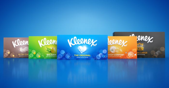
New graphics for Kleenex boxes sold in the UK and Europe leverages the strong color recognition of the previous packaging but is bolder and more contemporary.Echo
Kleenex, working with London-based brand design agency Echo, has redesigned the packaging for Core Tissues sold in the United Kingdom and Europe. The new packs began rolling out in February 2023.
Goals for Kleenex’s new packaging design were to elevate the brand using unique, premium styling; to simplify the product portfolio, with clear communication about the individual products and a consistent look and feel for the product family; and to refresh the brand, for heightened appeal among younger consumers.
The new stripped-down package graphics are deployed on all package formats used for the product line: boxes, pocket packs, and wipes packaging.
Package structures are unchanged; however, the box collar (through which tissues are dispensed) is made of paper flaps rather than slit plastic film.
With a nod to the brand’s heritage, the Kleenex brandmark retains its dominant position on the packaging. Product benefits play an important role in the redesign, with a new icon system communicating the benefits of specific products.
“The suite of icons was created in a holistic style that helped communicate softness across the entire family of products,” says Echo designer Duncan Anderson.
“We used iconography to communicate an additional benefit for two of the packs. For Balsam, we used a nose icon, to highlight how the product soothes the nose and surrounding area. For Allergy Comfort, we used an eye, to emphasize comfort around the eye area and face,” he explains.
Anderson adds that packages for added-benefits products, such as Kleenex Ultra Soft tissues, “were made to be more premium packs, using metallic [ink] colors for extra luxe.”
The redesign’s revised palette leverages the strong color recognition of the previous packaging but is bolder and more contemporary. The new graphics also are treated with a bokeh pattern — a pleasing, soft-focus effect — to emphasize softness.
The design team considered using a soft-touch finish on the packaging, as well as foils and embossing, but chose not to, for budgetary reasons.
The design team considered using a soft-touch finish on the packaging, as well as foils and embossing, but chose not to, for budgetary reasons.
In addition to making the packaging stand out on-shelf and ensuring easy product navigation for consumers, the new graphics work well outside of the retail environment. “The designs were created with an in-home look in mind and to blend into any environment,” Anderson says.
About the Author(s)
You May Also Like


