

Sign up for the Packaging Digest News & Insights newsletter.
Packaging Designs Speak to Immunity and Mood Management
12 Min Read

Consumers worried about their physical and/or mental health, perhaps triggered by the COVID-19 pandemic, look for products that reassure them, with package colors, such as orange to indicate Vitamin C, or precise immunity claims on the label.
The physical health threat that COVID-19 poses, together with pandemic-related fear and uneasiness, are driving sales of products that enhance immunity or improve mental well-being. Brand owners in those categories, in turn, are taking a close look at packaging design to assure product safety and communicate product benefits to stressed-out, health-minded consumers.
The health/wellness products affected include packaged foods and drinks, vitamins, supplements, and even essential oils. The products’ physical and mental health benefits range from immune-system support to improved sleep.
In a recent consumer study conducted by Bend, OR-based InsightsNow, 36% of participants reported making changes to their diet and supplement consumption to boost immunity. Of those, 65% said they were taking more vitamins and supplements, particularly zinc and Vitamin C.
Reports from packagers resonate with that trend. Batavia, IL-based GreenSeed Contract Packaging, which specializes in custom packaging for natural and nutritional dry foods and beverages, has seen a shift in demand since the pandemic started.
“We are fully equipped for supplement and nutraceutical packaging solutions, which we’ve seen increase tenfold since the pandemic, as consumers look for ways to boost immunity in their diets,” says GreenSeed CEO David Gray.
“We’ve seen about a 133% increase in demand for immunity-boosting products since the pandemic, as everyone stocks up on supplements and other healthy, natural food products to stay healthy,” Gray adds. “Supplements and nutraceutical demand is up, but we’ve also seen more CPGs [consumer packaged goods companies] adding additional immunity-boosting features to their regular food and beverage products.”
Healthy body, healthy mind.
Even before the pandemic struck, consumers were including mental well-being in their definition of health/wellness. That mindset bodes well for sales of products geared to mood enhancement, relaxation, and anxiety relief — and demand for appropriate packaging — in the current health-focused climate.
According to the recently released “Global Food and Drink Trends 2030” report from Mintel, a global research firm, more consumers are considering mental health along with exercise and diet as they manage their personal health.
“This holistic health and wellness approach has inspired consumers to seek products that can improve mood and boost brain health. In particular, high rates of stress and anxiety find consumers open to emerging functional ingredients, including adaptogens and nootropics,” says David Luttenberger, Mintel global packaging director.
Cannabis continues to be the primary anxiety reliever, for some. A recent study from AmericanMarijuana.org that asked 1,017 US cannabis consumers about how COVID-19 has changed their “weed-smoking habits” found that 65.49% of the participants “are fine with weed and haven’t used any anxiety relief supplements.” However, 34.51% have used other anxiety relief supplements since the pandemic started.
Early in the COVID-19 lockdown phase, demand for some cannabis products soared. “Our cannabis-beverage sales in California were up 42% for the month of March [2020],” says Kenny Morrison, founder and CEO of Venice, CA-basedVCC Brands, a manufacturer and distributor of cannabis-infused products.
The company’s beverage brands include Subtle Tea, which launched in two ready-to-drink formulations in early 2020. Broad Spectrum Subtle Tea is an adaptogenic, cold-brewed tea infused with hemp-derived CBD — but not with the psychoactive compound THC.
The other formulation, Full Spectrum Subtle Tea, comes in two potencies: one infused with THC only and the other with a combination of THC and CBD. Full Spectrum Subtle Tea, in 8-oz bottles, is sold through cannabis dispensaries in California.
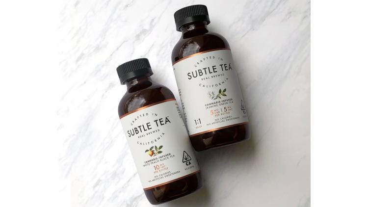
To comply with the State of California’s cannabis-packaging requirements, Full Spectrum Subtle Tea is filled into amber bottles. But the Broad Spectrum formulation does not require opaque packaging, because it does not contain THC. Broad Spectrum Subtle Tea is sold in 16-oz bottles at California retailers such as upscale Erewhon Market.
“Coming from the cannabis space, where all products need to be packaged in opaque packaging, we knew we wanted [Broad Spectrum Subtle Tea] to be visible,” explains Tad Jacobs, design director of VCC Brands. Colorless glass packaging was the obvious choice.
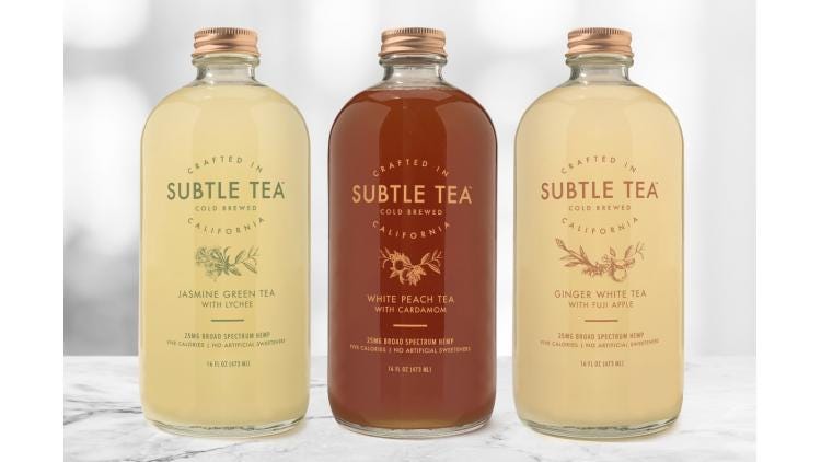
“We chose glass Boston round bottles, because they have a simple, healthy, medicinal visual quality right off the bat,” Jacobs says.
“The main thing we learned about packaging over the years and have been unable to do because of our opaque packaging rules, is to let the product be the star,” he adds. “Just putting the beautiful natural color of the [Broad Spectrum] tea in a glass Boston round bottle, you’re 90% there. The last step was to lay out the information clearly and choose label colors that complement and harmonize with the tea’s natural color.”
Safe for consumers and the planet.
Although COVID-19 fears have spurred new approaches to hygienic packaging, especially for food and beverages, widespread safety-related changes to packaging have not materialized. “We have not seen any examples of ‘pack switching’ — brands quickly changing from one pack format or material — in direct response to COVID-19 fears of contamination or safety,” Luttenberger reports.
“That said, Mintel’s Global COVID-19 Tracker data from May 6 - 15, 2020, reveals 55% of US consumers are still worried about exposure to COVID-19, and 28% are still worried about the safety of the food and drink products they buy, which is 11% greater than during the April 29 - May 6 period,” he says.
Brands and suppliers that design packaging for health/wellness products are fully aware of that anxiety.
“Packaging design that lacks a connection to safety and protection — both to our bodies and environment — will struggle in a post-COVID-19 world. In light of the pandemic, consumers’ flight to well-being is more top of mind than ever, and they will gravitate towards products that provide a feeling of security and comfort,” says Josh White, principal and creative director of New York City-based brand and design agency OffWhite Co.
“To position themselves for success, brands will need to pivot to this new reality and either adapt their brand positioning or fast-track sustainable initiatives in the pipeline,” White adds. His agency is “seeing this transformative rush firsthand, as current and new clients try to understand how a boosted focus on well-being will impact their businesses and product offerings.”
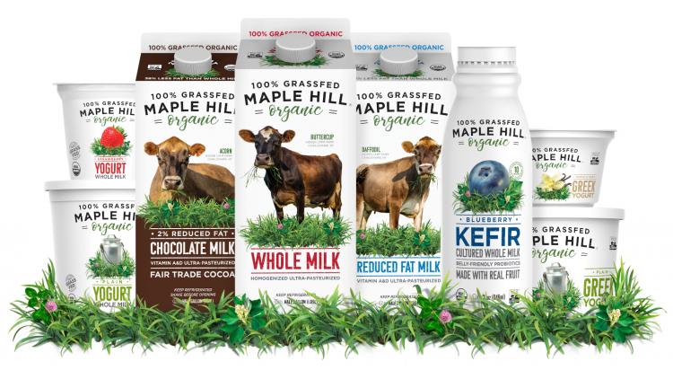
As an example, White points to Maple Hill Organic 100% Grassfed, a dairy client that “has used this COVID time to better understand consumer behavior and pivot the brand from its current 100% Grassfed positioning to a Better Organic or Organic 3.0 value proposition. This shift in mindset opens new possibilities for growth and expansion into new and innovative product opportunities.”
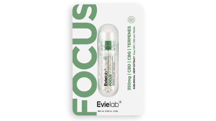
Product safety can take a more tangible form, as well, via packaging designs that assure product purity and protection from contaminants. CBD-supplement maker Evielab, Los Angeles, designed those characteristics into the “doser stick” packaging for its new solid, sublingual CBD micropearls. The product line launched during the pandemic.
The doser stick “distributes pearl by pearl. You just need to twist [the dispenser end] a quarter, and the pearl arrives, avoiding finger contact,” explains Evielab owner Xavier Suid.“We were ready before the context of the virus. The product was already conceived to avoid contamination and skin contact. That’s what we didn’t like with tinctures and gummies. For Evielab, it was one of the imperative characteristics — no skin contact, no contamination.”
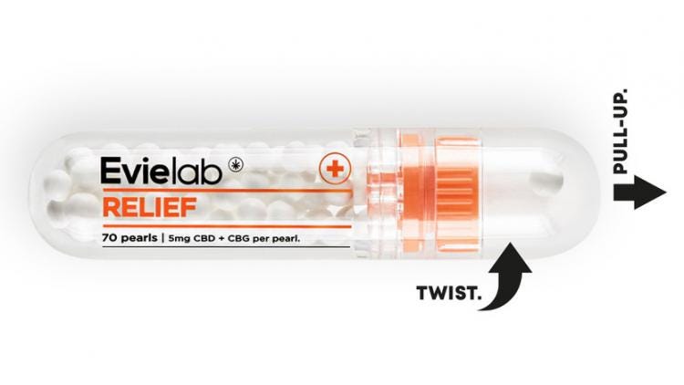
Evielab’s pocket-sized package is made from transparent pharmaceutical-grade plastic. To differentiate the eight stock-keeping units (SKUs), Evielab color-codes the doser sticks and accompanying blister cards by desired effect. SKUs include Immunity, Relax, Sleep, and Relief.
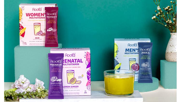
As for sustainable-packaging initiatives, vitamin brand Root’d has a goal of ultimately using no plastic packaging at all. Until that is possible, the company has pledged to use no more than 5% plastic in its packaging. Root’d also donates 1% of its sales for tree planting and another 1% for removing plastic from the ocean.
Root’d daily multivitamins are formulated as sugar-free “fizzy healthy drink” mixes. The three product formulations — Men’s, Women’s, and Prenatal — are packaged in cartons of stick packs.
Crafting on-pack claims.
To help safeguard the public from fraudulent COVID-19 treatments and preventives, the US Food & Drug Administration (FDA) and other health authorities are closely monitoring dietary supplements’ on-pack claims, including those related to immunity.
Nutritional Outlook reports that the phrase “immune support” is more acceptable to the FDA than wording that suggests a product can “defend,” “boost,” “protect,” or “build” a person’s immune system.
From a marketing perspective, less is more when it comes to on-pack claims. “The easiest way for brands to communicate health is by leading with the communication of key compelling claims to reassure the consumer. Too many brands, however, try and communicate too much,” says Richard Palmer, creative director at White Plains, NY-based branding agency Little Big Brands.
“By understanding what claims consumers are really looking for, and focusing on a couple of those, vs. a laundry list, a brand can create much more impact,” Palmer adds, noting that consumers have grown more informed about health and wellness, including ingredients and benefits. “Consumers are very savvy, and more and more used to weeding out brands that have created claims or are touting ‘marketing speak.’”
For obvious reasons, brand claims “that speak specifically to enhancing immunity are particularly interesting to consumers at the moment,” says Pamela Long, partner at Little Big Brands.
“Our work for Emergen-C is an example of a brand that consumers are looking for, or discovering now for the first time, especially some of the new innovations that speak to enhanced health needs, as well as combining unique form and function,” she says.
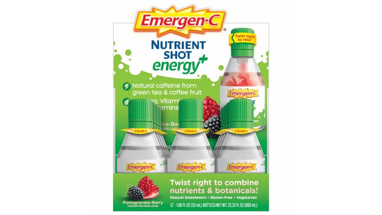
The brand’s innovations include Emergen-C Nutrient Shot Energy+ products, which are packaged in single-serve bottles. Immediately before consuming a shot, the consumer twists the closure clockwise to mix the powder in the cap with the liquid in the bottle.
Certifiably fun.
For any product claim, an on-pack certification can add credibility. “Better-for-you claims are resonating well with today’s consumers, who are looking for quick fixes to be healthier, both physically and emotionally, especially when those claims are backed by a certified organization,” says White.
Consider the packaging that OffWhite designed for Nightfood Nighttime Ice Cream. White explains that the brand “recently extended its ‘better-for-you, night-friendly ice cream that doesn’t mess with your sleep’ message to pregnant and nursing women as a healthy option to satisfy cravings.” To add authority to that positioning, the packaging states that Nightfood is the only ice cream endorsed by the American Pregnancy Association.
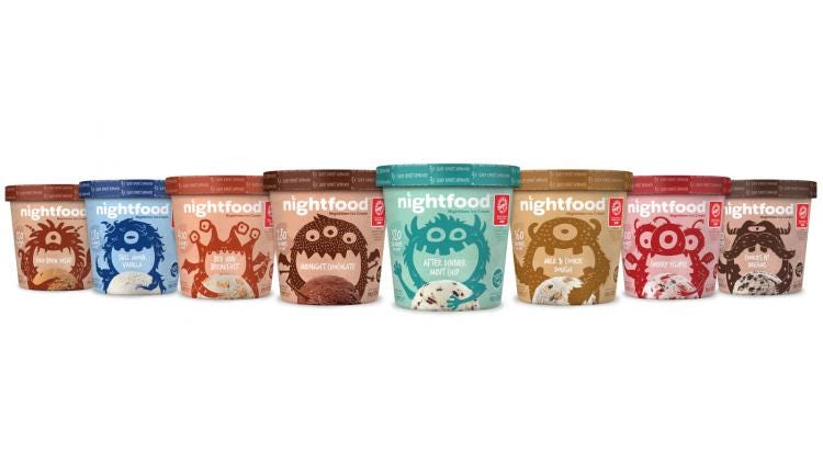
Nightfood’s package graphics create an emotional connection with consumers, as well. “We helped launch a special Pickles For Two flavor, with brand positioning that echoes the playfulness of the entire line,” White says. “Fun monster illustrations, called CraveMonsters, dominate Nightfood’s packaging, each hugging its favorite flavor and communicating the brand’s better-for-you message in a healthy, delicious, and fun way.”

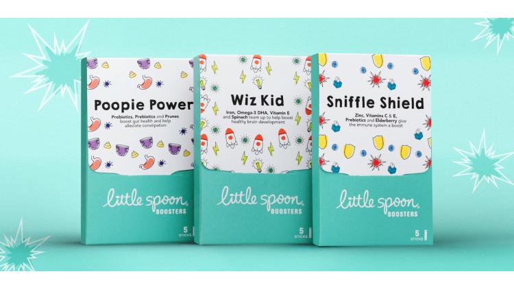
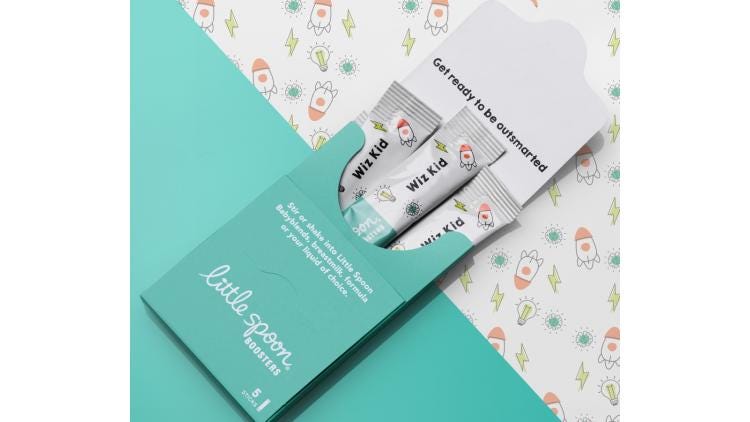
A similar graphics strategy — one that communicates wellness benefits but is also whimsical — is evident in Little Big Brands’ packaging design for Little Spoon Boosters for babies. The products include vitamins and probiotics.
Little Spoon, an organic, fresh baby food brand, launched Boosters in early 2020.Targeting immunity, gut health, brain development, and regularity, the supplements are packaged in cartons of five stick packs.The cartons are printed with a soft-touch finish, which creates tactile appeal.
This brand “is definitely more targeted at a Millennial parent, but it has broad appeal,” says Long. “One thing all parents are concerned with is safety, so developing a brand that they feel good about — that is transparent and trustworthy — is key. But we are talking about babies and kids here, so we also wanted the products to have a playfulness and be ‘real.’”
“While the overall design is clean and modern, we brought in some fun through naming, copy, and illustration. It also helps parents understand very easily what the product is for,” she adds.

Connecting through color.
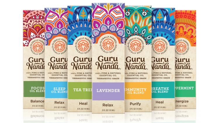
For some health/wellness packaging, color is the strongest differentiator on-shelf. Brands with “the most successful use of color are [those] that tap into color physiology to align with mood and feeling,” says Palmer. That thinking informed Little Big Brands’ rebranding work for essential-oil brand Guru Nanda, in which “color was at the heart of the redesign.”
Guru Nanda’s packaging redesign celebrates “the brand’s Indian heritage but also … create[s] a more shoppable portfolio,” Palmer explains. “Color cues vitality but also mood, in this case, and it needed to work very hard on both fronts. Good use of color should evoke positive feelings and help intuitively move consumers along the decision-making process.”
The brand’s lineup includes Immunity Oil Blend, Sleep Oil Blend, Breathe Oil Blend, and Focus Oil Blend.The products can be diffused into the air, inhaled, or diluted and then applied topically.
Packaging for orally consumed health/wellness products can also benefit from the discerning use of color, particularly when the hue amplifies a key ingredient. The wrapper for the Flat Tummies Vitamin Bar with Fresh Orange from Bangalore, India-based Moya Labs provides an example (see image at the top of the page).
“In terms of boosting immunity, Flat Tummies vitamin bars have used the term ‘fresh’ orange, usually associated with orange juice, when describing the flavor” of their product, says Mintel’s Luttenberger.
“Using fresh orange as the top ingredient makes the connection for consumers between the Vitamin C found in oranges and the immunity benefits they provide by highlighting the ‘immunity to rise’ bubble on the front of pack and featuring the orange color prominently,” he adds.
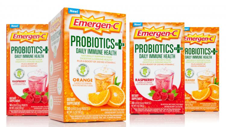
Package graphics for Emergen-C’s orange-flavor dietary supplements also use orange lavishly, broadcasting product flavor and color plus the high dose of Vitamin C in each sachet.
Other brands are more judicious in their use of orange. “In terms of color values, orange has long been known as a polarizing color,” Luttenberger says. “It can be warm and inviting, or it can mean one should exhibit great caution. Accordingly, designers should, and often do, use orange with what Mintel terms ‘mindfulness.’ Splash it for emphasis rather than flood for full effect.”
Clearly, the ability of color to modulate consumers’ emotional response to health/wellness packaging depends on the specific colors used and their relationship to the rest of the package design.
“Brands that are standing out on-shelf use a unified and strategic approach to communicate ‘good for immunity’ and mental-health messaging,” White summarizes. “Their positioning is direct, clear, and consistent in all of their brand assets, screaming to consumers that ‘this product will help you feel great about what’s going into your body.’ Simple graphics, comforting colors, and eco-friendly packaging delivered in creative ways are seeing the most success.”
About the Author(s)
You May Also Like


