Pepsi’s New Packaging Design Has a Throwback Vibe
Pepsi’s redesigned packaging boasts “more confidence” with a new logo, bolder typeface, and updated color palette.
March 29, 2023

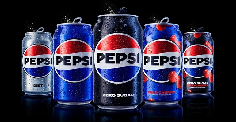
Pepsi revealed a new logo and visual identity system, the first update of the iconic Pepsi globe logo in 14 years. Pepsi will roll out the new look in North America this fall in time for the brand's 125th anniversary, and globally in 2024, marking the brand's next era with an eye toward the future.
The new design spans all physical and digital touchpoints, including packaging, fountain and cooler equipment, fleet, fashion, and dining.
The new logo and visual identity pay homage to the brand's rich heritage while taking a big leap toward the future, according to says Mauro Porcini, SVP & chief design officer of PepsiCo
"We design our brands to tell a compelling and holistic story,” says Porcini. “We designed the new brand identity to connect future generations with our brand's heritage, marrying distinction from our history with contemporary elements to signal our bold vision for what's to come."
If the new look seems vaguely familiar, it’s because the redesign is a modern update for a version used between 1987 and 1997, “but uses a different font, font color and slimmer border,” reports Design Week. DW also notes that it has been designed to work in a variety of settings and emphasize the distinctive Pepsi branding that most people recognize.
"Pepsi is an iconic brand that is constantly evolving with the times, as it has been a staple in pop culture and disrupted the category for the past 125 years," says Todd Kaplan, CMO. "We couldn't be more excited to begin a new era for Pepsi, as this exciting new and modern look will drive brand distinction to show up bigger and bolder and help people find new ways to unapologetically enjoy the things they love. This new visual system brings out the best of the Pepsi brand's rich heritage, while taking a giant leap forward to set it up for success in an increasingly digital world."
Some design details the brand singled out include…
An updated color palette introduces electric blue and black to bring contrast, vibrancy, and a contemporary edge to the classic Pepsi color scheme. Given the brand's continued focus on Pepsi Zero Sugar, the design brings in the color black, further showing the brand's commitment to Pepsi Zero Sugar in the future.
A new visually distinct can silhouette, which heroes the iconic Pepsi can as an accessible brand for all.
A modern, custom typeface reflects the brand's confidence and unapologetic mindset.
How did it play with industry insiders? Example of feedback from Porcini’s post about the new design at LinkedIn was resoundingly positive...
“I truly love this rebrand. In an age where things are moving at such a rapid speed it’s nice to see something that resembles simpler times. Job well done!” — Mike Russo, freelance art director/designer/animator.
“Mauro, Great refresh! It looks classic, but right for this time and brings back, at least for me, a sense of good times. Summer fun, warm days on the beach, kids Skateboarding, and endless possibilities. It could be nostalgic, or right for now! Nice work!!” — Patricio Fuentes, empowering brands to effectively engage multicultural audiences.
Two examples of a decidedly different opinion:
“I strongly dislike the font choice. The rest is fine, but that font is just hitting my eyes the wrong way.” — Christian Ritchie CTO Manager, Integration & AI
“Excellent, but 15 years too late.” — Mark Weinstein, director of marketing at Graphic Village.
I like the new design, especially the more robust logo; it’s bolder, stronger, and more assured, if you will, versus the generic swirl pattern featured before.
You May Also Like


