Starbucks launches "nameless" logo

Starbucks launches “nameless” logo
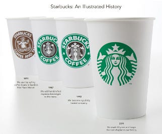
For the fourth time in the company's history, and to celebrate its 40th anniversary in 2011, Starbucks has updated its iconic sea siren logo, opting to go with a refreshed image only and erasing the outer ring with the words "Starbucks Coffee."
In a web video and blog announcing the change, CEO Howard Schultz says this indicates the company's intention to broaden its focus beyond coffee, but without losing its coffee leadership position. "Our new brand identity will give us the freedom and flexibility to explore innovations and new channels of distribution that will keep us in step with our current customers and build strong connections with new customers," Schultz says.
The new logo will appear on packaging in the spring 2011. Other recent brand logo changes, like the Gap, haven't been well received by their fans. Starbucks logo redesign has already gotten significant blow back, based on the comments left on their website (300+ and counting) and at various other sites:
"Who's the bonehead in your marketing department that removed the world-famous name of Starbucks Coffee from your new logo?"
"Why is it that when a company has any kind of milestone (good or bad), their executives feel its (sic) necessary to ***** around with the company logo?"
"There has never been a brand modification in history (I'll posit broadly) that didn't spark a negative comment from someone who felt a connection to the ‘old' brand. The difference now, of course, is that our multiple social and professional media networks turn such events into brushfires that quickly escalate in heat—and seeming importance—far beyond the marketing and business realities involved," explains Hayes Roth, chief marketing officer at packaging design and branding firm Landor Associates. "What matters is the story behind the brand change and whatever other substantive moves they intend to launch in its wake. Starbucks simply needs to stay the course, keep to their story and this will soon enough become another footnote in their long branding case history."
Few other logos are simple yet strong enough to communicate the brand's essence through image alone. Nike, Apple, Playboy (arguably) and...Starbucks?
Obviously, the company thinks so. Schultz wrote in the blog, "Throughout the last four decades, the Siren has been there through it all. And now, we've given her a small but meaningful update to ensure that the Starbucks brand continues to embrace our heritage in ways that are true to our core values and that also ensure we remain relevant and poised for future growth."
.
About the Author(s)
You May Also Like


