Starbucks v. Dunkin’: Iced coffee looks ‘premium’ in glass
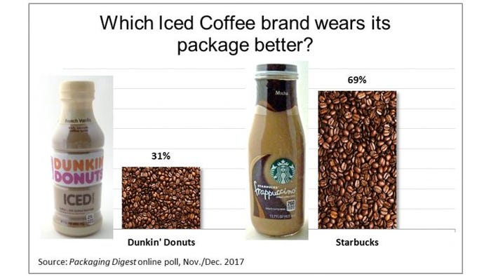
By a margin of more than two to one, respondents in our latest Who Wore It Better poll for Iced Coffee voted for Starbucks classic glass bottle over the shatter-resistant plastic container used by competitor Dunkin’ Donuts. Many said it was because the Starbucks bottle projected a high-quality look, even though some admitted they prefer the taste of Dunkin’.
More than 70 people voted in our poll, which Packaging Digest conducted this November and December. Almost immediately (after about 20 people had voted), the percentages emerged at two-thirds to one-third and barely registered any sway through to the end when we closed the poll at 69% for Starbucks and 31% for Dunkin' Donuts.

Both products are sold in single-serve containers. To help respondents make their decision, we described the packages and showed photos of the front, side, back and top (see the photos on page 2).
Starbucks is a glass bottle with a round base and squared off sides, transparent pressure-sensitive film labels on the front and back, and a metal vacuum closure with a printed tamper-evident neck bank.
Dunkin’ Donuts is a round polyethylene terephthalate (PET) container with a full-body shrink sleeve label that extends above the polypropylene closure to provide tamper evidence.
The tops of the closures were photographed and presented with the front label facing front to show how they were (or weren’t, actually) oriented.
In the side-by-side photo (above), you can see that the Starbucks container is slightly taller, even though the contents are the same in both bottles: 13.7 fluid ounces.
NEXT: Here’s why they picked what they did…
We also asked respondents to tell us why they picked the package they did. This helps us gain insight into what they see—as packaging professionals and as consumers themselves.
Why Starbucks?
The people who selected the Starbucks bottle talked about overall impression, the material, the graphics and the bottle’s shape/size.
Overall impression:
“Much more premium look.”
“The Starbucks package is a far classier design, AND it is almost completely recyclable!”
“Smoother more luxurious bottle. Less graphics. Overall the bottle makes the product appear richer. The Dunkin’ bottle looks more like a soda bottle, which makes my mind think the product is not as much of a premium product even though I prefer the taste of the DD brand.”
“More upscale. DD looks lower quality product.”
“Better design, better branding, high value perceived in Starbuck name and design.”
“Bottle makes the product look more expensive. The dark brown colors of the label goes well with an iced coffee product.”
The material:
“Like glass container.”
“Glass will always ‘look’ better!”
“Even though I prefer DD coffee over SB, I prefer the cleanness of glass over plastic for taste and style.”
The graphics:
“Simpler, more sophisticated graphics.”
“Dunkin’ made a couple little design mistakes. Starbucks is laser focused on selling.”
“Because it showcases the product better. The DD white band is distracting.”
The bottle’s shape/size:
“Size impression.”
“Looks like I’m buying more product…bigger bottle.”
“The shape of the bottle is more attractive. DD bottle has a look of a spice & herb bottle.”
“Shape of the bottle.”
“Sleeker image due to bottle shape. Simpler, relaxing design lets coffee advertise itself due to minimal graphics and minor copy size on label.”
And this respondent takes a broader view of the design, even taking production efficiencies into the equation: “From a consumer standpoint, Starbucks has a better visual appeal. From a manufacturer’s perspective, it would be Dunkin’ Donuts (material, costs, distribution, etc.).”
Why Dunkin’?
Respondents who picked the Dunkin’ Donuts package mainly cited functionality and clarity:
“Shatter resistant, lower thermal conductivity of PET, lighter, fits cup holder in car better (less topsy turvy).”
“The brand is more visible and it seems a bit more obvious on what the contents are—ICED Coffee.”
“Nutrition facts are more clearly presented; all surfaces are used—brand is displayed prominently.”
“Recyclability & functionality.”
“Better look. Better shrink sleeve application. Easier to read text because they used white text over a brown background.”
“Interesting shape of container. This shape is more difficult to shrink the label on it, but label fits better. Nice colors. I want to drink it.”
“More contour. Less plain.”
This respondent analyzes the sustainability aspects: “Glass packaging is perceived to be environmentally beneficial primarily due to its value in the recycling stream. The energy that goes into making a glass bottle and the added weight in distribution is not captured. Unfortunately, consumers don’t want to know the facts and wouldn’t believe them if they contradicted their belief. And what about the metal cap vs. a plastic closure? Another misconception.”
Read our earlier Who Wore It Better articles:
"Strong packaging graphics also need 'context'"
"Shoppability, easy-pour key to olive oil packaging design"
Do you wonder how your peers would rate your package design versus a competitor’s? If you have a suggestion for a “Who Wore It Better” poll, reach out to me at [email protected] or call 630-481-1422.
About the Author(s)
You May Also Like


