The truth about how food packaging influences taste perception
February 2, 2016

A relationship as old as time, the link between food and the way it’s presented to us is indisputable. Eating is one of the most multisensory activities; we can’t just attribute eating to our taste buds. Scientists have long argued that what is perceived as flavor is actually filtered through many other receptors, such as smell, sight, sound and touch.
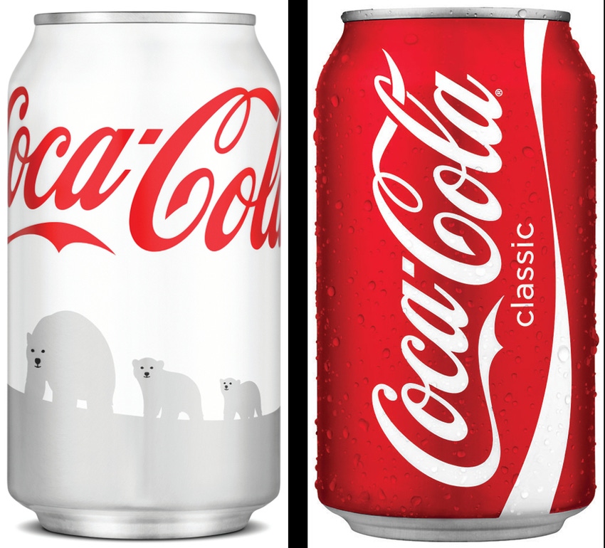
In 2011, the irrevocably recognizable red Coke can changed colors. It was a special edition white-colored packaging, raising funds for endangered polar bears. It seemed like a great idea, until customers started complaining that Coca-Cola had changed its secret formula. For Charles Spence, a professor of experimental psychology at Oxford University, this is just one of numerous examples where it is proven that packaging can change the way we perceive the taste of foods or drinks.
To further prove that Coca-Cola tastes sweeter in a red can, Spence conducted an experiment in his lab where he served popcorn in variously colored bowls. The color red is associated with sweetness, and this was proven in Spence’s tests, whereby participants perceived salty popcorn to taste sweeter when served in a red bowl. This link between food packaging materials and their contents cannot be ignored. As consumers or sellers, we need to be conscious of this relationship and its effect on our psyche.
Dedicating his life’s work to this correlation, Spence has proven time and time again that colors and the type of materials used in packaging can influence taste perception. He has found that a strawberry-flavored mousse tastes 10% sweeter when served from a white container rather than a black one; that coffee tastes nearly twice as intense but only two-thirds as sweet when it is drunk from a white mug rather than a clear glass one. He has also discovered that Colombian and British shoppers are twice as willing to choose a juice whose label features a concave, smile-like line rather than a convex, frown-like one.
However, it’s important to note that this connection between food and its packaging isn’t merely an accident. It’s a way for savvy companies to show why their product is special, and also a chance for consumers to engage with the product. If done right, it is a powerful marketing tool that can make brands instantly recognizable around the word.
Spence is also working towards using the link between consumption and packaging for the greater good. He is experimenting with the perception of taste as a tool to combat obesity, by using "sensory seasoning to replace some of the salt and sugar in packaged foods." He's also working with a cancer hospital to experiment with the ways that plating, lighting and sound could counter the metallic taste and nausea that often accompanies chemotherapy. What a guy!
So next time you purchase your morning coffee, take note of the color of the takeaway cup. Smell the aroma, and note the hue of the brew. Do you have any preconceptions about what it should look or smell like? You probably do. Ask yourself, what is the basis of the preconceived notions? It’s certainly a fun exercise, and can hold some quite surprising results!
Emily Phillips is in her second year at RMIT University in Australia, undertaking a bachelor of Food Science and Technology. She is also a freelance writer for Venus Packaging, a leader in food packaging supplies. She covers a range of industry topics from food packaging to food safety.
______________________________________________________________________________________
Experts on Packaging Design for Beer & Spirits and for Health & Beauty will share their insights at conferences at WestPack 2016 (Feb. 9-11; Anaheim, CA). Sign up now!
______________________________________________________________________________________
About the Author(s)
You May Also Like


