Top 10 ‘right-on’ packaging designs for store brands
Are retail insiders more in tune with what shoppers want or need when it comes to product packaging? A look at some of the top packaging designs of store-brand products shows that their packaging creators definitely “get” today’s consumers.
Packaging Digest editors Rick Lingle and myself were treated to a smorgasbord of dazzling designs as we once again served as judges in the packaging competition organized by Store Brands magazine. Packaging mavens Ben Miyares and Linda Casey were also there to review the 184 entries submitted this year.
The winners will be announced in the September issue of Store Brands, but here’s a quick look at some of the entries that stood out to me and why.
A couple general comments first:
• Several packages took advantage of direct-package printing technologies, such as in-mold labeling. I’ve always been a fan of this method because of its secondary tactile feature. Direct-package printing technologies are on the upswing and it’s one of the issues covered at the EastPack 2016 show at the Packaging for Foods & Beverages conference. Package design experts Tim Bohlke of Avery Dennison and Jim Warner of JW3D tackled the topic in the session “The Future of Labeling & the Emergence of Direct-to-Package Printing.” (Highlights of that session to come later.)
• The quality and amount of packaging designs entered into this competition by CVS Pharmacy is most impressive—and for the second year in a row! This drug-store retailer definitely does not prescribe to the outdated “me-too” strategy of private-label packaging design we still see at competitive stores (Walgreens, are you hearing this?).
• The packaging department at Brookshire’s Food & Pharmacy—a regional grocer with stores in Texas, Arkansas and Louisiana—has also been active, based on the number of entries in this year’s competition, a couple of which I’ve included in this slideshow.
• Color coding is a staple in any package designer’s toolbox, especially for product lines with different flavors or varieties. Several entries in this year’s competition used color coding to their advantage, through unique placement of color bars and/or the use of contemporary hues.
• One last comment specific to packaging designs for foods and beverages. This year, we saw even more clear packages that showcase the product and let consumers judge taste and quality before buying. And we also saw a continuation of graphics that depict “foodie” values such as unusual or exclusive recipes, as well as “restaurant inspired” designs. Several labels used a stylized “distressed” font, to replicate hand-written menu boards at trendy restaurants.
Interested in comparing the 2016 competition with previous ones? Here are the Packaging Digest articles about last year’s Store Brands Packaging Awards competition:
The top winner: Store-brand packaging pairs good looks with utility
From Rick Lingle’s perspective: Winning retail packaging starts with attention to detail
Through my eyes (Lisa Pierce): Packaging design trends add value to store brands
Here is my take of the 2014 competition: Sophisticated packaging sells store brands
And the trends I saw during the 2013 judging: A brand by any other name...
Now for this year’s stand outs …
1. Tangled Tree snacks (see photo above)
Although there are 22 stock-keeping units (SKUs) in the Tangled Tree line of snacks, distributor Pique Brands in Grand Rapids, MI, uses just two sizes of stand-up pouches for all of them. Pouches are generically printed—beautifully so—with matte and gloss areas to highlight the background tree graphic and brand name. Branding is further reinforced with the circle logo, which also adds a bit of color to the front of the pouch.
Separate labels on the front (in the upper left primary position) and on the back are printed with product specific info. This is cost efficient (volume buying) and simplifies inventory management. We’ve seen this type of label strategy on bags of coffee and some confections, but this was the first time I have seen it on snack nuts and berries.
The muted colors of the labels are contemporary and the ragged right edge of the front label (which has a soft-touch feel to it, too!) adds an element of “natural” to the design. All labels were carefully positioned—so much so that it wasn’t obvious at first that it was a label.
The clear window at the bottom lets consumers see what’s in the bag before buying and showcased the products well.
I thought this was one of the best package designs in the competition. Visually appealing with a touch of tactile dynamism.
NEXT: Jumbo impact!
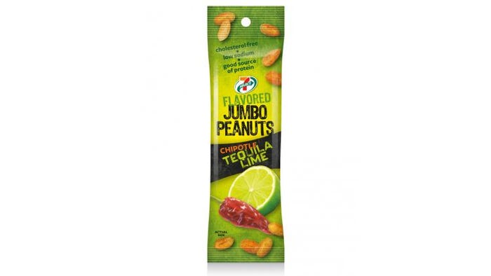
2. 7-Eleven Flavored Jumbo Peanuts
Not only are the flavors intriguing—Chipotle Tequila Lime and Smoky Bacon Cheddar, for example—but the ingredient graphics have definite taste appeal. The narrow pouch makes it easy for people to handle and pour the product right into their mouth—even when they are on the go. Healthy snacks are all the rage these days and putting claims like “cholesterol free,” “low sodium” and “good source of protein” in the prominent top position calls attention to what might be a tie breaker when shoppers compare alternative selections.
NEXT: Butcher fresh
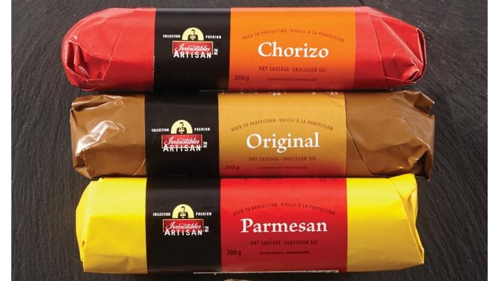
3. Irresistibles Artisan Dry Sausage
This paper-wrapped sausage package reminded me of shopping with my mom as a young girl when she would buy meat from the butcher counter. But this package has bright colors and a clean printed label to keep it sealed and fresh. The label adds branding for the Irresistibles Artisan line and also clearly identifies the flavor of the meat inside. Nostalgic and contemporary!
NEXT: Homemade goodness
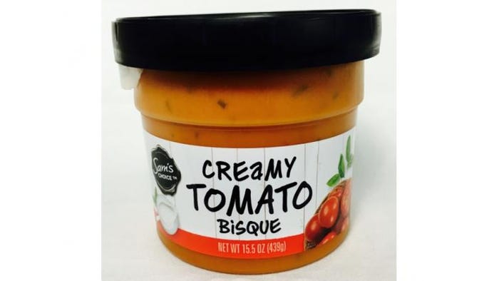
4. Sam’s Choice Slow Simmered Soup
The hand-written font implies this soup is hand/home-made. Using a generic black lid for all the flavors is cost effective, saves inventory space and simplifies changeover on the packaging line. The “No preservatives” call-out printed on the top of the lid really stands out.
NEXT: Honey of a design
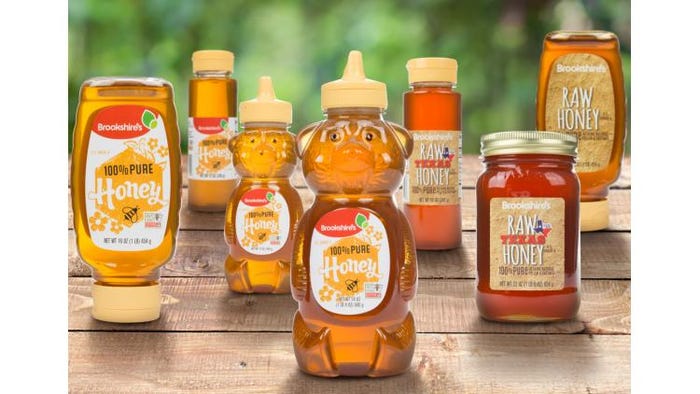
5. Brookshire’s Raw Texas Honey
The package I liked the best in the line of Raw Texas Honey from Brookshire’s is the old-fashioned mason jar because it stands out as being different. And I like to use a spoon with honey so I have an idea of how much I’m using. But Brookshire’s also has an upside-down bottle so people can conveniently squeeze the honey out if they’d rather.
NEXT: Tagged spices
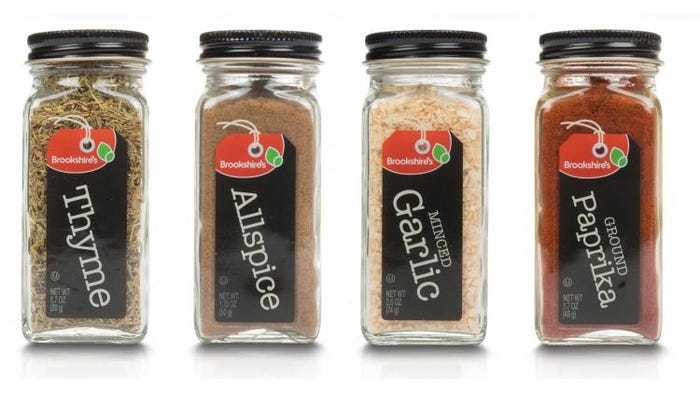
6. Brookshire’s Spices
The mix of old-fashioned apothecary jars, a contemporary font and unusual “tag” graphics adds an appealing nostalgic feel to the packaging for Brookshire’s Spices.
NEXT: A clean swatch
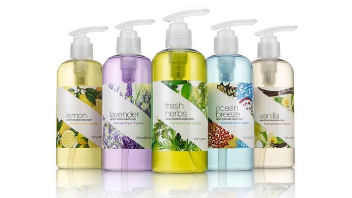
7. CVS Scented Hand Soap
Nice use of a pearlescent label. The white swatch cuts diagonally through the background image of the scent/flowers—an unusual graphic treatment that looks elegant to me. The elongated pump head seems more ergonomic and contrasts with the smoothness of the bottle’s rounded shoulder in a nice way.
NEXT: Simple naming and color coding
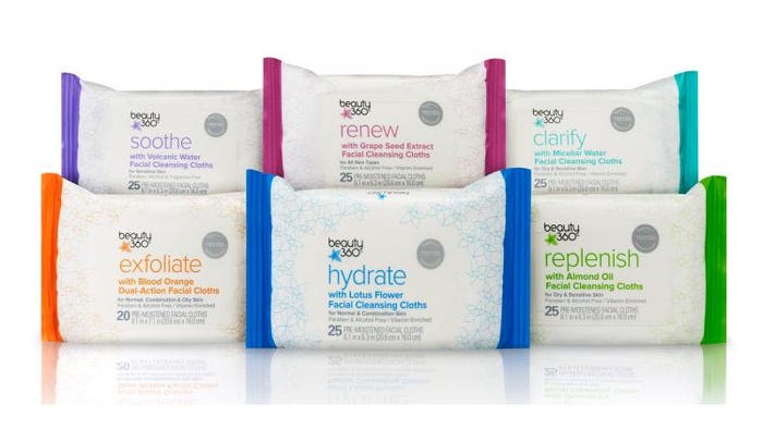
8. CVS beauty 360 facial wipes
The color-coding bars on the sides frame this horizontal pack, which uses soft-touch material and simple, clean graphics. Lower-case lettering on the one-word names, which quickly and adequately describe the products, along with the thin fonts add a feminine feel to the line—without resorting to overused pink or pastel colors.
NEXT: Unusual category colors
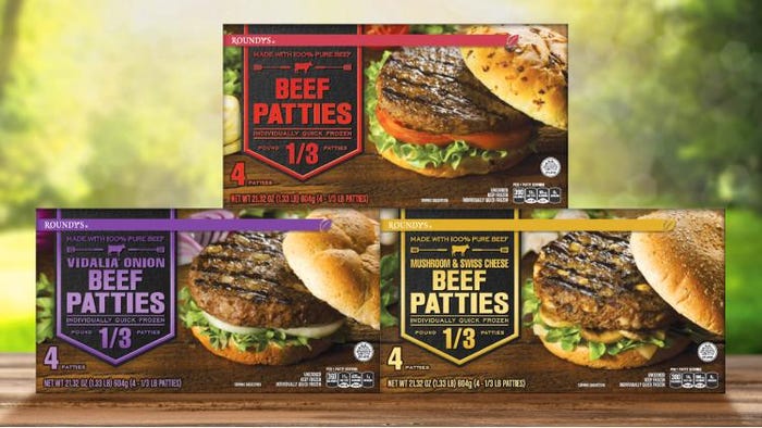
9. Roundies Vidalia Onion Beef Patties
The leaf at the end of the color bar ties in nicely to the leaf in the logo. I also think they did a good job with color coding the different flavors. Purple is an unusual color for the category but works in this case to say “premium.”
NEXT: Holiday-inspired designs
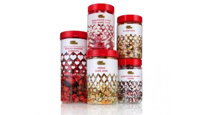
10. Gold Emblem Holiday Snacks
For the most part, these red-and-white designs have life well after a holiday yet still tie in to special times, like Valentine’s Day and Christmas. Sprinkling the graphics down from the white background at the top looks festive. And the stock round containers and red screw-on closures are a cost-efficient way of keeping a family look to the line, even when product distribution might be months apart.
Read a BONUS ITEM from fellow judge and Packaging Digest technical editor Rick Lingle here.
About the Author(s)
You May Also Like


