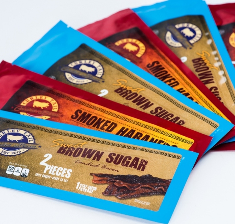
What does your package color say to consumers?
August 22, 2018

Jared Powell
In today’s competitive retail space, it’s important for brands to make a colorful impression on consumers and stand out from the crowd on the shelves. The psychology of color, as it relates to persuasion in marketing and branding, is one of the most interesting, if controversial, aspects of the industry. While the same color can evoke different emotional responses from an individual based on his or her personal experience, much broader messaging patterns are found in the perception of color.
A study found up to 90% of snap judgements made about products can be based on color alone. Snap judgements aside, almost 85% of shoppers cite color as the primary reason they buy a particular product, and 80% believe color increases brand recognition. For a lot of products and brands, these colors exist in the labels and packaging. Because color choices have a proven effect on consumer’s purchasing decisions, it’s important for companies and brands to be cognizant of the messages they’re sending to consumers through color in their packaging.

Define the message; understand the color schemes
The first step in the journey to creating cohesion between color and branding is to identify a desired brand image that serves as the overall brand identity’s building block. Asking yourself the following questions can help identify patterns and lead to the creation of a strong message:
• What is our brand?
• What do we do?
• What message are we trying to convey?
• Who is our target audience?
• What is our company culture?
• What are our values?
Once you have a strong foundation for your brand message, the next step is to understand the effects and emotions a color scheme can evoke. According to research compiled by web design and marketing company WebPageFX, consumers make subconscious judgments about products in less than 90 seconds, with a majority making that assessment on color alone. Cool colors, for example, foster a peaceful and calming environment or mindset, while warm colors are more stimulating.
This is especially important when incorporating colors into brand labels and packaging, as that’s the first impression a brand has to make. For example, if a portion of your brand message is to spread happiness, using the color green, which represents restfulness and soothing, may not be your best bet. Instead, using the color orange is a safe bet. Orange combines the energy from red, and the happiness from yellow, leaving the viewer enthused, happy and encouraged.
Remain adaptable
It’s never too late to pick your brand’s new favorite color. If your company decides to move in a new direction, it’s important to keep your current and desired color schemes in mind during your rebranding process. When going through these types of changes, companies should remain cognizant of the visual elements that are being incorporated and the effects they have on the direction of your brand identity. A disconnect between a brand’s identity concept and execution can lead to consumer confusion, and ultimately, failure.
If a total rebrand is out of the question, look at the colors you’re using that are dragging down your visual branding, particularly in your labels and packaging. Perhaps your color palette is feeling a little old, boring or overdone. Giving your color palette a refresh while salvaging your familiar branding is a great way to give your business or products a fresh outlook without a total overhaul.
Maybe you are introducing new or seasonal products that call for new labels or packaging. This is the perfect time to play with color and test the waters. Stay true to your brand’s image, but maybe incorporate new colors schemes into a temporary label or package.
For example, if you are currently using two to three colors in your labels, bring an orange hue in for fall or a cool color in for winter. This works well if you like one or two of the main colors in your labeling but feel indifferent about the rest. You can choose one or two dominant brand colors to keep from your original color palate and change the others.
Colors used in consumer-facing spaces will always have a profound impact on the way a company, brand or product is perceived by an audience. Knowing this, companies and brands need to make strategic and calculated considerations when choosing colors of packaging, logos and product labels. When choosing color schemes in visual collateral, the first step is to define a desired brand message and ensure the impact the color has on the viewer is aligned with the brand message. From there, it’s critical to ensure there is seamless cohesion between the desired image and colors used, while remaining adaptable in ever-changing markets.
Not everyone is a color expert, but there are resources for businesses to use during the design process to get it right. From marketing agencies to labeling companies, outside sources exist to give you and your product a leg up on creativity. Leverage those agencies, connect with those digital printers, scour company blogs for advice, exhaust all resources and, most importantly, remain colorful.
Jared Powell is CEO of Frontier Label, a fully adhesive custom label company. With more than a decade of leadership and a background in bio engineering, Powell has developed a workplace and culture that values problem-solving and growth through purpose, excellence and investing in others. This common vision guides the passion of the Frontier team as they make labels for you.
You May Also Like


