Sign up for the Packaging Digest News & Insights newsletter.
Capturing the tropical experience
Linda Casey
March 11, 2015
6 Min Read

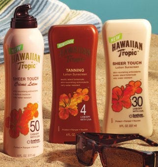
HT beauty shot
Less than a year after its acquisition of Playtex Products Inc. and its health-and-beauty aid brands, Energizer Holdings Inc. embarked on a complete redesign of the newly acquired Hawaiian Tropic suncare line. “It was the summer of 2008,” recalls Chuck Renz, senior manager of package development and packaging innovation for Energizer Personal Care division, “I was heading up the package development group, when the Hawaiian Tropic marketing head came to me and shared their whole new strategy for brand positioning.” The entire line of sunscreens and after-sun products were to get a luxurious, upscale look and feel that also would offer more brand consistency from product to product within the Hawaiian Tropic line.To help develop the graphics for the redesign, the Hawaiian Tropic product team brought in Phillips Design Group and charged it with the task of targeting two primary demographics with one look, while maintaining brand equity and effectively communicating several messages.
“They were talking to the indulgent sun-and-beauty seekers, who want to be out in the sun and get dark, and the skin-involved age resistors, who are people that want to be in the sun but don’t want to wrinkle and ruin their skin,” explains Steve Phillips, president of Phillips Design Group. “These are two different kinds of audiences.”
Because the target markets were so different, the agency created separate image boards for each demographic to not only guide their graphic and contextual messaging for these consumers but also to look for alignment between the disparate audiences. “What these two distinct groups have in common is the desire to pamper and indulge their skin with something special,” Phillips adds.
The finding set the group off in what Phillips calls “the experiential direction.” He says this direction tries to capitalize on the emotion of the experience of a sunny day by bringing in the visual reminders of the tropics. The group’s visual exploration of the experiential direction is dominated by images of lush tropical fruit, beautiful locations and refreshing waters. Market research confirmed the experiential direction’s appeal.
With a general market target identified, the agency then charged a team of six—a design director and five other designers—to develop graphic concepts for the brand. “What we do initially is throw the project at everyone so we get as many ideas as possible,” Phillips explains. “The client narrows down the direction, and then we narrow down our team to the people who worked on the selected designs.”
Developed concepts included those with an ingredient focus, more abstract pictograms, masculine shapes, a play on the Hawaiian Tropic palm tree logo and an ethereal look that sought to convey how easily the products are absorbed. Simple more upscale looks and more cosmetics-oriented designs also were considered.
The Hawaiian Tropic group narrowed down the designs to those created by Phillips Design Group senior designers Cara King and Angela Kowalczwk. But to determine the final design direction, Phillips would insist on consumer research. “A lot of us make subjective decisions—you could like yellow and I could like blue,” Phillips remarks. “We want to see what our target audience selects.”
Consumer testing identified hibiscus flower design as the most effective. Phillips attributes this to three characteristics of the design. “It’s reminiscent of the tropics; it’s easily color coded; and it has a strong bull’s eye effect on the package,” he explains.
Before the design could become an actual package though, the agency would need to collaborate more closely with Energizer’s Hawaiian Tropic team on the look, feel and shape.
Parallel processes bestow benefits
King and Kowalczwk worked with Veronica Lewis and Jean Fulfidio from Energizer to fine-tune the hibiscus design. Camilla Medeiros, who held the position of senior global business manager for Hawaiian Tropic at the time, served as the primary decision maker for graphics and color cues. The agency also collaborated with the Hawaiian Tropic package development team to increase the effectiveness between the package structure and design.
“As marketing was developing graphics, we were developing structures that would go nicely with the graphics and work with the new brand image,” Renz recalls.
The “we” that Renz is referring to includes him and independent, industrial designer Diana Sierra, who created photorealistic renderings of the package forms and shapes, using McNeel North America’s Rhino CAD software, a free-form 3-D modeling tool.
Renz then creates more technically specific drawings in Parametric Technology Corp.’s Pro/Engineer (PTC) CAD software before producing fused-deposition models (FDM) using a Dimension Inc. 3-D printer. The onsite creation of working models made of ABS plastic enabled the Hawaiian Tropic team to quickly test the form, fit and function of the designs. “Within a day of having a design, we can have a model that is a solid representation of the actual design we’re coming up with,” Renz explains. The FDM models in ABS plastic were the first prototypes to be tested on the filling and packing lines.
Production prototypes
To further refine its understanding of how the new packaging would impact filling and labeling, Energizer worked with a variety of suppliers to create production prototypes and identify and obtain package components that could be purchased as stock items. This was no easy task because the redesign applied to the entire sun-care product line from oils to aerosol sprays. The restage involved 205 finished goods across the U.S., Canada, Latin America and Europe.
The package development team worked closely with both Graham Packaging to develop the new, more shapely tottle structures that can sit on the cap end. and CCL Containers on the new aerosol cans. Additionally, they worked with AptarGroup Inc. on new Emsar lotion pumps and SeaquistPerfect Creme actuators and twist-lock actuators; Berry Plastics for a new child-resistant closure; Polytop Corp. and Zeller Plastik USA Inc. on new flip-top closures; and TricorBraun and Giflor srl on the latch force and fitting of a low-profile closure into the tottle’s revised orifice.
The components were tested on existing equipment to optimize the manufacturing process. Energizer also took this opportunity to install new packaging lines for the project. In January 2011, it was putting the final touches on a new tottle filling line, which will be featured in an upcoming edition of PD.
AptarGroup Inc., 815/477-0424. www.aptargroup.com
Berry Plastics Corp., 812/306-2000. www.berryplastics.com
CCL Container Inc., 724/981-4420. www.cclcontainer.com
Dimension Inc., 866/721-9244. www.dimensionprinting.com
Giflor srl, +39 0444 380550. www.giflor.it
Graham Packaging Co. Inc., 717/849-8500. www.grahampackaging.com
McNeel North America, 206/545-7000. www.rhino3d.com
Parametric Technology Corp. (PTC), 781/370-5000. www.ptc.com
Phillips Design Group, 617/423-7676. www.phillipsdesigngroup.com
Polytop Corp., 401/767-2400. www.polytop.com
TricorBraun, 800/325-7782. www.tricorbraun.com
Zeller Plastik USA Inc., 847/247-7900. www.zellerplastik.com
About the Author(s)
You May Also Like


