June 4, 2014

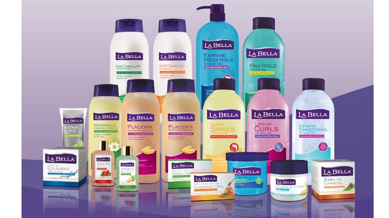
Known as the #1 Hispanic brand in styling and beauty products, La Bella has recently undergone a makeover after 30 years with the same look. The new redesign and logo showcase a more contemporary style for the brand while offering consistent messaging across the entire bilingual line of personal care offerings including styling, skin, hair and body care products.
Packaging Digest got the exclusive on the redesign from Jocelyn Yuan Riddle vp of marketing at Newhall Laboratories, the parent company for La Bella.
What is the motivation behind La Bella’s recent activity in introducing new packaging after three decades of the same design?
Riddle: La Bella has more than 30 years of providing outstanding performance products with high-quality formulations. The new logo and packaging design was tested with female head of households and we learned that La Bella should be aspirational, feminine and elegant. This was a key insight that we are leveraging across all the marketing vehicles.
In 2012, Brynwood Partners acquired California-based Newhall Laboratories. Newhall Laboratories is now a leading marketer of widely recognized personal care brands, including La Bella.
In the past, the La Bella brand did not have a clear strategy and did not have a contemporary image. Following the acquisition, resources have been dedicated to position the brand – its marketing, packaging and new product development, to be more contemporary, distinctive, premium appealing and authentic for today’s core consumer, the female head of household.
What design trends does your packaging set in the beauty category?
Riddle: When looking at other products in the beauty world, La Bella product packaging stands out with a strong focus on ingredients. The authentic ingredient-based formulations appeal to Latinas and their families.
The packaging features bilingual information that is carefully crafted and organized to help ensure readability in English and Spanish.
What changes did you make to the packaging that makes it more eye catching?
Riddle: La Bella packaging received a modern makeover in 2014 with a packaging redesign. The new packaging now boasts a prominent logo that spans the entire width of the package. It has a more feminine and aspirational look that the target consumer desires.
Certain packaging elements needed to remain consistent for consumers to quickly identify La Bella products on shelves. The logo still features the recognizable purple and white colors, while incorporating updated design elements such as the silver “swish” and contemporary font choice.
La Bella also created a clear hierarchy of communication and design, rolling it out across all the SKUs for a branded look. In the past, each product had its own look and feel, causing a lack in consistency.
The new packaging places an emphasis on communication, as evident with its bilingual information in English and Spanish, as well as a strong ingredient story using design icons to help communicate ingredients and their benefits.
What were the key goals and requirements from a marketing view? From a packaging view?
Riddle: The primary goal for La Bella was to create a stronger impact on shelf. This was achieved by elevating the packaging so it would be perceived as more premium, contemporary and distinctive. Additionally, all La Bella offerings were redesigned to ensure that packaging was beauty oriented and that all products were consistent in design and messaging.
About the Author(s)
You May Also Like


