How do you Package America’s First OTC Birth Control Pill?
Considering the political and ethical landmines around opposing positions of abortion and right to life, Opill’s packaging design is “unapologetic in its boldness.”
At a Glance
- Opill is available without a prescription online and in retail stores nationwide, even in states that have banned abortions.
- For the packaging, design consultancy Elmwood sought a balance between creativity and practicality.
- The color palette for Opill’s packaging reinvents industry standards.
Eye-catching colors and bold fonts are not typically associated with cartons for contraceptive pills. But when Elmwood designed the packaging for the first over-the-counter (OTC) birth control pill, artistic flare took center stage.
Manufactured by Perrigo in Dublin, Opill was approved by the FDA last year and is currently available online and in retail stores nationwide, including in states where abortions have been banned. Its OTC status reduces barriers to accessibility, giving women a range of birth control products to choose from and empowering them to choose the method that best meets their needs.
Elmwood’s marketing director Alex Ehrensperger answered Packaging Digest’s questions about Opill’s packaging design and how it supports Perrigo’s mission.
Describe Opill’s packaging and the significance of its design elements.
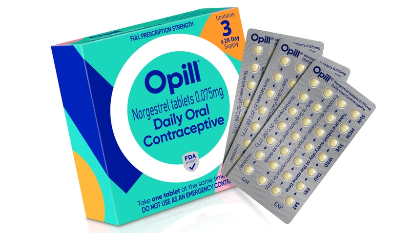
Ehrensperger: Opill’s packaging revolves around its O-shaped brand mark. Against a backdrop where one-third of American women report barriers in accessing contraception, the halo outline of the O is designed to be clear, strong, and accessible. Between the many roadblocks to reproductive support, it becomes a beacon for protection; a motif that speaks to Opill’s simplicity, convenience, and ease of use.
The color palette for Opill’s packaging also reinvents industry standards …
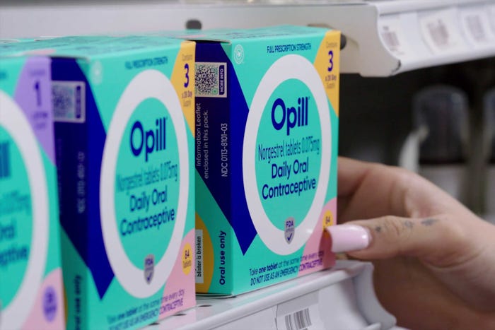
The color palette for Opill’s packaging also reinvents industry standards, featuring a background of modern teal alongside pops of coral, lilac, orange, blush, and yellow that appear in free-form shapes. These surround a striking dark-blue typeface that references classic Rx language, underpinning Opill’s efficacy as a daily contraceptive.
Perrigo
Together, the effect is a visual metaphor for the arcs of the world around us (the free-form shapes) and Opill’s steady presence within that (the pharmaceutical color of the lettering).
Opill’s block-letter font was intentionally selected due to its open and round typeface, building the sense of a brand that is warm and approachable.
What was Perrigo looking to achieve with this package design?
Ehrensperger: It was a challenging yet exciting task to design the package for the first-ever over-the-counter daily oral contraceptive in the US.
We set multiple goals for the creative design: Opill needs to stand out in the family planning aisles, inspire trust and confidence, be easy to remember and recognize, and appeal to people, including teenagers as well as trans men and nonbinary people, with its purpose clearly communicated. From a practical standpoint, it needs to be simple to carry and use, contain straightforward but accurate user information, and, lastly, clear FDA requirements.
The key learning is that these people want the freedom and control to get safe and effective birth control easily, which has since been the core spirit the company delved into and embodied.
With these ambitious goals established, Perrigo started out by conducting consumer research around contraceptive pill usage to understand the main needs of women ages 18 to 45, as well as trans men and gender-nonconforming people. The key learning is that these people want the freedom and control to get safe and effective birth control easily, which has since been the core spirit the company delved into and embodied.
To distinguish Opill from prescription drugs, Perrigo deliberately avoided elements one could associate with a lab product; instead, we created a dynamic effect with a white ring in the center and a teal color on the back, along with geometric shapes to add dimension to the pack that is unapologetic in its boldness.
The name Opill was chosen because it was easy to remember and pronounce. It’s evoked by the white ring featured on the packaging and is also a nod to the over-the-counter nature of the product — a concept the user groups recognized.
We wanted to ensure the right balance was struck across the packaging design between the creative design and practicality.
Were there any challenges specific to this project?
Ehrensperger: In terms of challenges, when it came to creating the packaging design and wider brand identity, it relates to striking a balance between creating a brand that inspires trust and confidence, and which still conveys efficacy and trust at the core of its purpose in being an FDA-approved product that is simple to carry and use. We wanted to ensure the right balance was struck across the packaging design between the creative design and practicality.
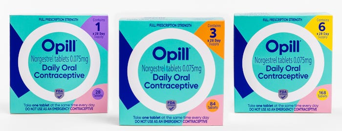
Opill cartons contain birth-control pills for 1, 3, or 6 months. Perrigo
Did you design any other marketing materials for launching this product?
Ehrensperger: Elmwood crafted the packaging design, visual identity, and brand world experience for Opill, which includes the creation of a set of brand tools and guidelines to use across all brand touchpoints — from billboards to social media marketing and more.
How does the packaging support patient compliance?
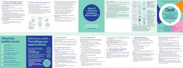
Ehrensperger: Besides the packaging, the design team also paid special attention to making two elements within the box more understandable and consumer friendly: the consumer information leaflet (written in accessible, non-technical language) and a reminder card for people to write the time they intend to take Opill daily. The packaging is designed to ensure the product remains upright on store shelves and that the Drug Facts label on the back of the pack is easy to read.
Where will the product be sold?
Ehrensperger: Opill is available in the family planning aisles at a range of retailers across all 50 states. In addition to availability at physical stores and major online marketplaces, consumers can buy Opill on opill.com.
Are there any age restrictions for purchasing Opill?
Ehrensperger: Opill is safe and effective for use by people of all reproductive ages. People who have or have ever had breast cancer shouldn’t use Opill.
About the Author(s)
You May Also Like

