Makeover gives feminine products a fresh feeling
April 2, 2015


Summers Eve feminine wash
Summer's Eve feminine care products have graced store shelves for decades. However, while the brand has a long-standing reputation, owner C.B. Fleet felt the packaging could use some freshening up.
"The old packaging was dated," says Summer's Eve brand manager Angela Bryant. "The products came across as clinical, didn't have much design to them and really did not have that true feminine look."
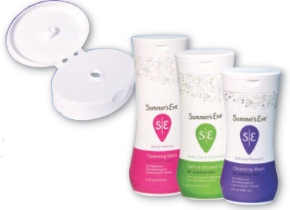
C.B. Fleet engaged Little Big Brands and Product Ventures to revamp the product's appearance and structure. The design team was charged with come up with a package that better reflected the needs and desires of modern female consumers, drawing inspiration from extensive research and input from nearly 3,000 women. Graphic elements of the new packaging include bold, bright colors, contemporary accents and a "yoni" logo based on an ancient symbol of femininity. The physical makeup of the products got a makeover, too. The Cleansing Wash, for example, which had been clunky and shared the same dated look as other products, needed to better appeal to modern shoppers.
"We wanted the bottle to have a strong shoulder presence, and it had to have a feminine touch to it," says Bryant.
The Cleansing Wash stands out on shelves with a sleek, curvy design reminiscent of the female form. The shrink-labeled HDPE bottle required a specialized closure. Zeller Plastik and Henry Pak partnered on an oval flip-top closure that complements the body.
.
About the Author(s)
You May Also Like


