Sign up for the Packaging Digest News & Insights newsletter.
New packaging shines for Dove deodorants
Linda Casey
March 11, 2015
1 Min Read

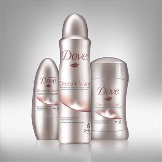
photo of new packaging for Dove DermoAclarant Clear Tone
Unilever relaunches Dove DermoAclarant Clear Tone, a line of premium Dove deodorants with advanced functional benefits to recover natural skin color, in new packaging to provide differentiation from its core variants. 
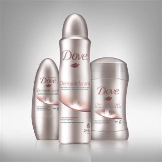
new packaging for Dove DermoAclarant Clear Tone
Previous packaging used same visual codes as Dove’s core line: a white background with a colored overcap that identified the variant. To help Unilever visually position Dove DermoAclarant Clear Tone, Unilever’s design agency Casa Rex researched packaging for the personal care segment and how it communicates advanced functional benefits as well as the visual codes used to convey premium products.
After several rounds of research and prototypes, a new packaging design evolved with a softer silver-hue with touches of copper replacing the bright white background. A restrained color pallet was adopted to further convey the premium nature of the brand. The brand’s pink color was carried over from the old packaging to help consumers, who are loyal to the brand, identify that this was a relaunch of the product and not a completely new product. The pink was adjusted to a richer hue to better communicate the brand’s positioning.
About the Author(s)
You May Also Like


