Beverage cans appeal with detailed high-resolution graphics
March 11, 2015


new cans for Pure Pret
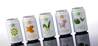
International café chain Pret A Manger has relaunched its range of Pure Pret sparkling fresh juices in a visually appealing beverage can from Crown Holdings Inc.
Pret A Manger, which specializes in freshly prepared, natural products, aimed to create new packaging that would reflect its brand image and values. "A huge amount of passion goes into all of the products we make and it's wonderful to be able to reflect it in the designs we produce," notes James Cannell, international head of creative, Pret A Manger.
The new Pure Pret cans feature detailed typography and images of Pret A Manger's iconic food-based characters, such as a goldfish cleverly formed by parts of an orange. The detailed graphics realistically depict the textures of the fruits used in the juices and are used to communicate flavors, which include Sparkling Orange, Apple, Elderflower & Grape, Ginger Beer and Yoga Bunny Detox.
The characters on the new Pure Pret cans are displayed on a clear white background, which maintains visual synergy with other Pret A Manger products further strengthening its brand identity, while the clean design hints at the beverage's natural ingredients. Another major component of the new Pure Pret can design is its ability to create an association with the wider Pret A Manger mission and passion for well-being with informative fact panels about the company's use of natural and preservative-free ingredients.
To produce these detailed graphics, Pictoris high quality print makes use of proprietary separation techniques and special, high resolution printing plates, allowing for improved dot spacing and superior print reproduction of complex images directly onto a metal surface.
"Intelligent and savvy customers want to be entertained and packaging should be used as a tool to engage and inform. Once we had worked through the concepts for our sparkling Pure Pret drinks, the challenge was simple - to showcase these beautiful eye-catching designs on our cans," says Cannell. "The support from Crown and their collaborative way of working was nothing short of inspiring. Focused and dedicated, everyone rose to the challenge and the final result is striking and beautiful packaging that looks fantastic in our shops, is a hit with our customers and that makes our team incredibly proud."
Not only is the packaging design a good fit for Pret A Manger, the choice of metal beverage cans is in line with the company's sustainability and recycling goals. "The sustainability benefits together with the large printable surface of the beverage can allowed us to create a package that clearly promotes Pret A Manger's key messages and strengthens brand identity," said Caroline Archer-Reed, marketing director, Crown Bevcan Europe & Middle East.
According to Crown, metal cans are environmentally friendly packages because they can be recycled again and again and again without loss of or alteration in quality. In addition, the packaging manufacturer states that the beverage can is the most recycled drinks pack in the world.
About the Author(s)
You May Also Like


