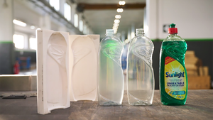
Restaging Suave package proves profitable
January 30, 2014

You don't always get what you pay for. In Unilever's case, with the recent restaging of its Suave(R) Naturals line of botanically based shampoos and conditioners, it got much more. Working closely with structural packaging designer 4sight, Inc. (www.4sightinc.com), Unilever embarked upon the project two years ago with what 4sight president Stuart Leslie says was a "crystal-clear" objective: to find incremental cost savings throughout the Suave packaging system. But what resulted was a bottle-and-cap design that not only significantly reduces the company's manufacturing costs, but also provides a greatly enhanced brand image that has led to a growth in sales.
Central to the success of the restaging, relates Leslie, was Unilever and 4sight's comprehensive evaluation of Unilever's existing packaging and filling processes. Through observation, they determined that maximum filling efficiency would be gained by replacing Suave's existing cylindrical bottle with one that was round in those places where it made contact with the equipment. The bottle's sides are contoured, giving the container a subtle, feminine, hourglass shape and making it easier for consumers to grasp with wet hands in the shower.
To reduce material costs, 4sight designed the new bottle—in a 15-oz size and a 24-oz family-size version—with a stronger top-load ability and a shorter finish height with a snap-on cap, eliminating much of the plastic typically used for the neck thread. A shorter, wider cap also reduces material use and it handles better during unscrambling. The shampoo bottles are made from a clear polyethylene terephthalate and are supplied by Matrix Packaging (www.matrixpackaging.com), while the conditioners come in opaque-white high-density polyethylene bottles from Matrix and Alpla (www.alpla.com). The polypropylene caps, which 4sight convinced Unilever to change from a Suave-blue color to a more elegant, clear, pearlescent look, are supplied by Seaquist Closures (www.seaquistclosures.com).
Also key in the redesign, adds Leslie, was an understanding of Suave's consumers and their expectations. "Suave products are targeted at the smart consumer," he says. "The challenge was to find a look that conveys quality without making consumers feel like they are overpaying for the product." The design they chose, he notes, integrates visual cues of shape, color and texture, without frivolous decoration, to communicate Suave's positioning of quality and performance at a great price.
Upon its launch, Suave Naturals' new packaging was met with enthusiasm, reflected by a 3-percent increase in dollar sales. Says Eric Yoch, senior brand development manager for Unilever, "Not only is the major redesign of our relatively generic bottle a major win with our consumers, but the added production efficiencies and cost savings for Unilever made it a true win-win situation."
You May Also Like


