5 top trends in cannabis branding and packaging
January 14, 2020
Marijuana is now legal in half of U.S. states, with more expected to follow, and this has led to a rapidly growing industry selling the product—whether for recreational or medical use. We have noticed the rise in cannabis-related businesses on the 99designs platform, where we’ve seen a 55% increase in design projects being created for these new brands in the past two years.
Whether or not cannabis is legal in your state, it’s not illegal for packaging design firms to work for cannabis customer. That said, if you are a designer, you may still want to consider if this is an area that you want to focus on going forward, if it fits with your own values and if it could be controversial with other clients.
If you do decide to work with cannabis companies, you’ll need to embrace an up-to-date interpretation and steer clear of the old clichés that can have more negative connotations. As in any logo and marketing design, you’ll also want to consider your target audience.
Here are five trends to look out for in cannabis branding and packaging:
Page 1. Leafy imagery
Page 2. Green in color and in ethos
Page 3. A focus on health
Page 4. Minimalism
Page 5. Playing with stereotypes
1. Leafy imagery
The pointy leaf may be a cliché but it’s also an instantly recognizable icon; it’s the fastest way to make a product identifiable in store.
While many brands continue to use the cannabis leaf in their logos and packaging designs, they are usually doing so with a twist. Logos may use a modern, stylized version of the leaf, they may use other colors or they may combine it with other elements to modernize the design while still playing on this familiar theme.
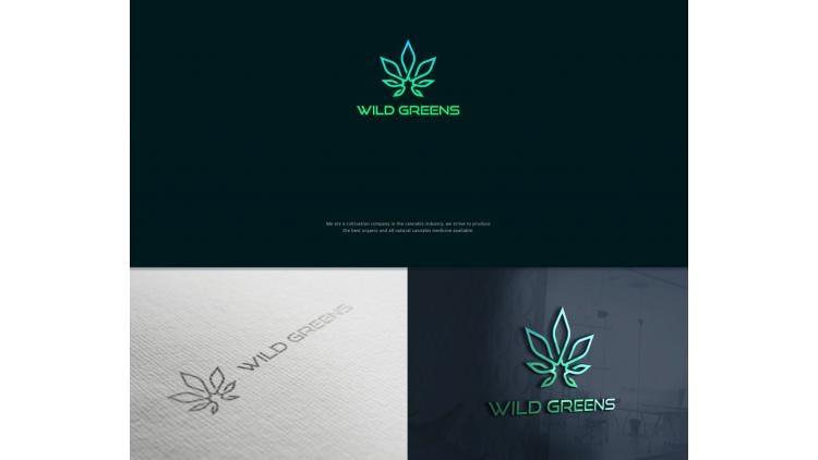
This stylized logo by 99designs designer KisaDesign brings the classic leaf image bang up to date.
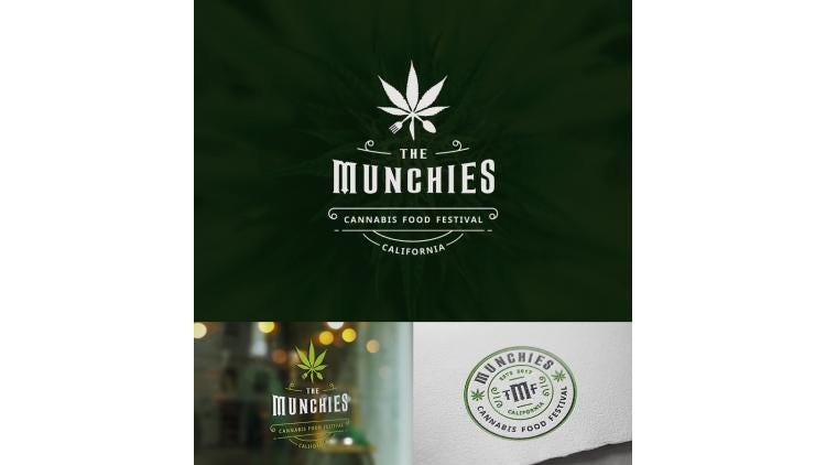
Who doesn’t get “The Munchies”? Hipster foot festival logo design by 99designs designer Iva Tan.
This logo hints at the traditional green leaf while combining a gray-blue cross that adds a more corporate and medical touch. Design by 99designs designer ludibes.
NEXT: Green in color and in ethos
*****************************************************************************
Production efficiencies, ecommerce challenges, sustainability trends, new bioplastic technologies and more are among the topics on the agenda at the new Packaging Hub at EastPack 2018. This free educational program will have more than 16 hours of can’t-miss presentations and demonstrations. Register to attend today!
A vintage look for this “botanicals” brand in a design by 99designs designer pswizzard.
2. Green in color and in ethos
There’s a general movement in society towards considering the impact we’re having on the environment, and cannabis users tend to particularly appreciate the product’s natural roots. Hopping on the “raw” and “organic” trend makes cannabis products especially up to date.
Muted greens and browns are used to indicate how natural these products are while the language used reflects this as well. We’re also seeing logos and designs that suggest an established heritage that gives the brand a certain distinction in the industry.
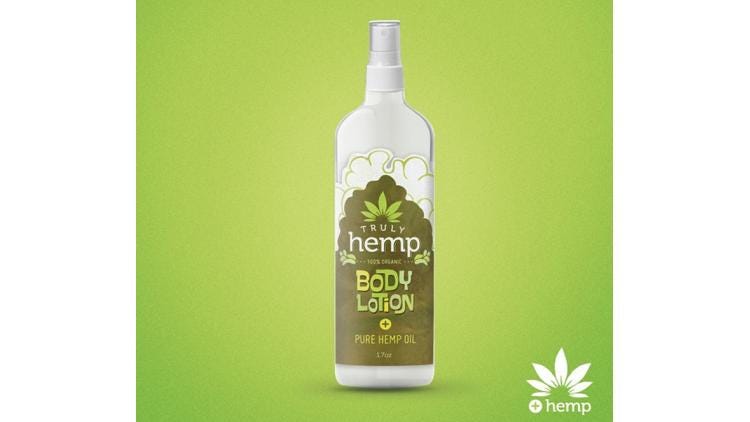
Although hemp and cannabis can be used interchangeably, strictly speaking, hemp comes from a plant that contains only trace amounts of the chemical compound THC (tetrahydrocannabinol), the psychoactive part of cannabis. This body lotion is 100% organic in a design by 99designs designer Martis Lupus.
This logo design by markomavric uses elements of the classic green leaf while emphasizing the “raw” and “organic” attributes.
NEXT: A focus on health
*****************************************************************************
Production efficiencies, ecommerce challenges, sustainability trends, new bioplastic technologies and more are among the topics on the agenda at the new Packaging Hub at EastPack 2018. This free educational program will have more than 16 hours of can’t-miss presentations and demonstrations. Register to attend today!
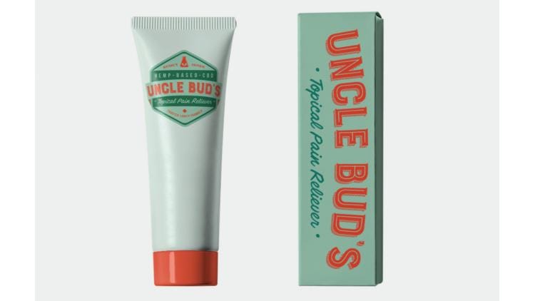
This tropical pain reliever is “nature’s original” and “a trusted family formula,” combining a natural green with a red medical cross in a packaging design by 99designs designer green in blue.
3. A focus on health
With medical marijuana currently being more commonly accepted than recreational marijuana, there is a particularly large business opportunity here. Brands are tapping into the medicinal properties of their products and using medical or pharmaceutical symbols and colors to add legitimacy to their business and appeal to this segment of the market.
Look for the familiar medical cross shape and packaging that makes only the smallest hint at the origin of the product inside, as well as new formats including creams and tinctures.
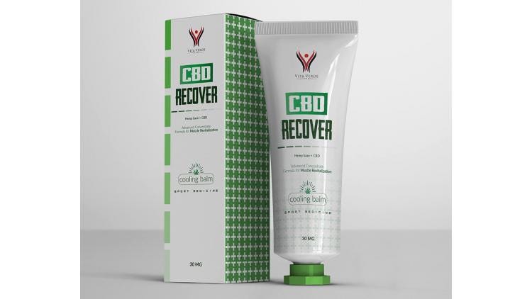
This hemp-based cooling balm is labeled as “sport medicine” in a design by 99designs designer hollyM.
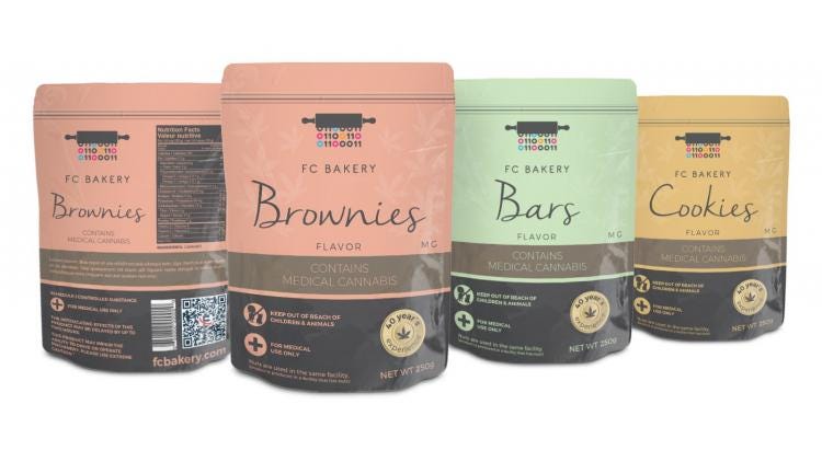
These brownies, bars and cookies are “for medical use only.” Designed by 99designs designer forEM.
NEXT: Minimalism
*****************************************************************************
Production efficiencies, ecommerce challenges, sustainability trends, new bioplastic technologies and more are among the topics on the agenda at the new Packaging Hub at EastPack 2018. This free educational program will have more than 16 hours of can’t-miss presentations and demonstrations. Register to attend today!
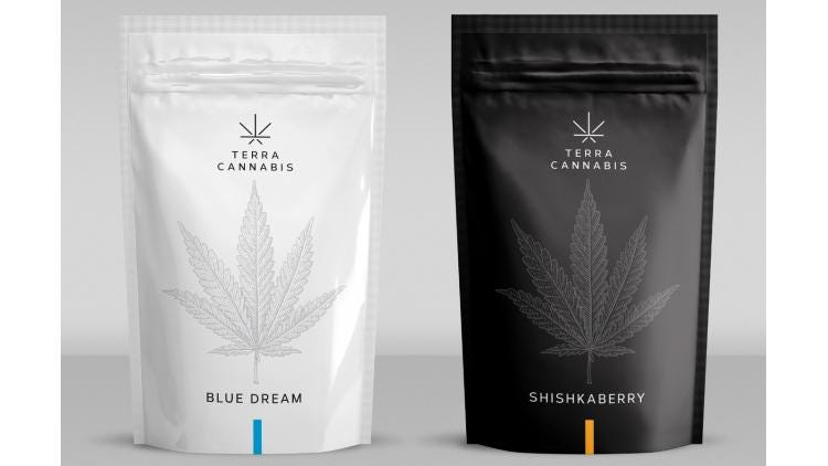
This minimalist packaging in black and white is a far cry from the psychedelic designs of the past. Design by 99designs designer lasko.
4. Minimalism
Taking a minimalist approach to branding can give a business a more stylish and contemporary look. Clean and simple designs still fit well with the theme of relaxation and meditation but bring the brand into the new era.
These designs can look very different from the colorful designs we’re used to but, for that reason, they can also appeal to a new type of consumer. Stylish black-and-white designs can be particularly appropriate for the new high-end, high-quality products that are emerging.
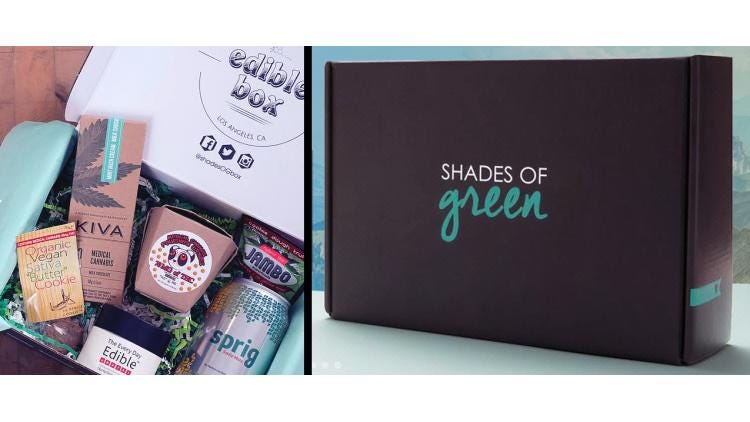
This brand’s logo and packaging is “convenient and discreet.” Web design by 99designs designer Adam Bagus.
This stylish logo by 99designs designer Strobok keeps things simple.
NEXT: Playing with stereotypes
*****************************************************************************
Production efficiencies, ecommerce challenges, sustainability trends, new bioplastic technologies and more are among the topics on the agenda at the new Packaging Hub at EastPack 2018. This free educational program will have more than 16 hours of can’t-miss presentations and demonstrations. Register to attend today!
Taking the high road (bu-dum) with this craft cannabis brand logo design by 99designs designer DIX LIX MIX.
5. Playing with stereotypes
Finally, yes, we did say at the start that you should steer clear of those stereotypes—but there is a trend in cannabis branding that involves a clever play on words or hinting at that counterculture of old. Where recreational cannabis is legal, brands can afford to be a bit more playful and make explicit references to the recreational use of the product. A bit of creativity and fun will help a brand to stand out from the growing competition.
“The only thing that bakes at room temperature” says this meditating bear in a logo design by 99designs designer deb·o·nair.
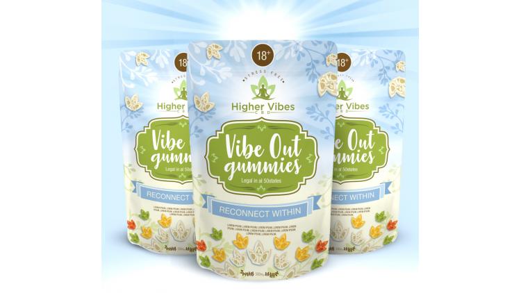
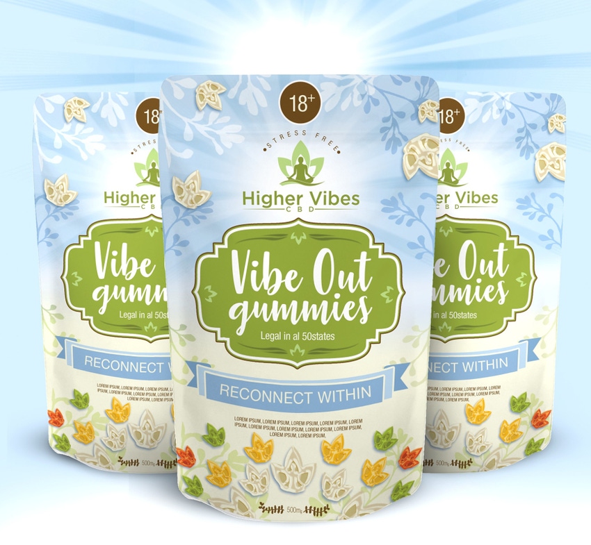
These “Vibe Out gummies” are fun and friendly, and “legal in 50 states.” Packaging design by 99designs designer LanaD.
While these five branding and packaging styles have dominated the early stages of the cannabis industry, more states legalize the drug every election cycle. And more sellers will lead to more diverse branding and more packaging design experimentation.
*****************************************************************************
Production efficiencies, ecommerce challenges, sustainability trends, new bioplastic technologies and more are among the topics on the agenda at the new Packaging Hub at EastPack 2018. This free educational program will have more than 16 hours of can’t-miss presentations and demonstrations. Register to attend today!
About the Author(s)
You May Also Like


