Brand Refresh Fires Up Growth
April 23, 2020

A wood-fired pizza brand sold out of a food truck was elevated through a packaging redesign — here are three takeaways for any start-up.
When chef Matt Lucas launched Copper Crust Co. in 2016 to bring a delicious wood-fired mobile pizza experience to local residents in Marquette, MI, he knew he had great-tasting, homegrown pizza on his side. What he didn’t realize was that growing his business would require its own special recipe: Elevated branding.
“I started this business out of a five-by-eight boxed trailer, hauling my wood pizza oven to craft breweries, weddings, and any local event we could find,” said Lucas. “I would pull up to these breweries with 75 to 250 people milling about looking for something to eat and that’s when I realized I had something.”

Three years in, his small business hit a tipping point. In order to grow his business model, he knew he needed to re-energize his brand and turned to OffWhite Co. for a complete refresh.
The first step was the recommended name change to Smelted, a play on delicious, melt-in-your mouth ingredients and Marquette’s iron ore mining town heritage.
Next came a deep dive into the creative process, leading Smelted through a design and branding transformation to resonate better with its young, hip audience and capture the attention of a broader market.
Elevated to an edgy, artisanal look.
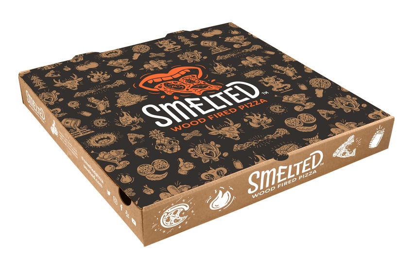
The original logo, which featured a brick wood oven arch covering a line of evergreens and encircled by a beer-can ring, was replaced with a large orange salivating pizza mouth, reminiscent of the Rolling Stones band logo from the 70s and 80s. An orange and black color palette was chosen to convey an edgy, artisanal feel with a strong tonality.
The new design direction included playful pizza flavors to reflect Smelted’s unexpected ingredient combinations: Goat Yoga for goat cheese and fig, Dirty Martini for green olives and Yooper Sunrise for maple honey butter and sage sausage crumble, for example. Each flavor was given its own edgy, humorous custom-illustrated flavor icon, all of which easily scale across other Smelted brand elements, including its new four-season, state-of-the-art food truck and promotional swag.
Since launching its fun, edgy look last year, Smelted is rapidly expanding its customer base and generating strong brand awareness. The company recently signed a deal with a major hotel chain to licence its brand in hotel restaurants and is now developing a “take and bake” option that will eventually transition to a consumer line.
What can a growing company learn from Smelted’s successful brand refresh? Here are what I see as being the top three takeaways:
1. Plan for growth: When you’re a small business in growth mode, it’s important to invest in a cohesive brand strategy from the beginning. Each element of Smelted’s original logo was chosen for a reason, but together resulted in a busy and complicated design that left consumers confused. The new, revitalized brand says: “Look at us. We’re a fun, growing pizza business. You should try us.” It provides a coordinated set of bold, playful brand assets that will scale with the company as it grows, delivering an authentic and fun experience that customers love.

2. Develop a consistent brand personality: Food companies often approach us with great-tasting products that are having difficulty getting to the next level of business. What we often find is they haven’t quite put their finger on the one or two distinct qualities that distinguish them in their market. With Smelted, we took the approach of anchoring the brand and overall design strategy in the concept of “fun” and identified three key brand values: creative, speed and artisanal. Each new brand asset combines the idea of “melt-in-your-mouth” handcrafted pizza, made from hand-picked farm ingredients, with the image of a colorful, young company that is delivering a new take on wood-fired pizza.
3. Establish an emotional connection: Research shows that your best shot at building a loyal following for your brand hinges on how strongly people feel connected to it. Smelted’s original logomark was not only confusing, but failed to resonate with its audience, largely made up of blue-collar workers and millennials. Its refreshed brand assets — including the sleek new food truck, fully decked out in renditions of its graphic flavor icons — tell its brand story in an exciting, energetic and fun way that inspires people to reach out and make a lasting connection.
Riding into the next wave of its business, Smelted is well positioned to grow its brand story along with sales and new ventures. As Lucas puts it: “We had to come up with a totally different approach to our business to give us a coordinated, on-brand strategy in one fell swoop. Now, we have the blueprint we need to aggressively go out and attack new opportunities.”
About the Author(s)
You May Also Like


